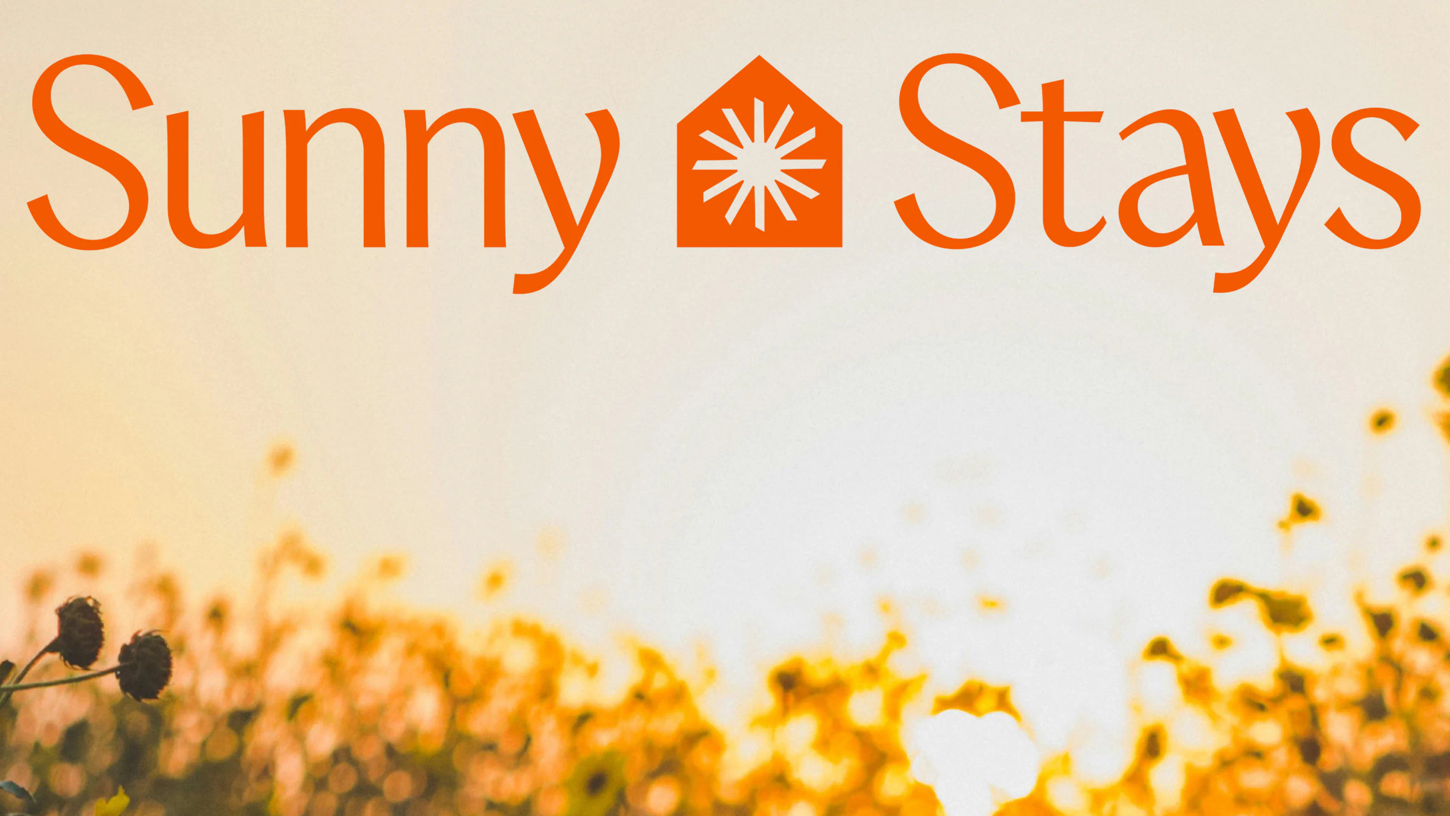
Sunny Stays Brand Identity
Client:
Farrugia Group
Project Date:
2026
Industry:
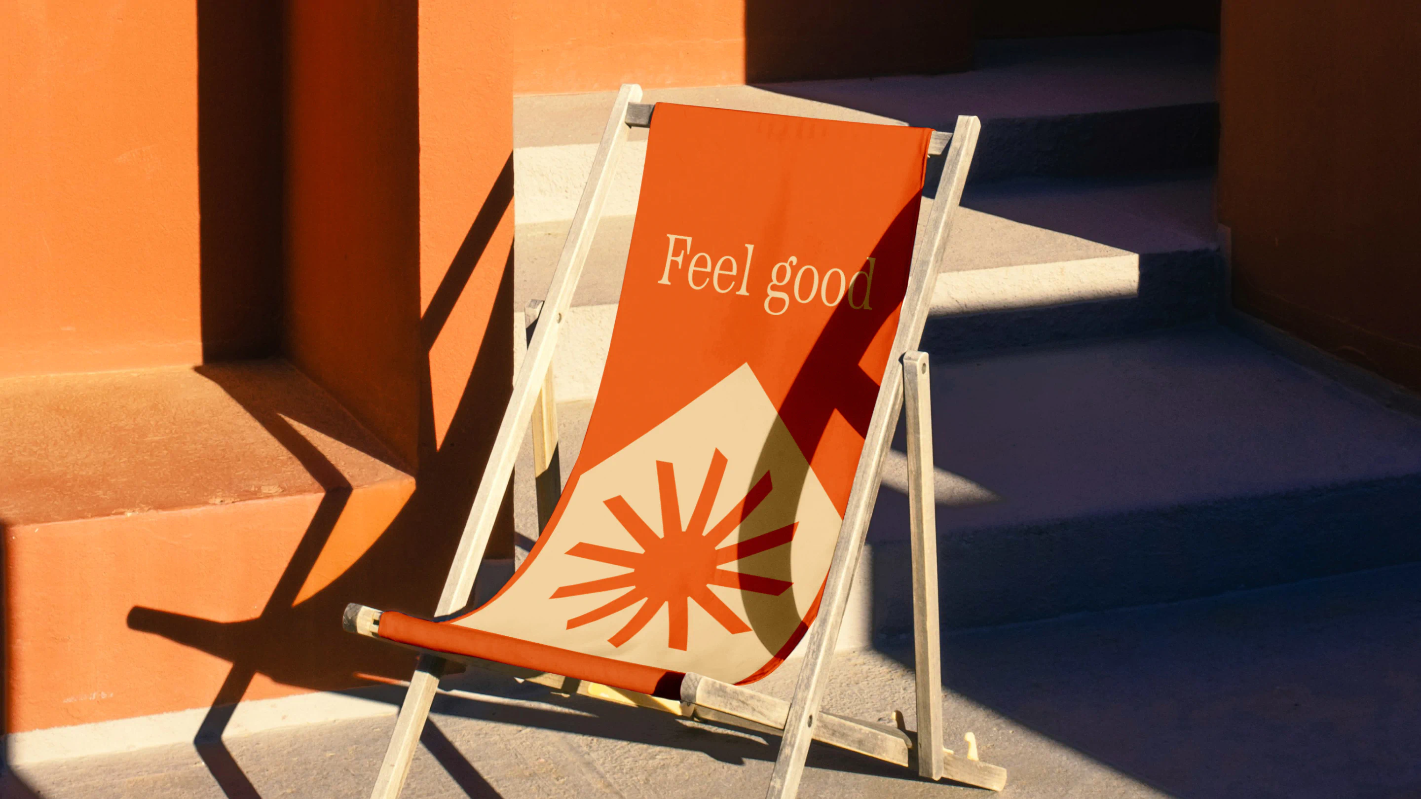
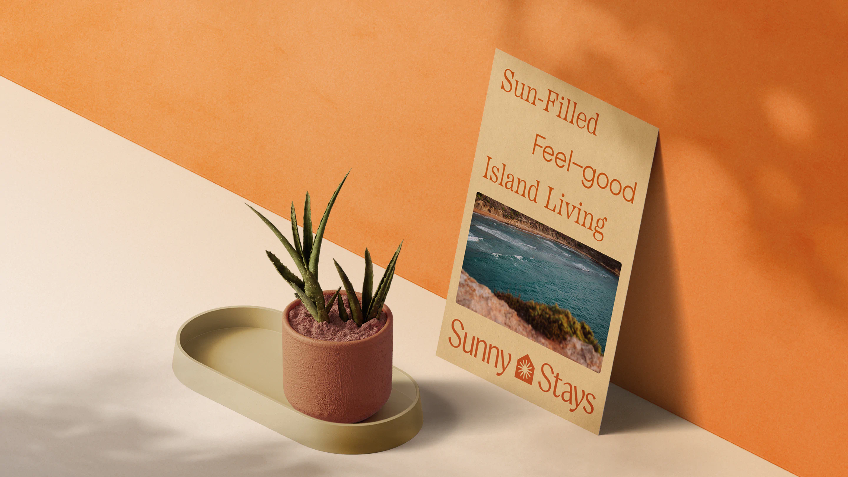
We created the name and brand identity for Sunny Stays, a new rental company by Farrugia Group. Designed to feel warm, memorable, and instantly uplifting, the brand celebrates Malta’s sunshine while balancing approachability with premium appeal across identity and digital touchpoints.
The Brief
Farrugia Group approached us to create a brand for their rental company, one that could confidently stand on its own within a competitive local market. The name needed to feel familiar yet distinctive, easy to pronounce in both Maltese and English, and free from any personal name associations.
The ambition was to build a stand alone brand with a strong presence among local competitors. A brand that would feel welcoming, memorable, and emotionally uplifting. Something that would quite literally put a smile on people’s faces the moment they heard it.
The Work
Every great stay begins with a feeling.
When exploring name directions, we knew we wanted something that captured not just accommodation, but atmosphere. “Sunny Stays” immediately stood out. Cheerful, instantly likeable, and effortlessly memorable, the alliteration gives it rhythm and recall. More than that, it taps into a universal desire, especially for British travellers, the pursuit of sun, warmth, and escape.
Malta’s biggest natural asset is its weather. So we chose to celebrate it.
“Sunny Stays” does not simply describe a rental company. It promises a mood. A mindset. A memorable experience shaped by light, warmth, and ease.
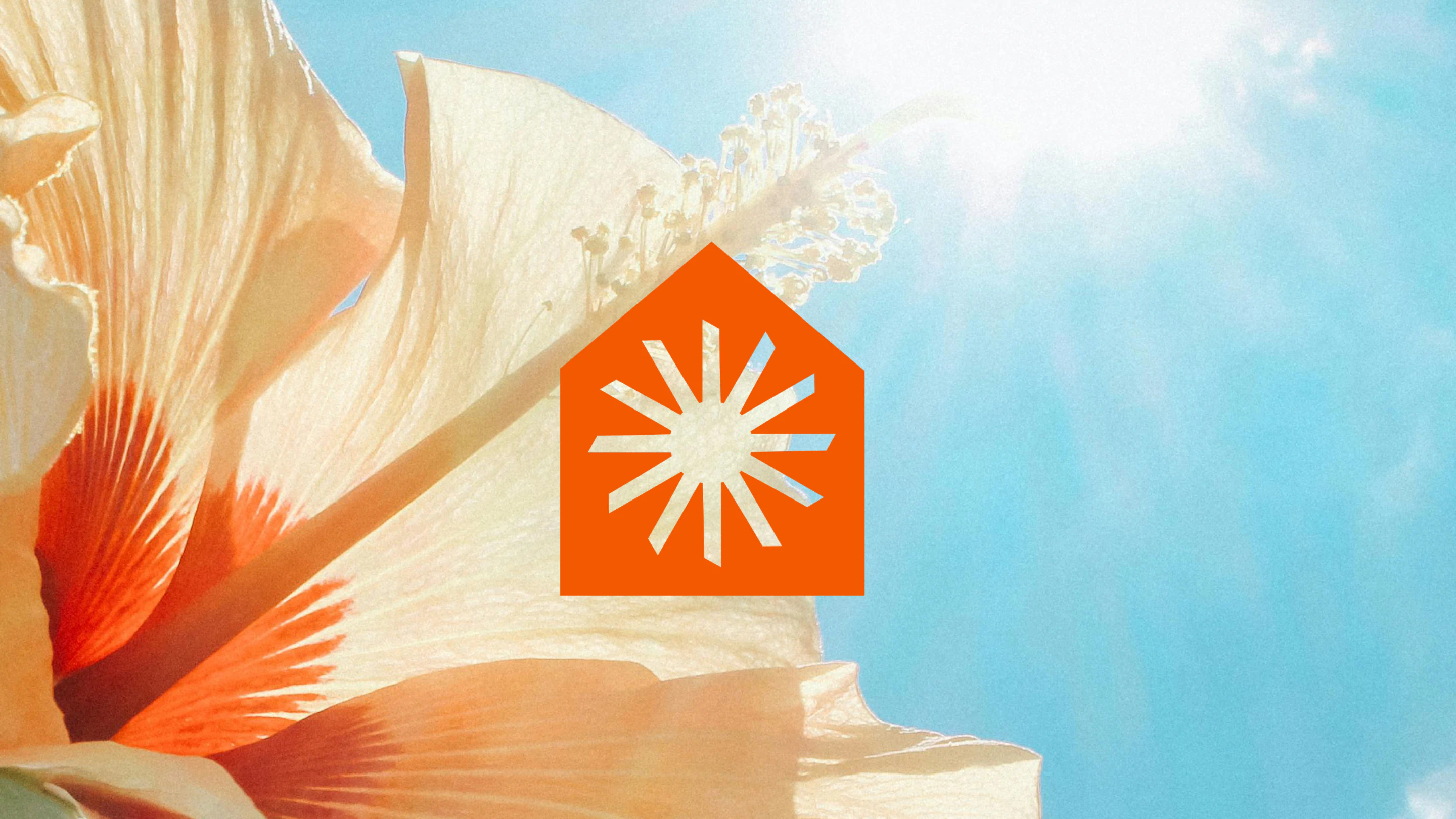
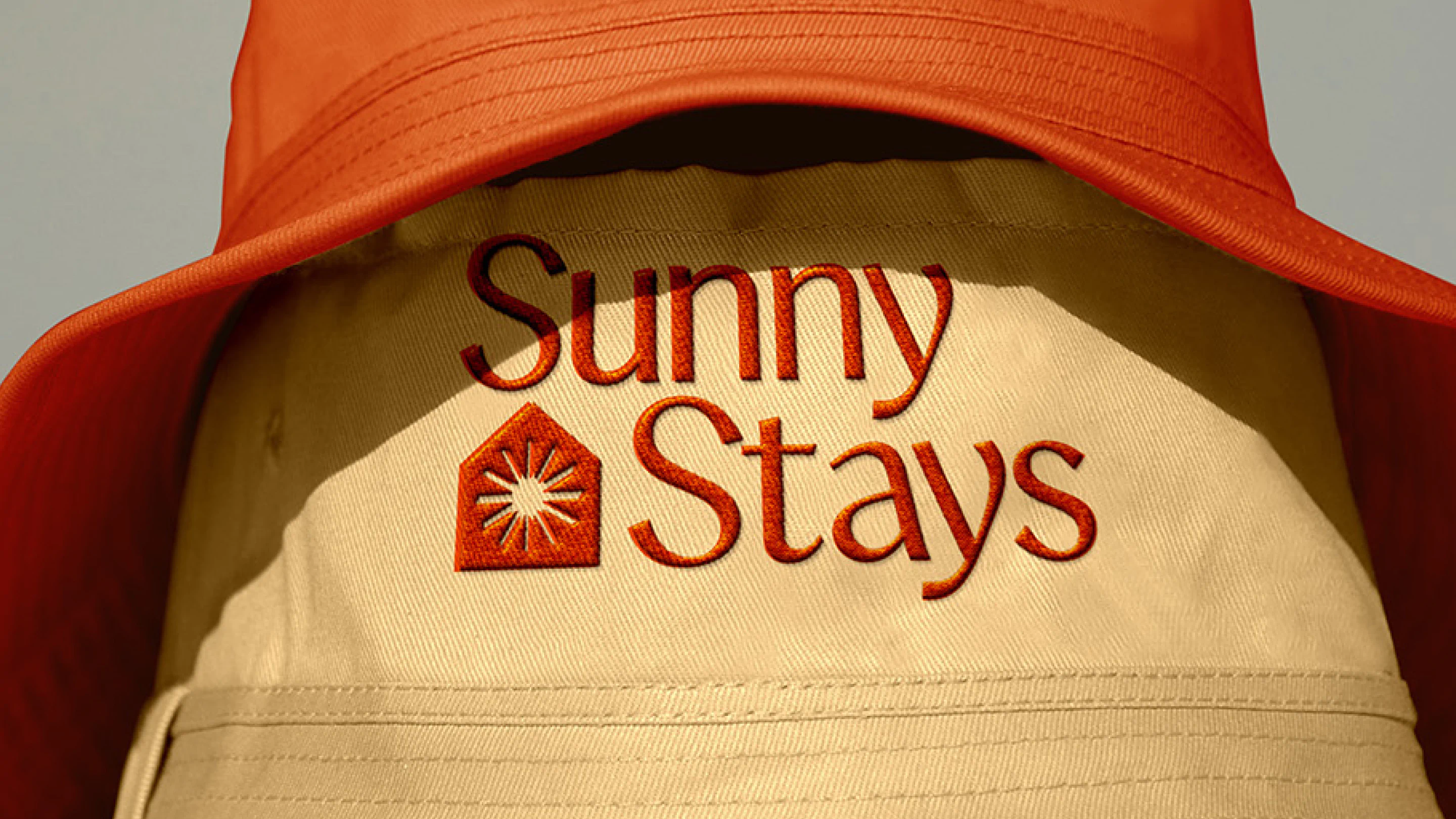
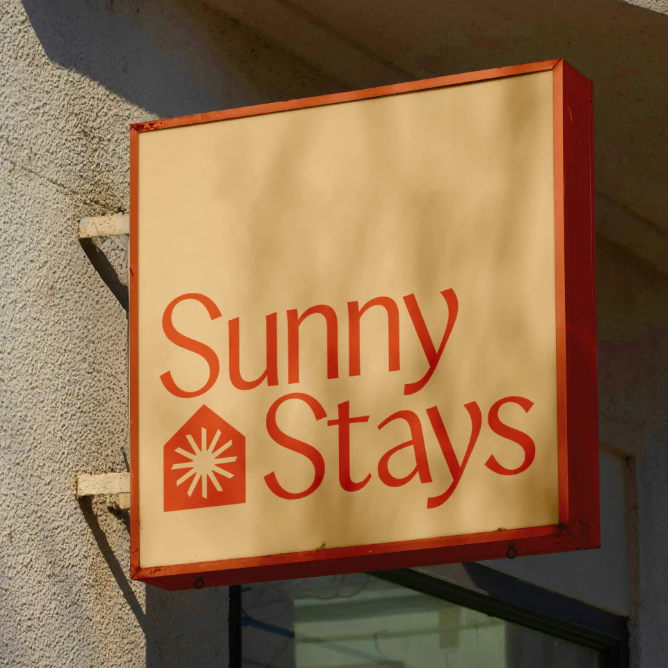
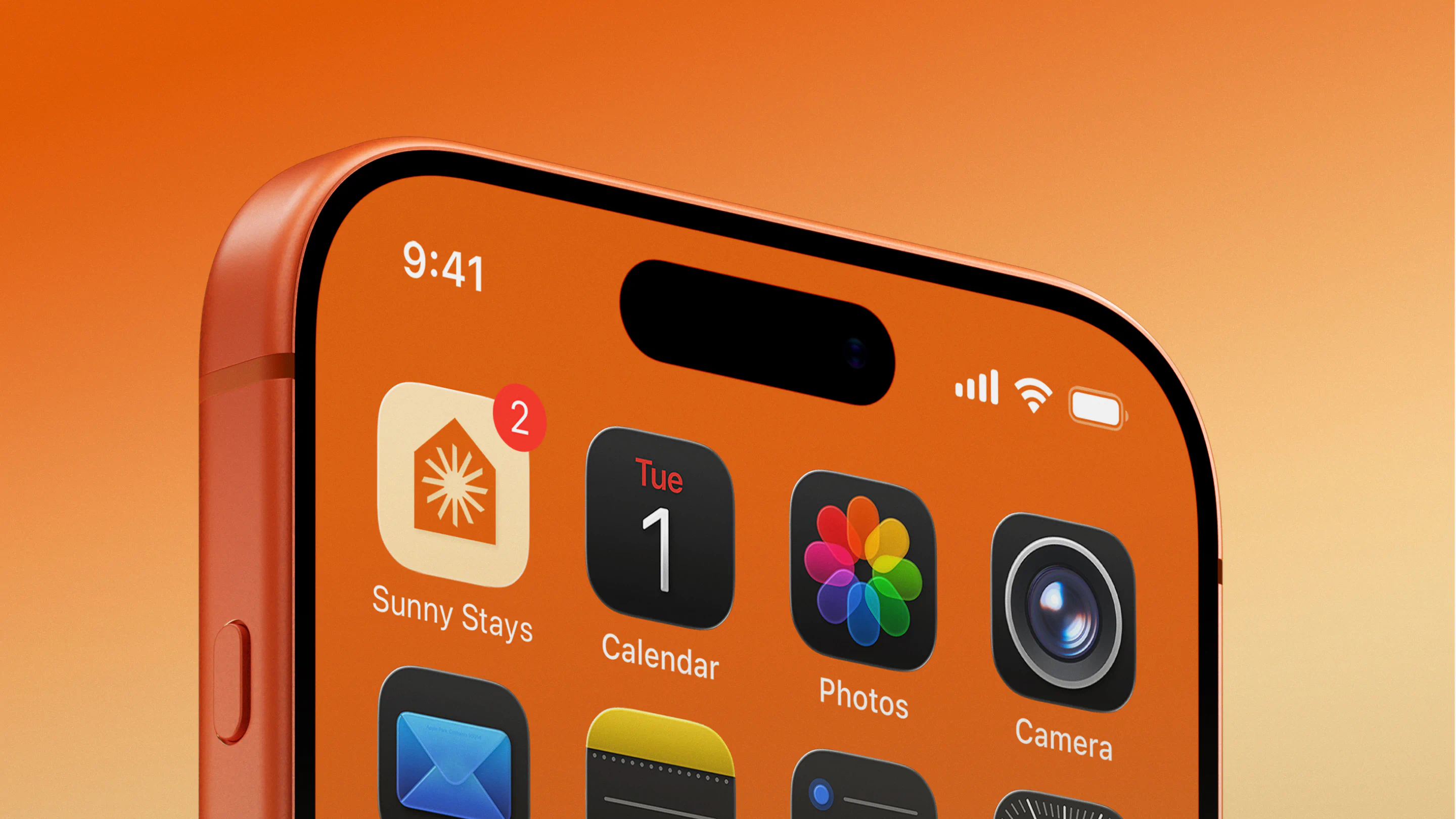
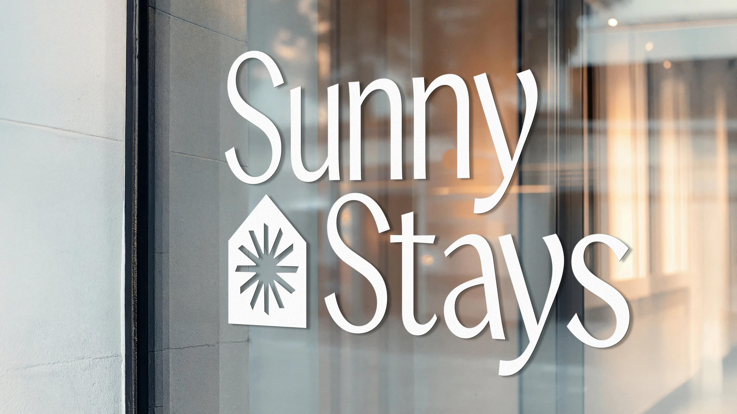
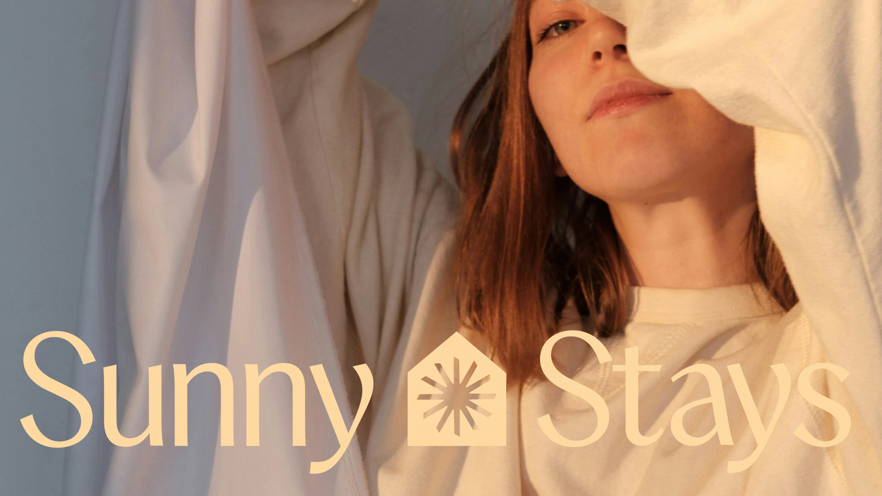
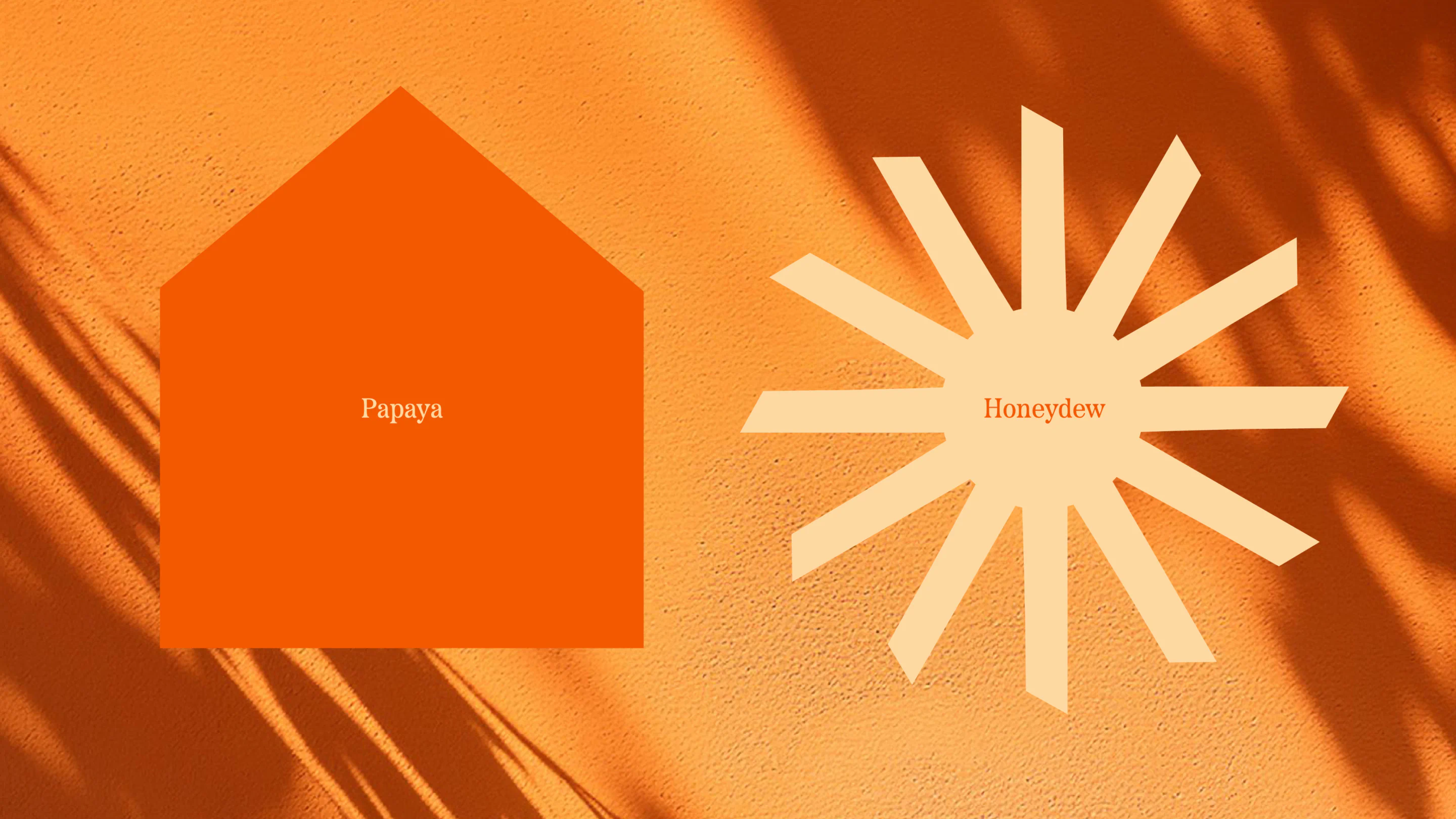
From there, we translated this optimism into a visual identity built around the idea of home as destination. The logo combines a distinctive icon with a confident wordmark. The primary outer shape forms a house silhouette, immediately grounding the brand in rental living. Within this structure sits a radiant sun, its rays inspired by the geometric forms found within the wordmark itself, particularly the crossbar of the “t”. This relationship between typography and symbol creates a cohesive and considered system.
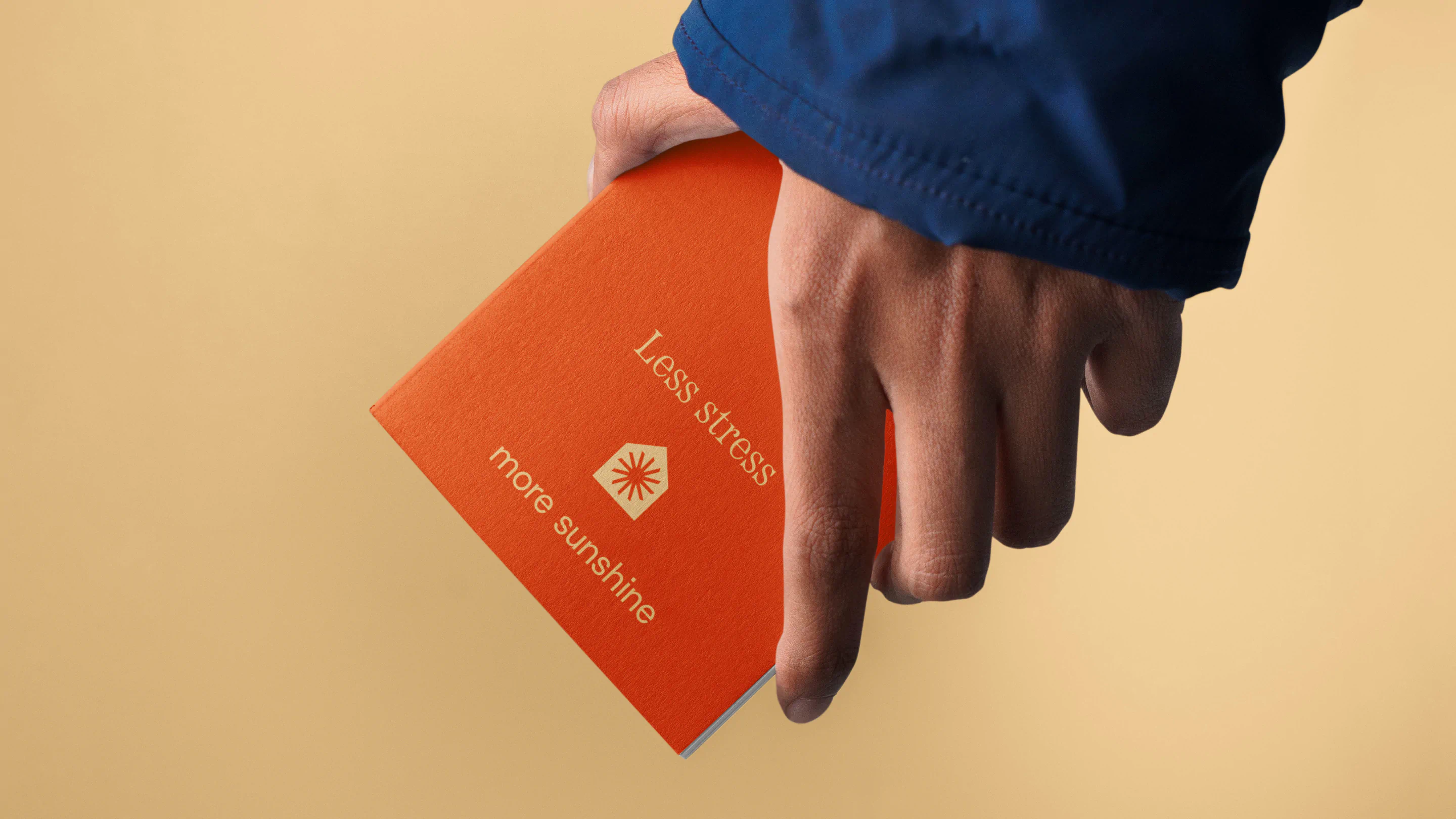
The sun is positioned inside the home shape, reinforcing the idea that warmth, comfort, and brightness are part of every stay. The home is not just a structure. It holds the sunshine within it.
Colour plays a powerful emotional role. We developed a palette centred around two custom named tones, Papaya and Honeydew. These shades bring Mediterranean warmth and freshness into the brand, creating a visual language that feels uplifting yet refined.
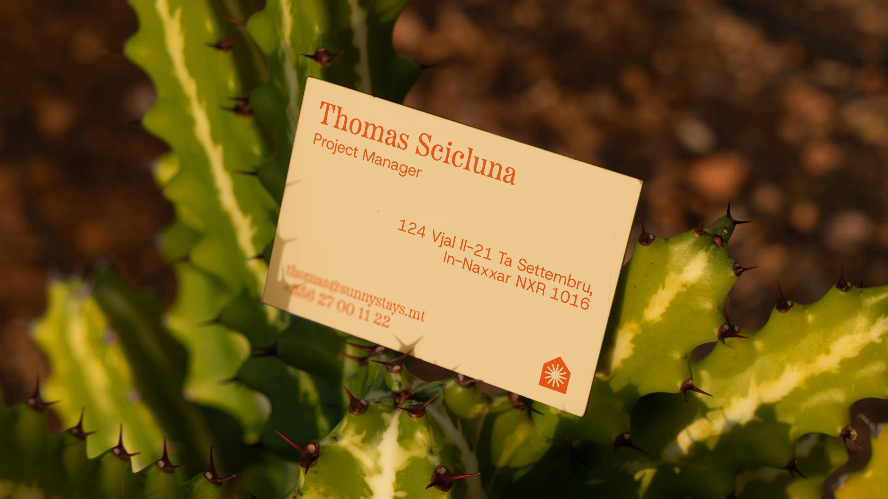
Typography balances personality with professionalism. Etna was chosen for its personality filled curves, readability, and confident charm. It brings warmth without losing polish. Paired with Host Grotesk, a subtle nod to the hospitality world, the result is clean, structured, and quietly premium.
The overall personality strikes a deliberate balance. Approachable yet high quality. Suitable for both family holidays and premium style rentals.
Sunny Stays is not just a name. It is a feeling you arrive with and leave remembering.


The results