Springs+
Client:
Springs+
Project Date:
2025
Industry:
Pharmasal Limited asked us to develop a brand that would unify their network of pharmacies while reflecting their commitment to personalised care and community. Together, we created Springs+, a new pharmacy chain that combines warmth and professionalism, setting the foundation for a more connected, approachable pharmacy experience.
The Brief
Create a people-first brand for Pharmasal Limited’s group of pharmacies. The new brand should reflect their values of care while offering a modern, approachable identity that stands out and delivers a consistent experience across all touchpoints.
The Work
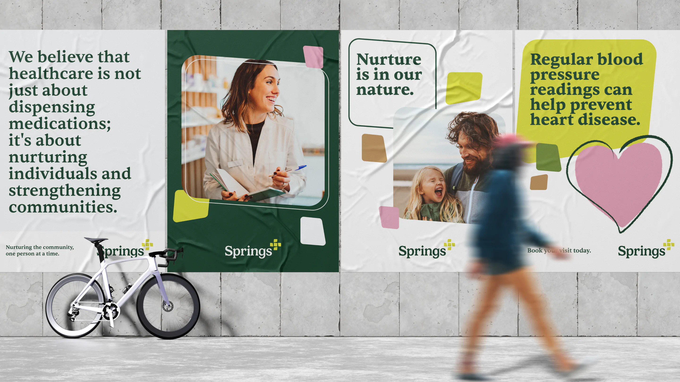
Pharmasal Limited is a people-first group of pharmacies that believes great care starts with understanding the individual — because when you care for each person, you uplift the entire community. It was this deeply human approach that inspired us to dig deeper and articulate a brand purpose that truly reflected who they are. After spending time with the team, we worked together to define a new brand strategy, principles, and purpose: ‘nurturing the community one person at a time’.
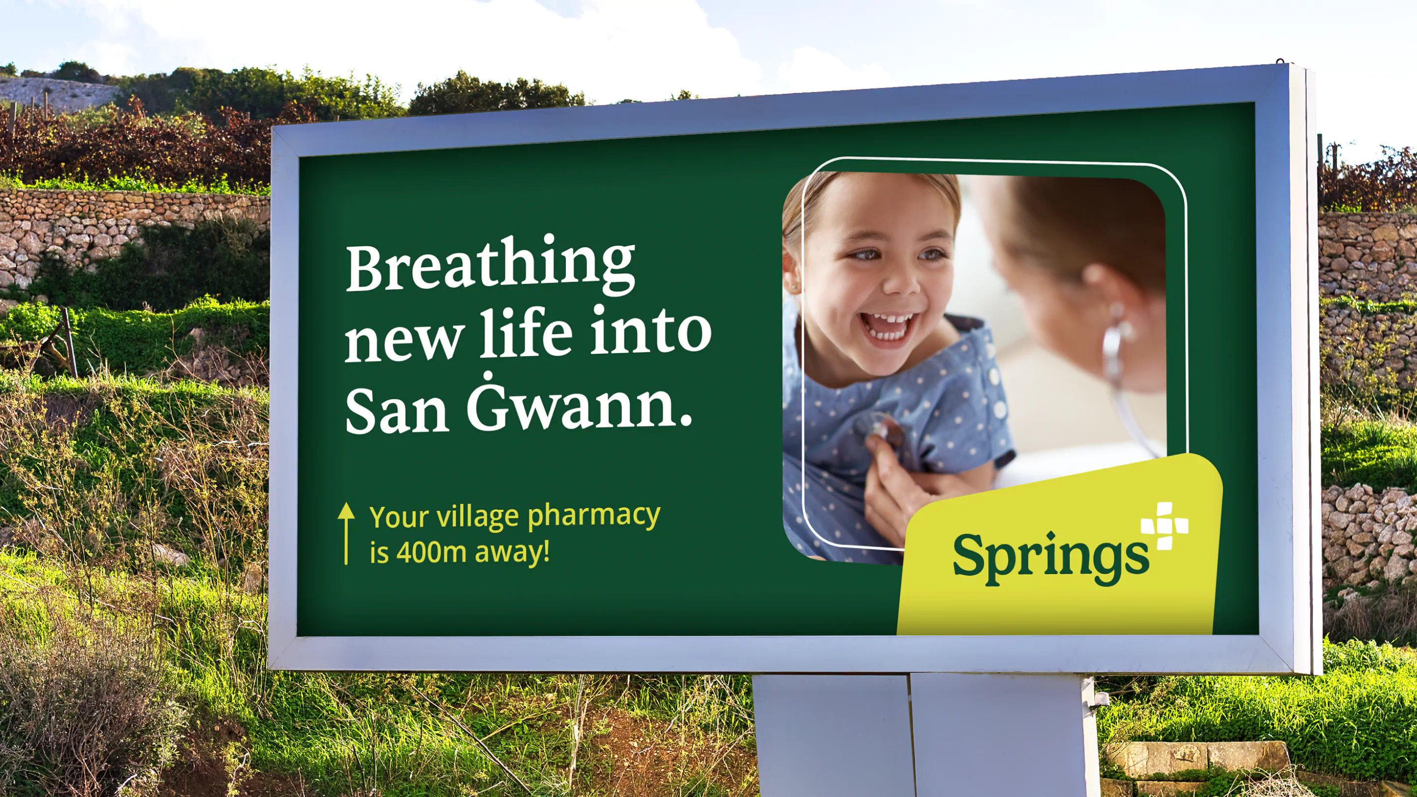
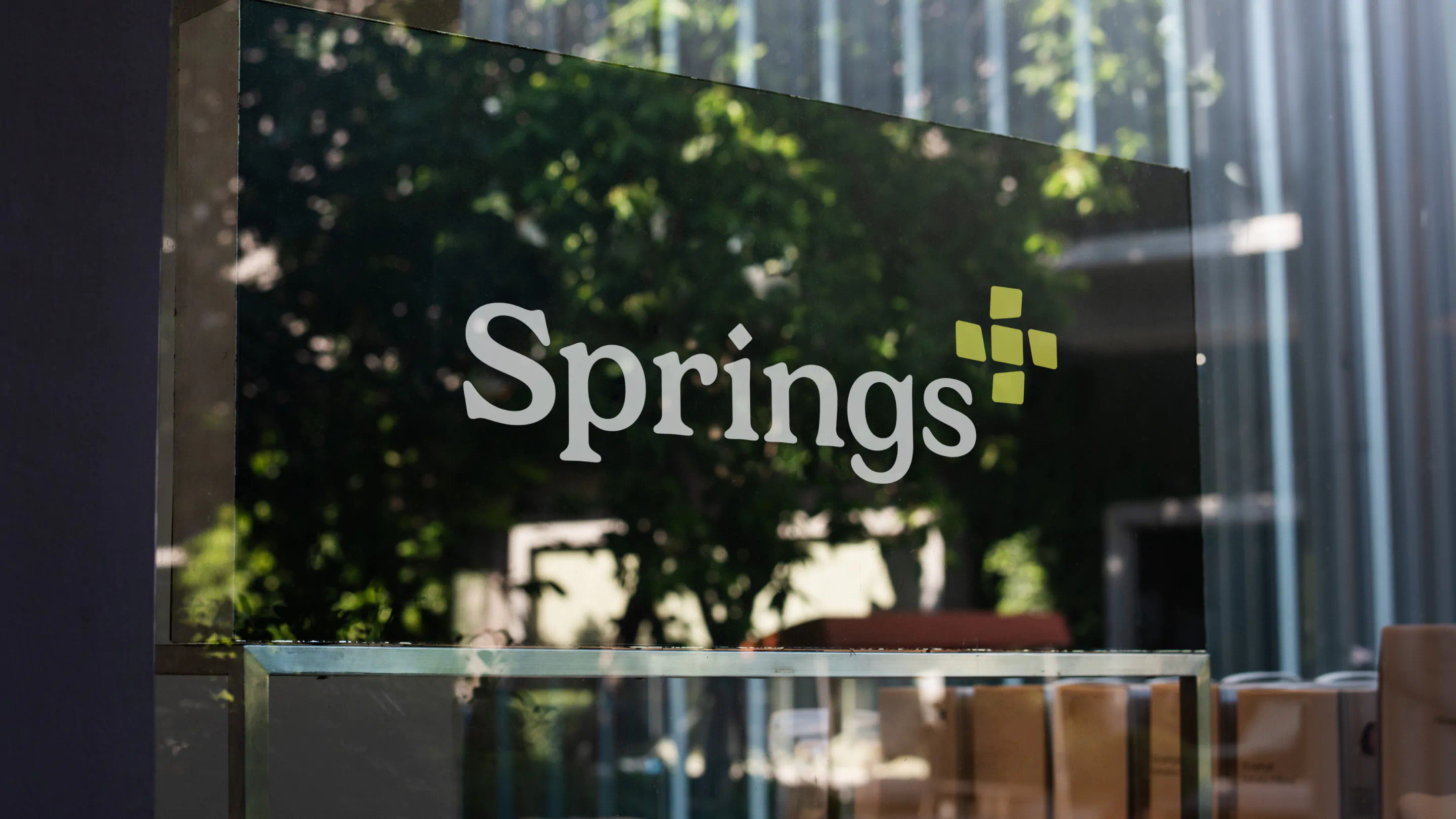
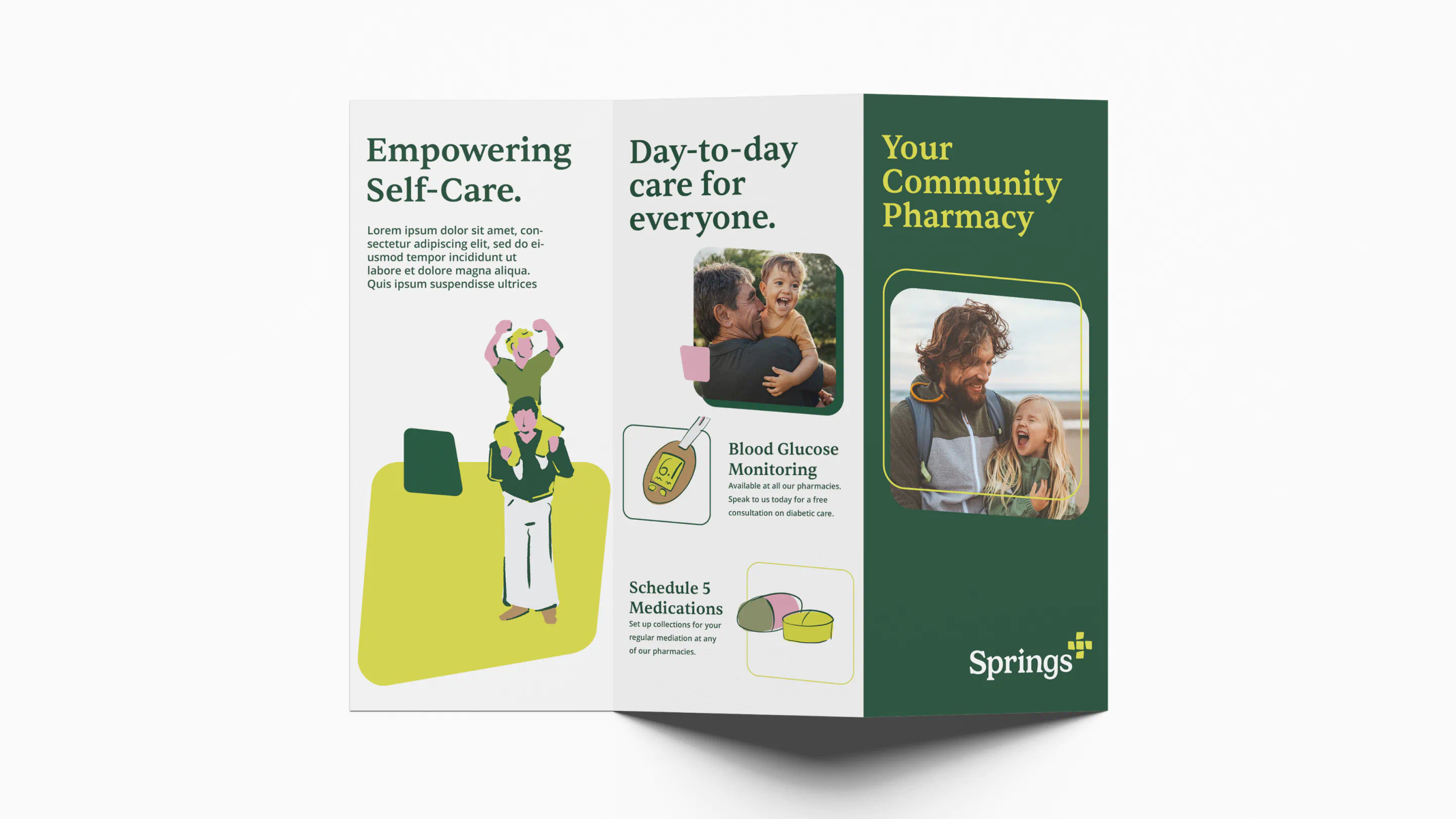
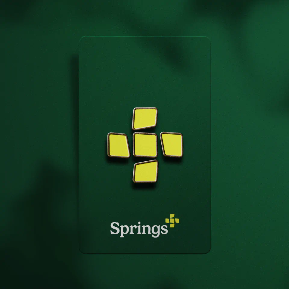
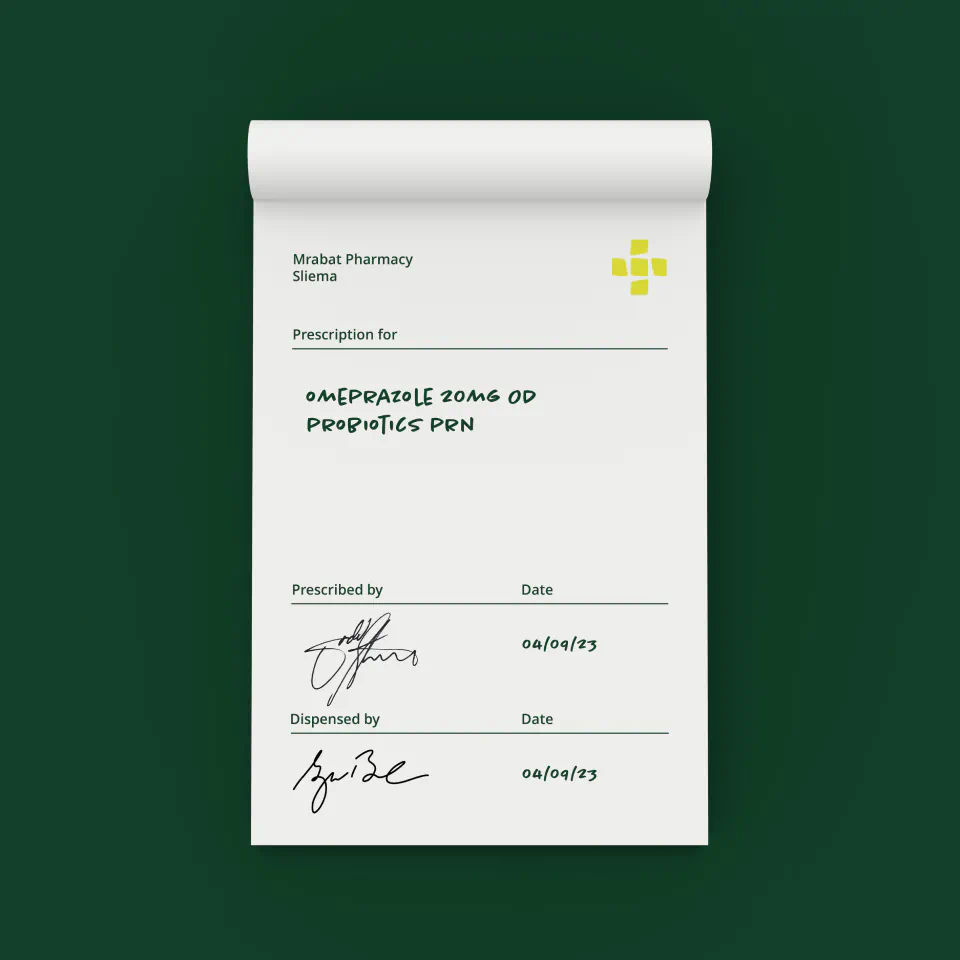
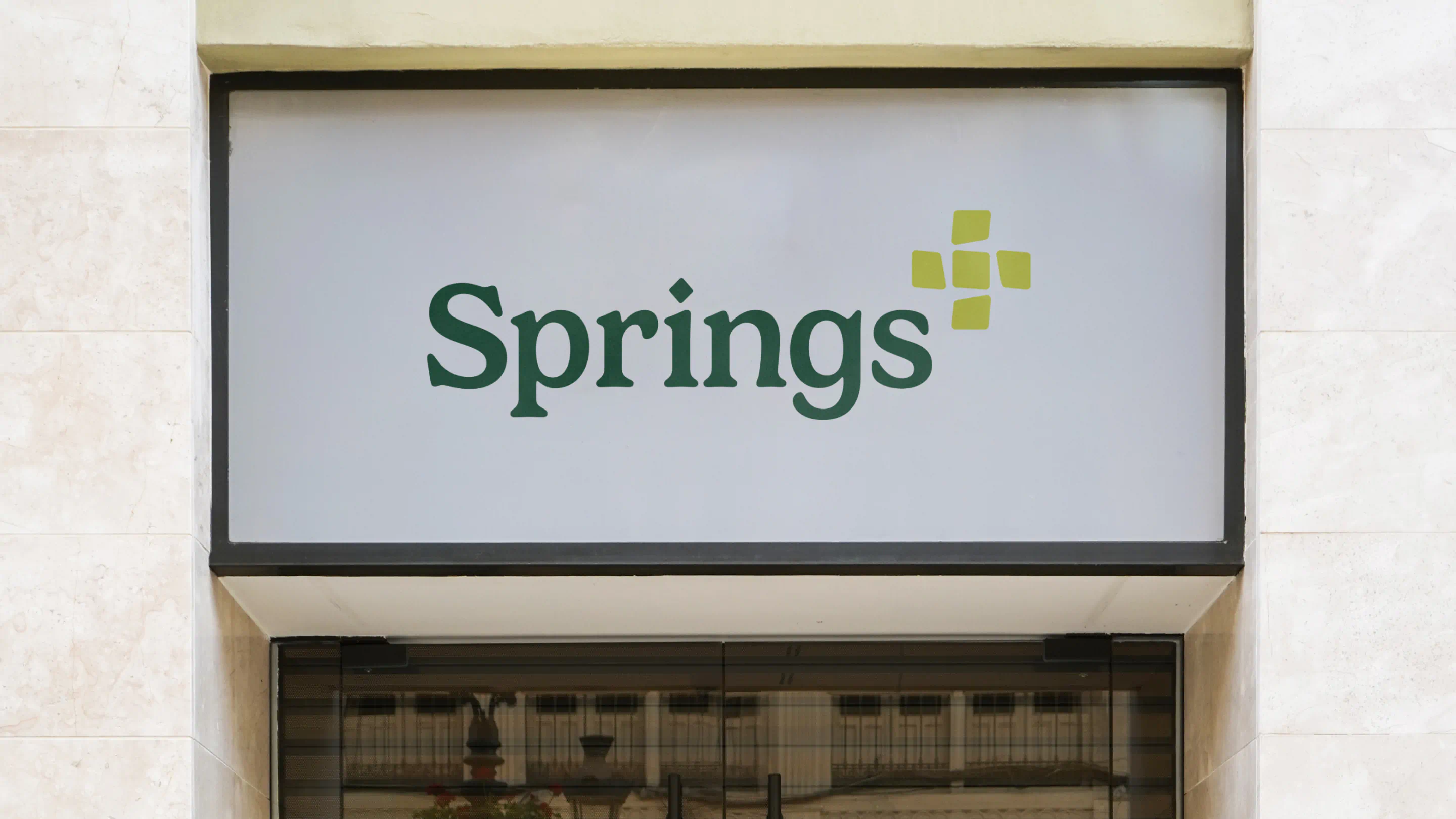
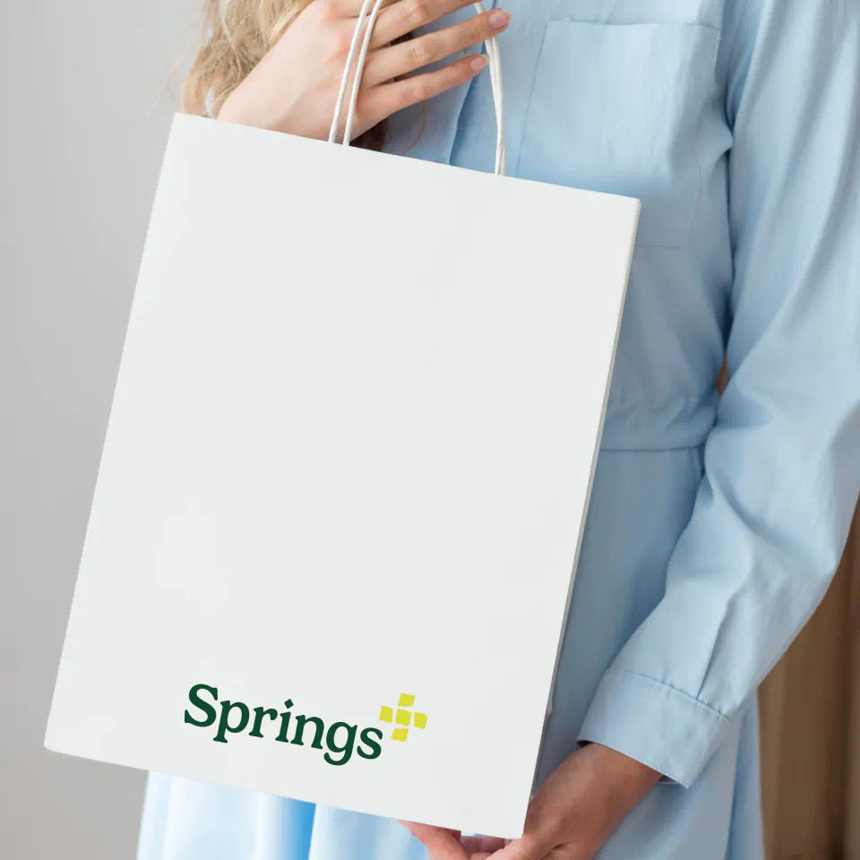
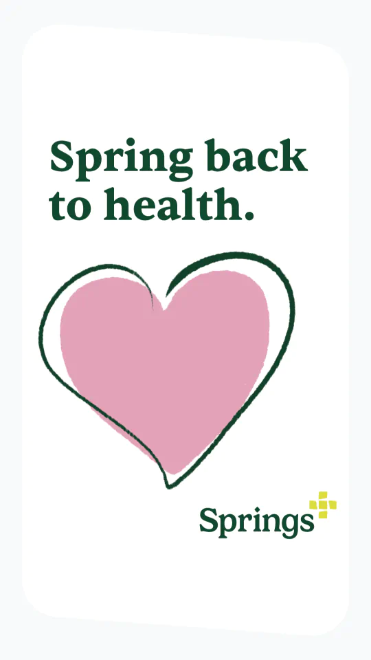
With this new purpose as our North star, we wanted to find a name that was bright, cheerful and reflected that sense of going the extra mile. We landed on Springs+, inspired by the idea of natural springs, symbolising life and healing, and the spring season which brings new life, renewal and transformation. We added the '+' as a reference to the traditional green cross sign pharmacies are known for and as a brand promise to deliver more.
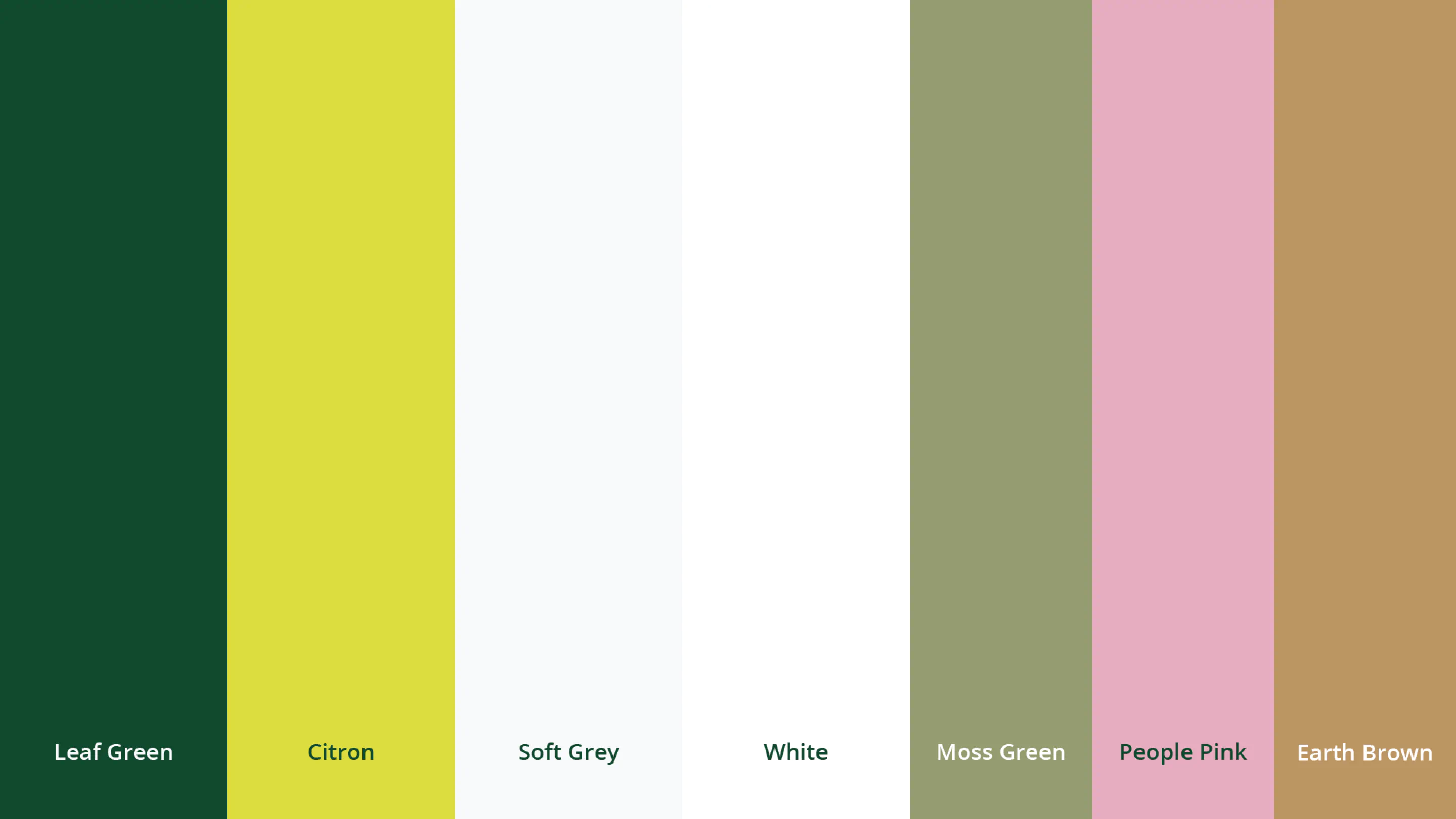
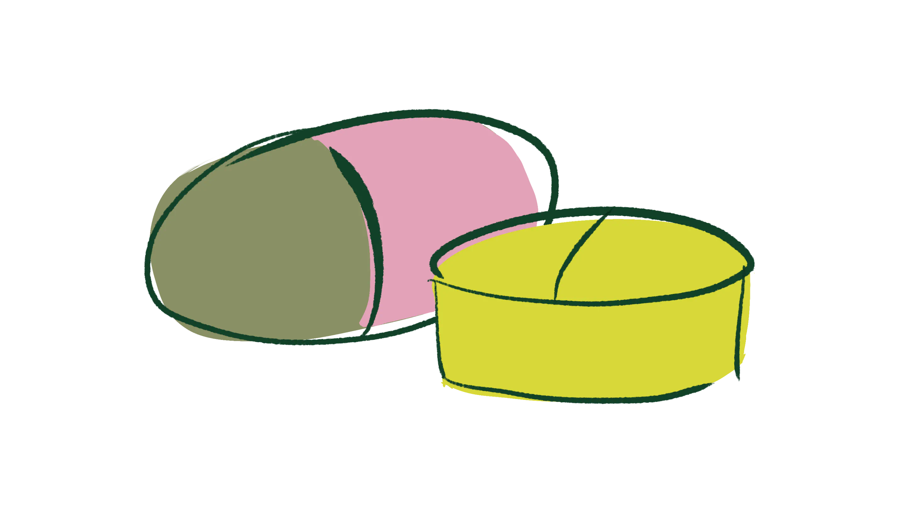
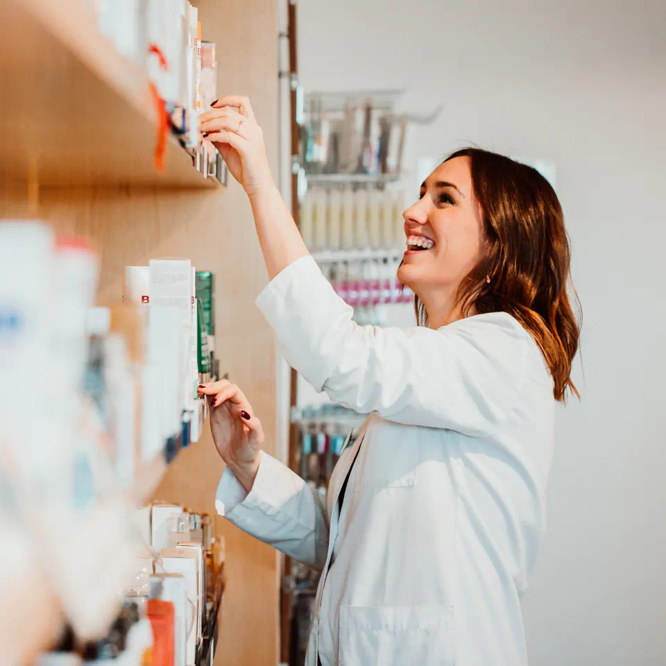
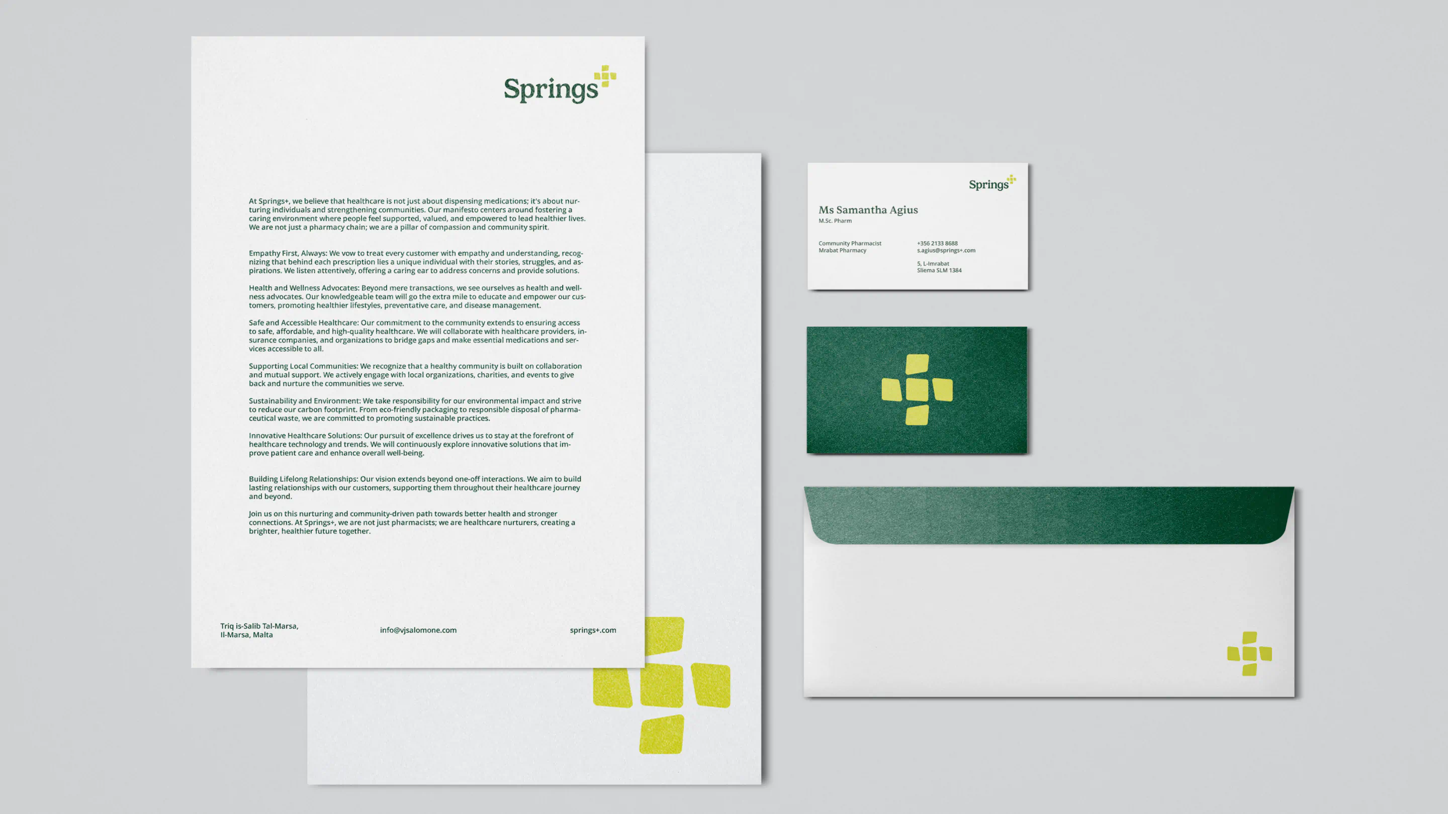
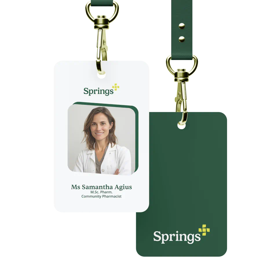
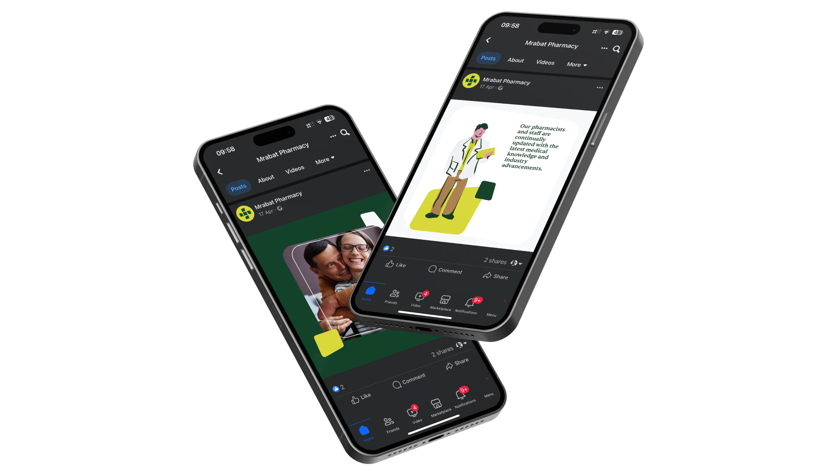
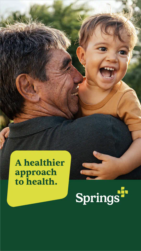
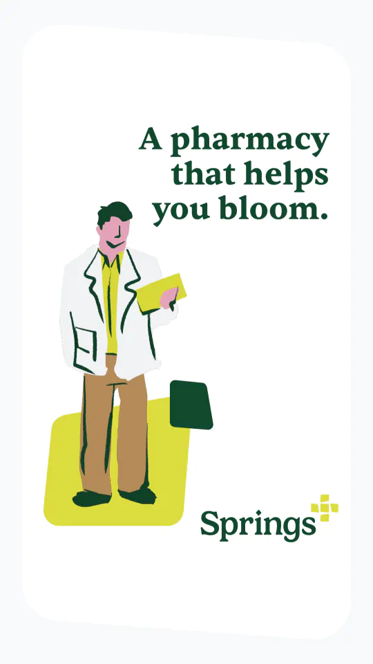
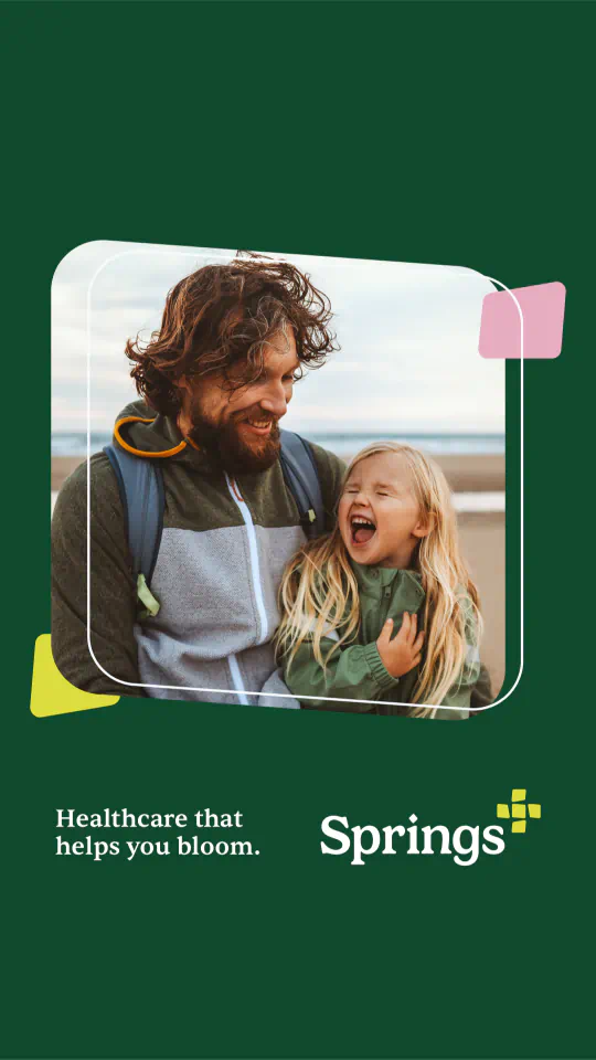
That same thinking shaped the visual identity. We paired the new name with warm colours, custom illustrations, and friendly icons to create a look and feel that’s distinctly human — approachable, uplifting, and personal.
Moving on to the next phase of the project, we turned to digital. This fresh identity needed an online home that could carry the same sense of warmth, clarity, and care. We designed and developed a custom Webflow site that feels as approachable as the Springs+ brand itself. With user-friendly navigation, clear service listings, and a location finder tailored to their widespread presence across Malta, the site makes it easy for people to connect with the right specialist, in the right locations.
Together, the new brand and website bring Pharmasal’s people-first values to life and with Springs+, Pharmasal now has a unified identity that’s bold, approachable, and proudly personal.


The results