Farm Meat Market Brand Refresh
Client:
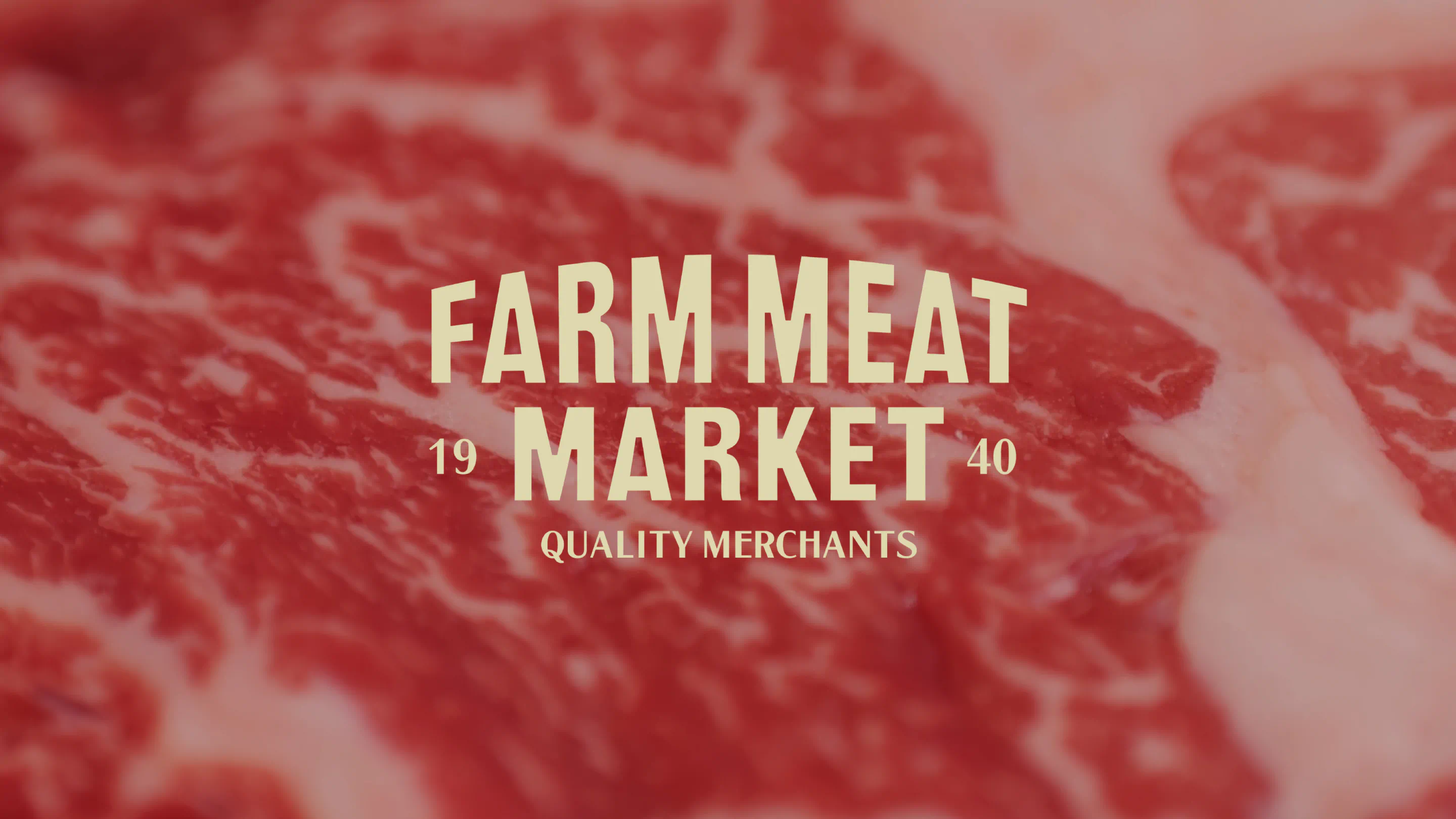
Farm Meat Market
Project Date:
2025
A legacy farm turned premium meat supplier, Farm Meat Market required a refreshed identity that respected its heritage while unifying its B2B and B2C operations. We delivered a strategic brand refresh that strengthens clarity, communicates premiumness and legacy, and brings the farm-to-fork philosophy to life under a single, confident identity.
The Brief
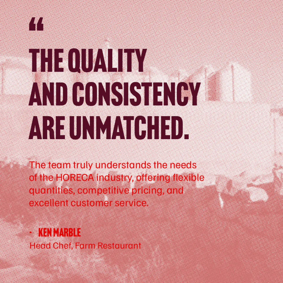
Farm Meat Market has been operating in Malta since the 1940s, beginning as one of the island’s earliest farms. Over the decades, the business built a strong reputation for supplying high-quality meat to both direct consumers and the HORECA industry. In recent years, however, shifting shopping habits and the rise of supermarket convenience meant the brand needed to evolve.
Our objective was to modernise Farm Meat Market’s identity by unifying its retail and wholesale operations under one clear and compelling brand – while preserving the legacy, expertise, and values of a proud family-run business.
The Work
This project was grounded in craft and quality. With decades of hands-on experience in farming, butchery, sourcing, and food preparation, Farm Meat Market has a deep understanding of the trade and the local market it serves. This depth of knowledge has always been central to the brand’s success and needed to remain visible in its next chapter.
Our challenge was to honour this legacy while repositioning the business for today’s consumer expectations and a highly competitive food service landscape.
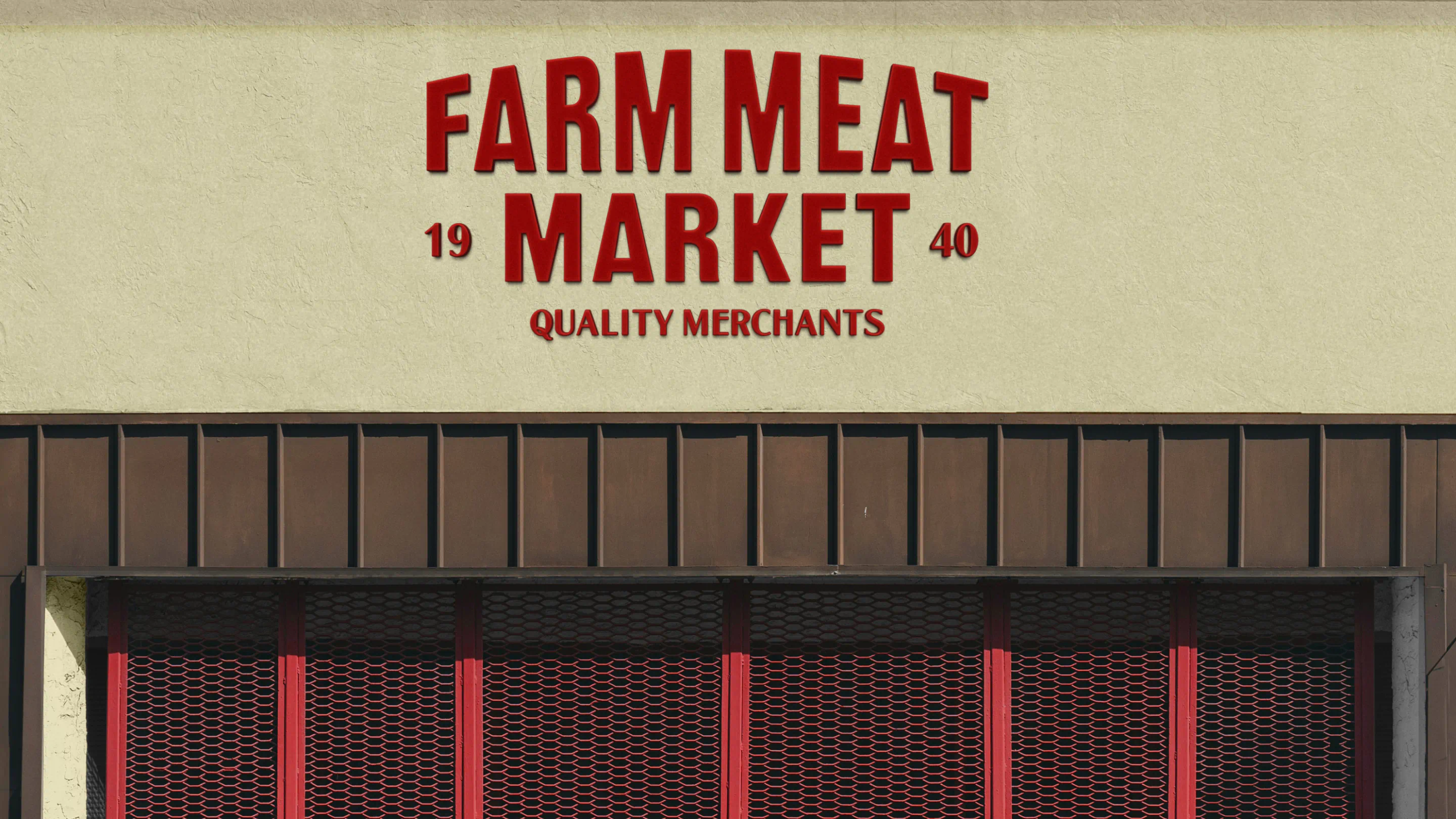
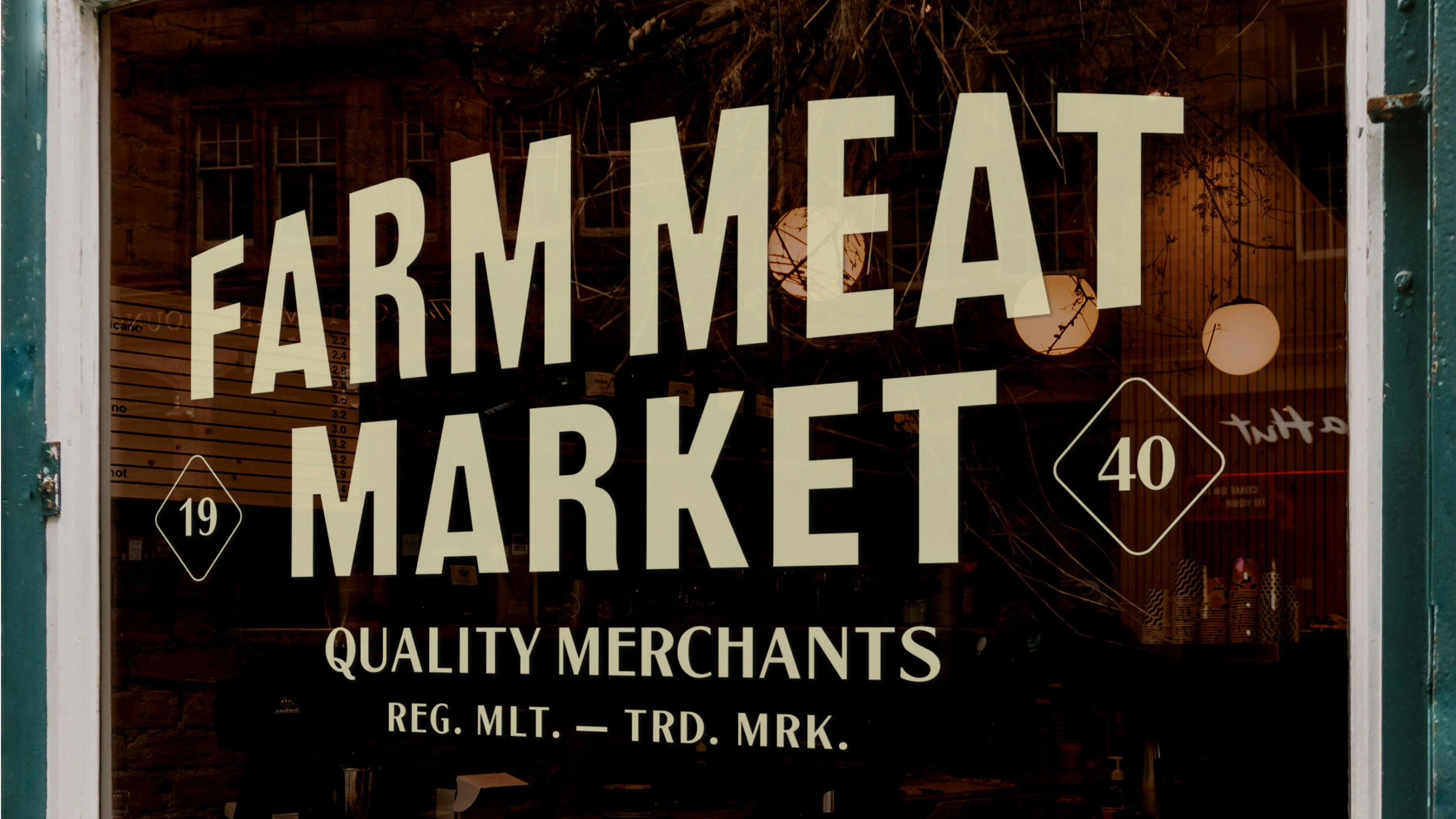
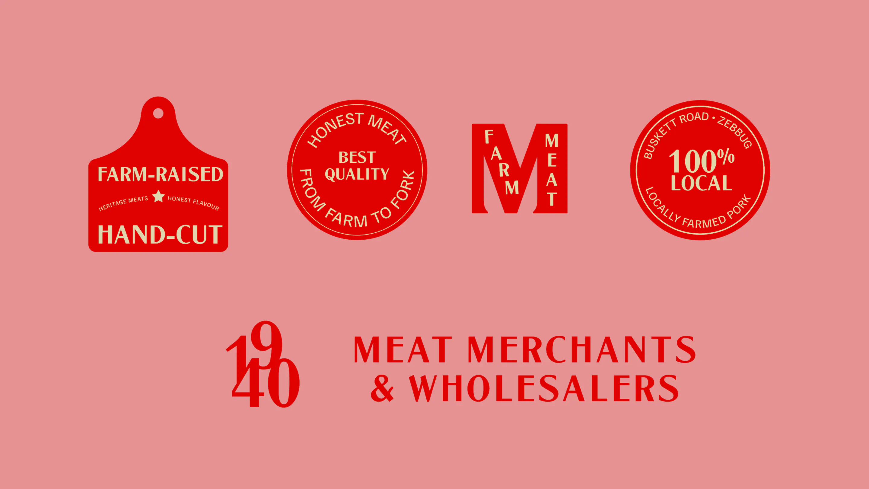
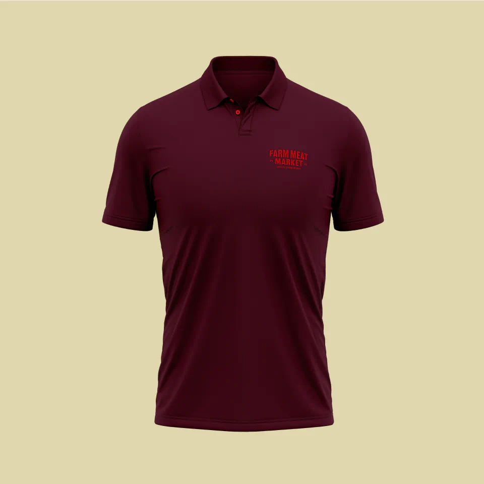
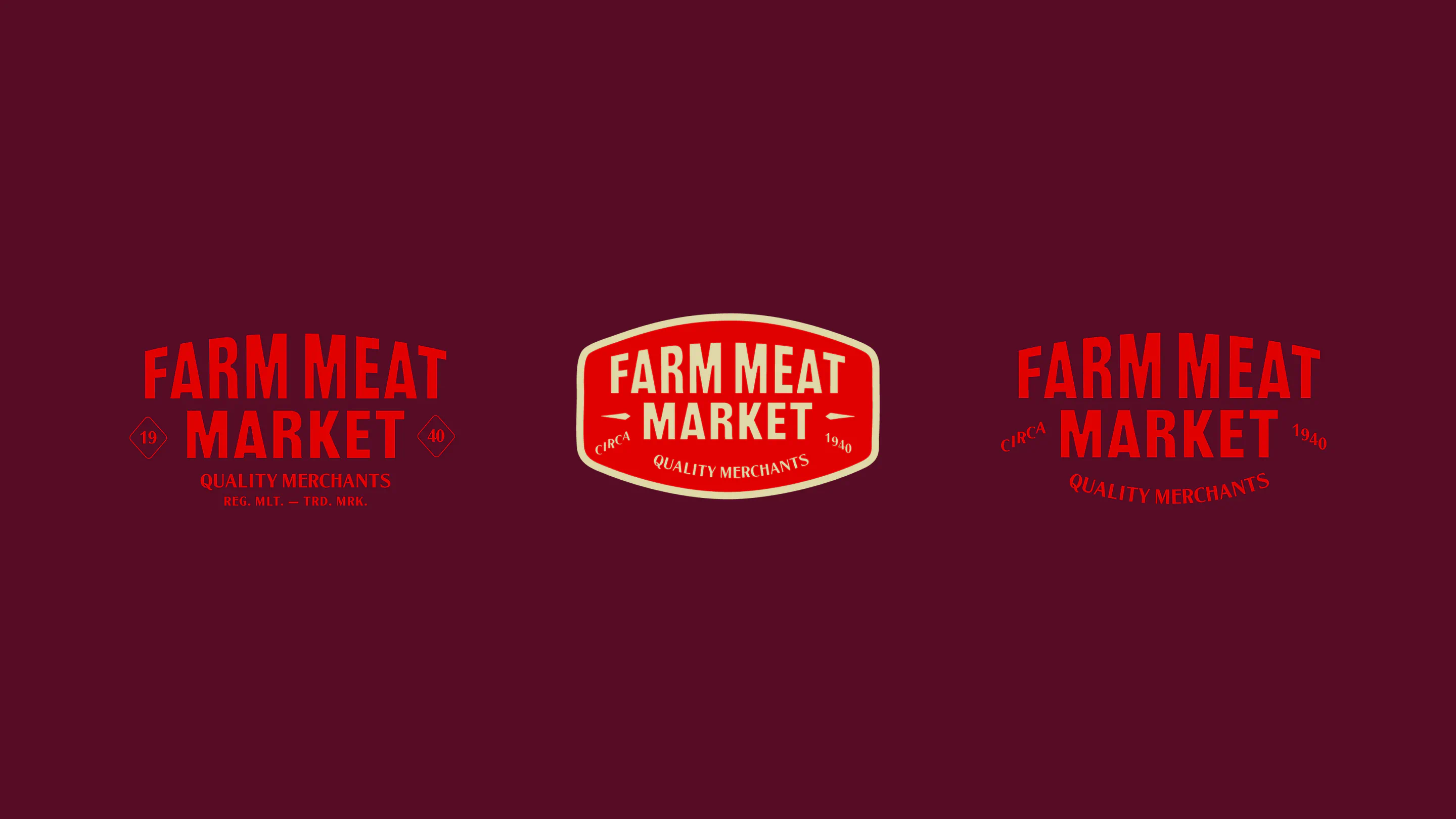
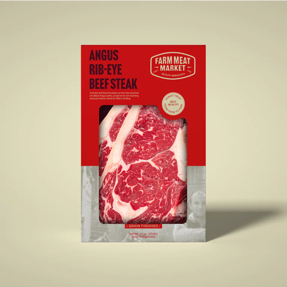
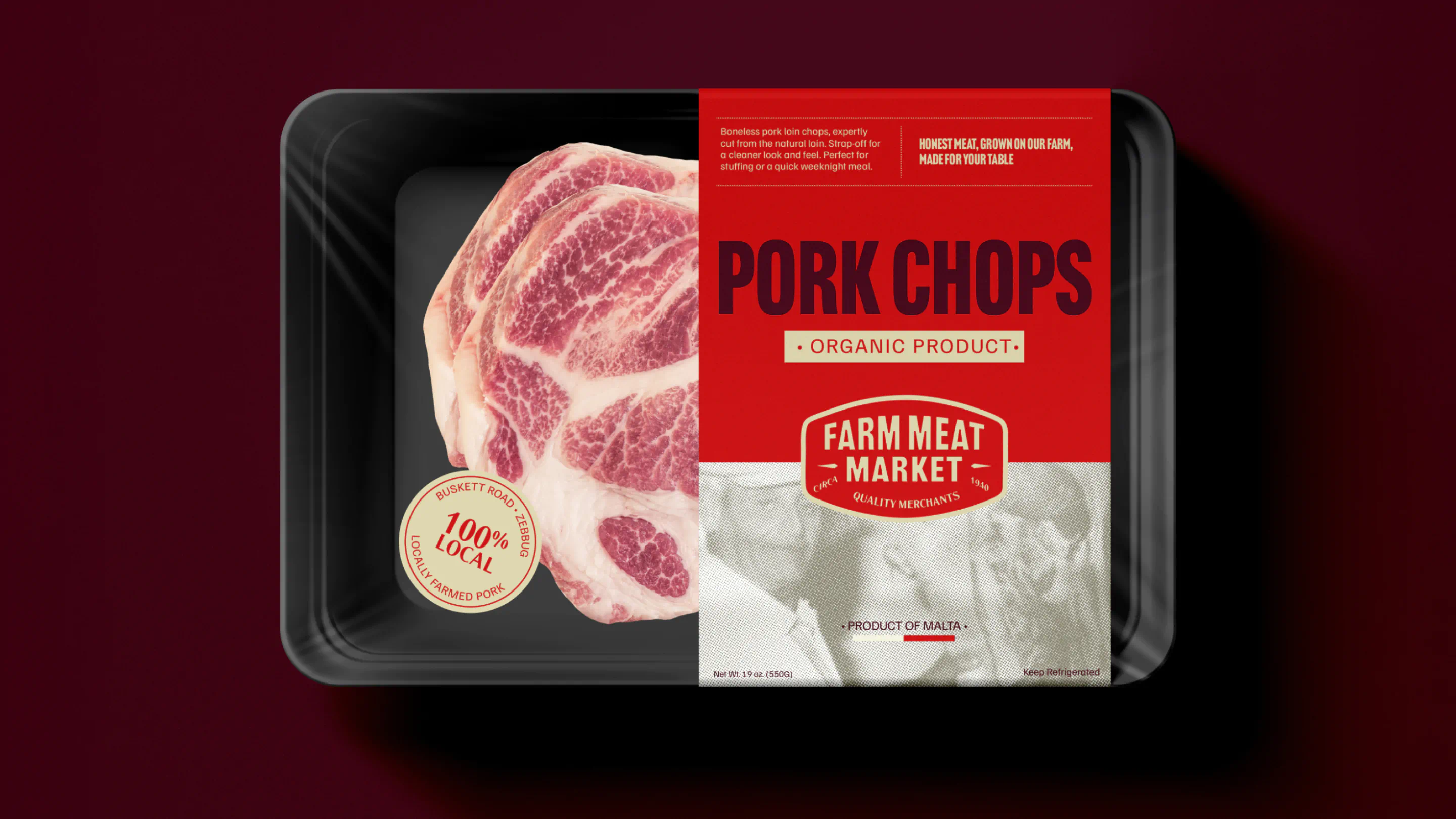
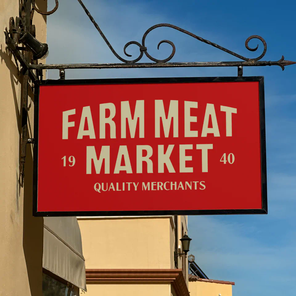
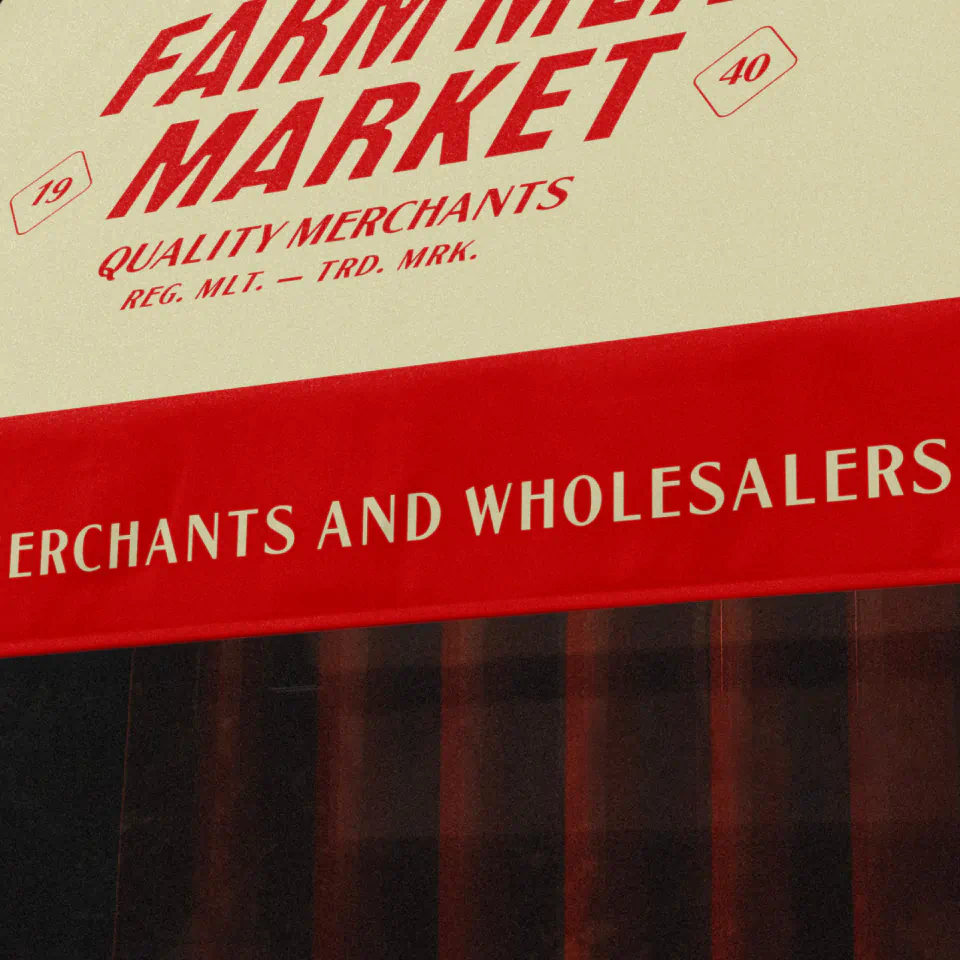
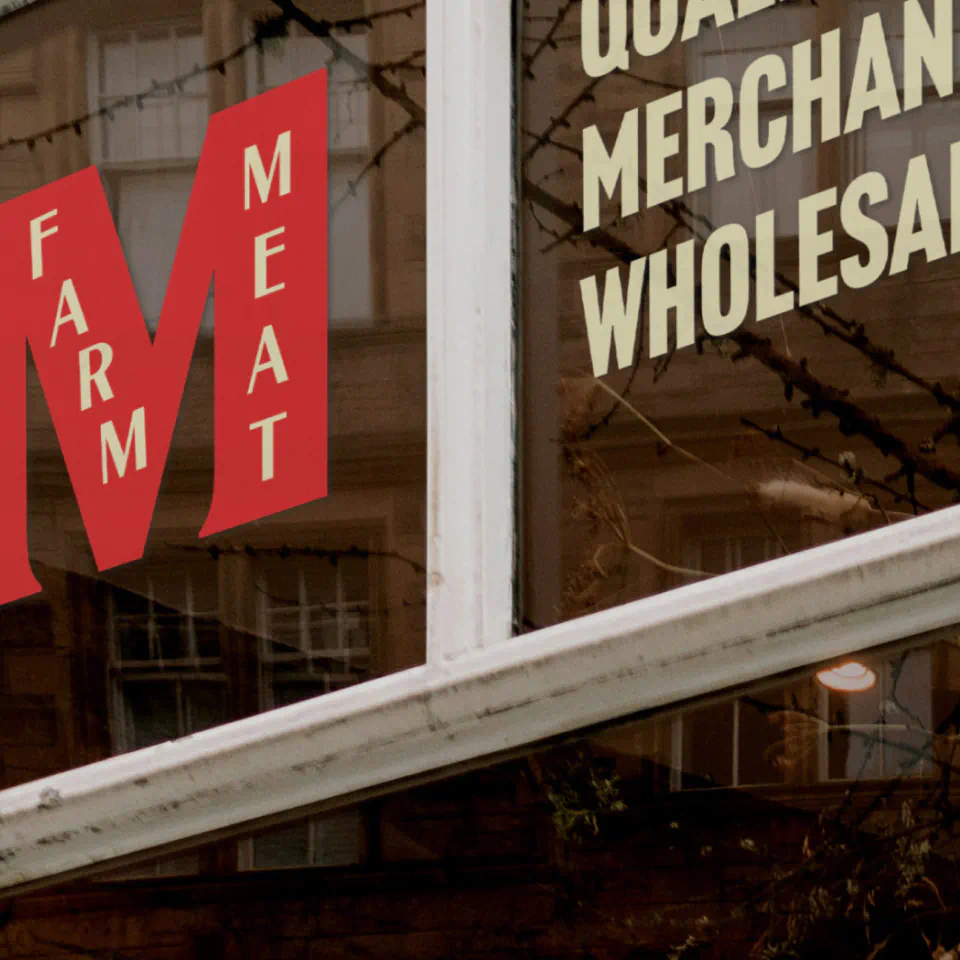
To bring clarity and strength to the brand, we began with a strategic unification of the brand architecture. Previously, Farm to Fork (B2C) and Farm Meat Market (B2B) operated as separate identities, creating confusion and diluting brand equity. We consolidated both under the Farm Meat Market name, supported by the subline “Quality Merchants” – a statement that reinforces both product excellence and long-standing trade expertise across retail and wholesale.
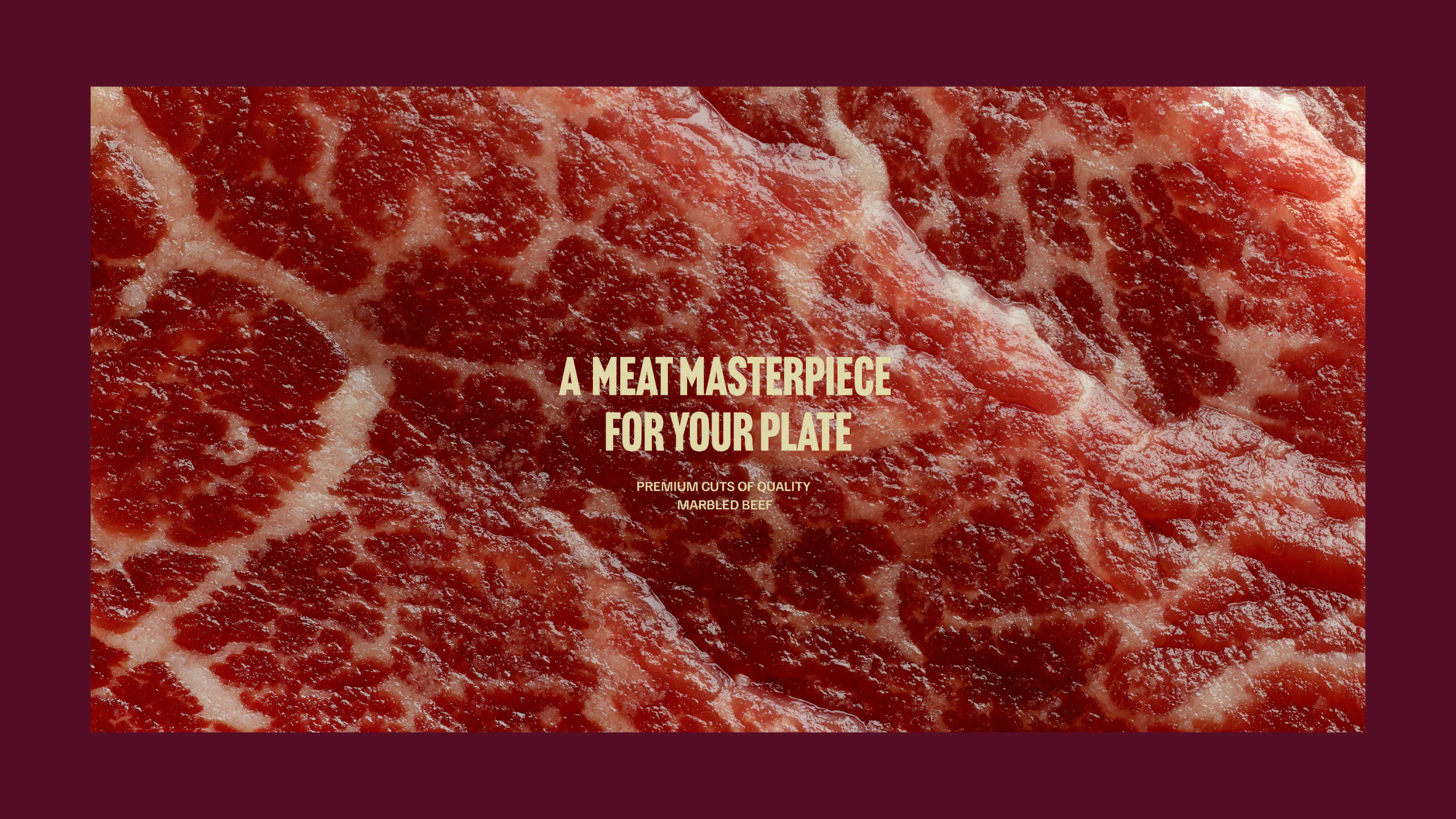
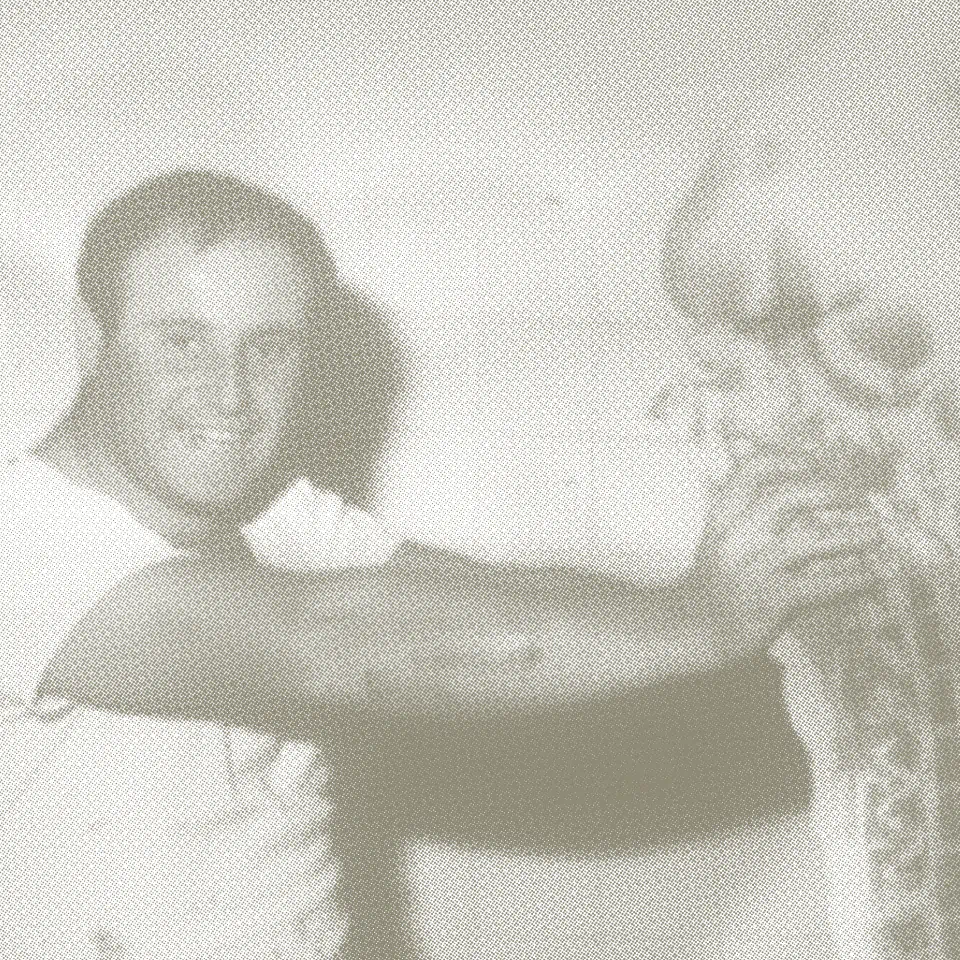
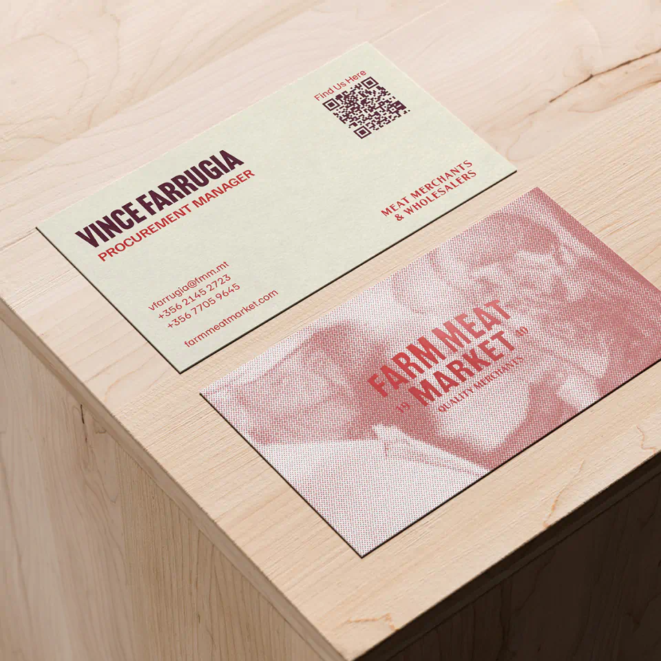
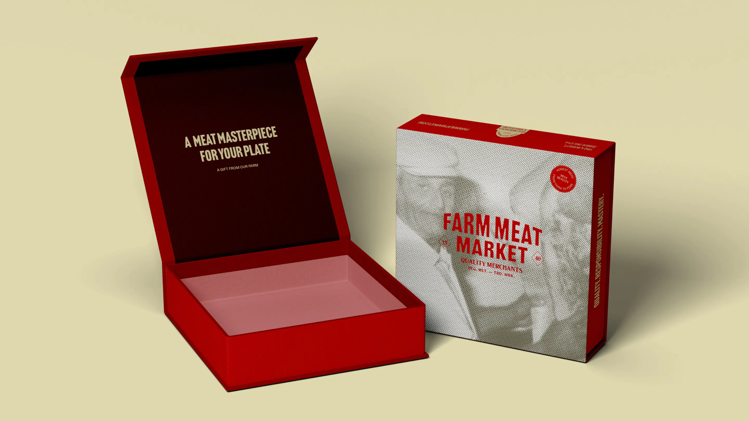
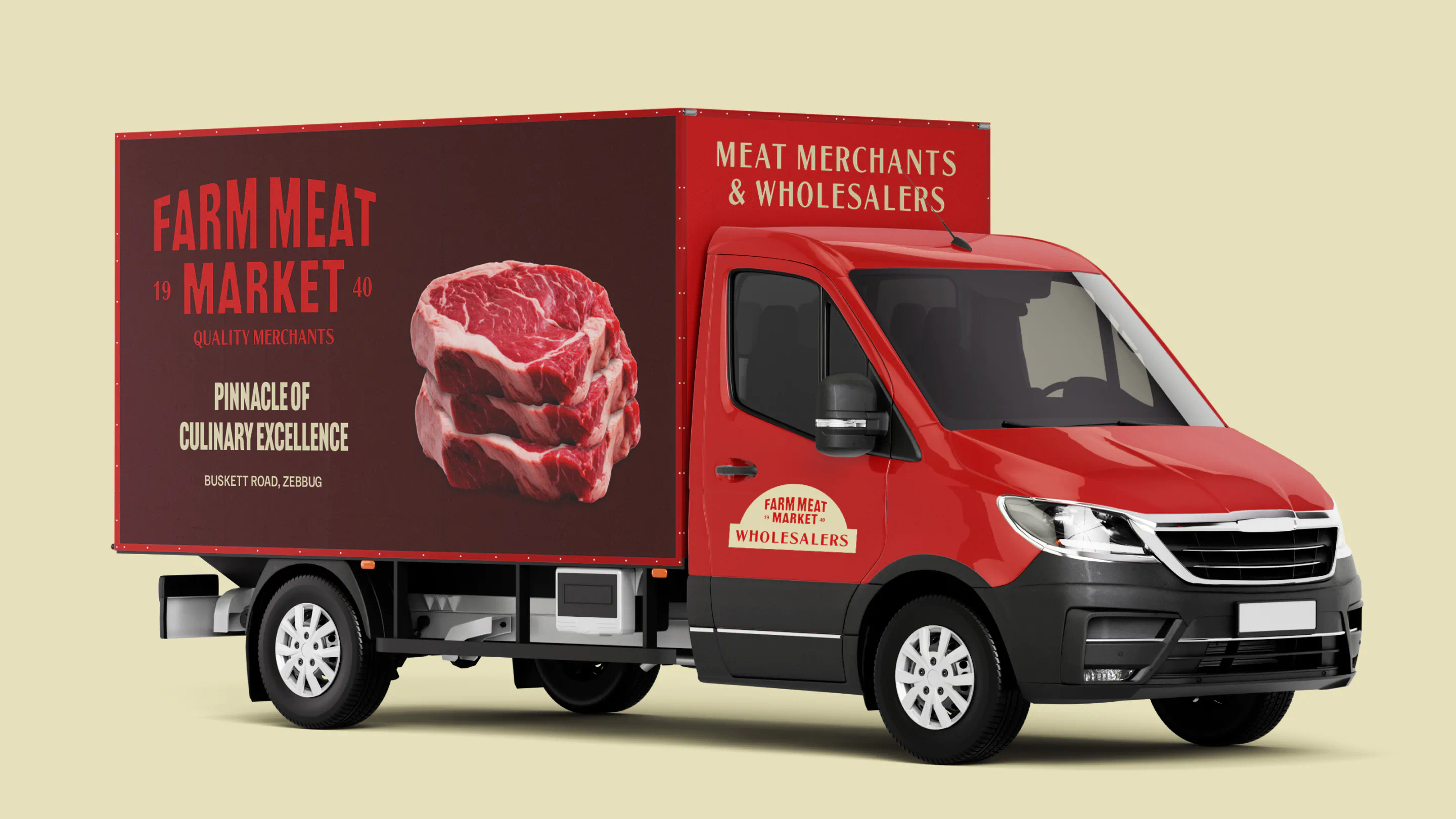
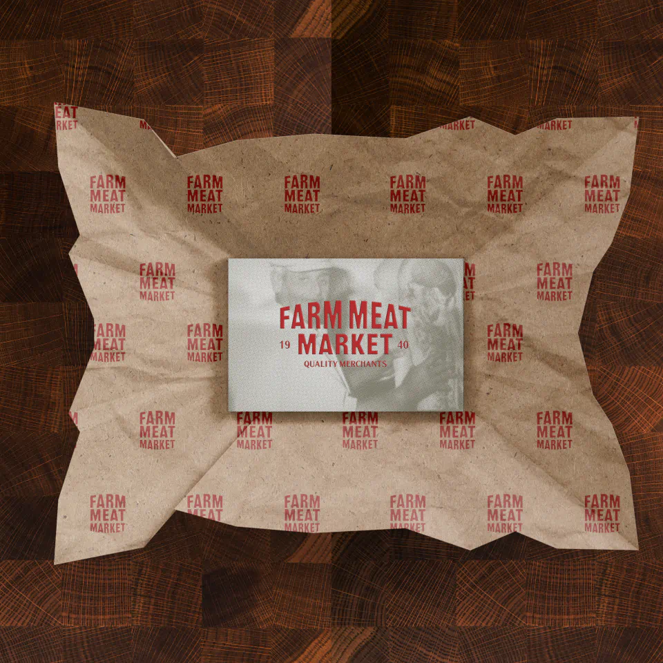
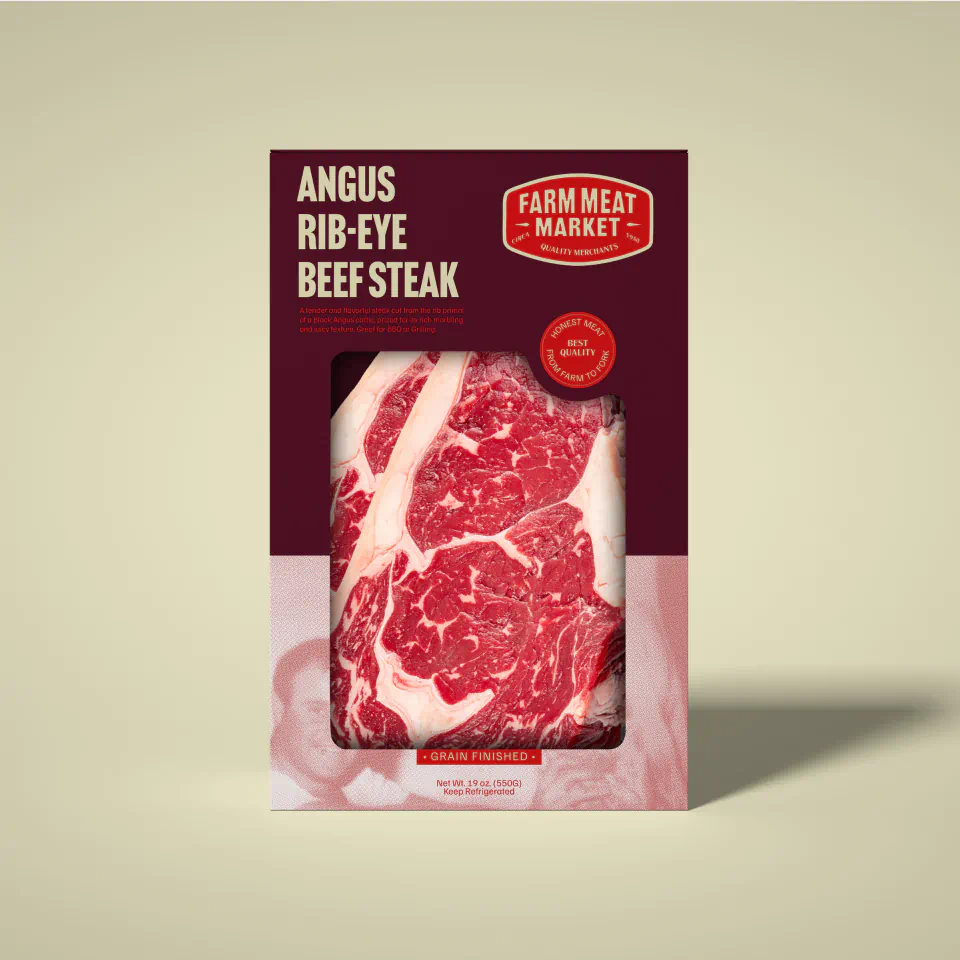
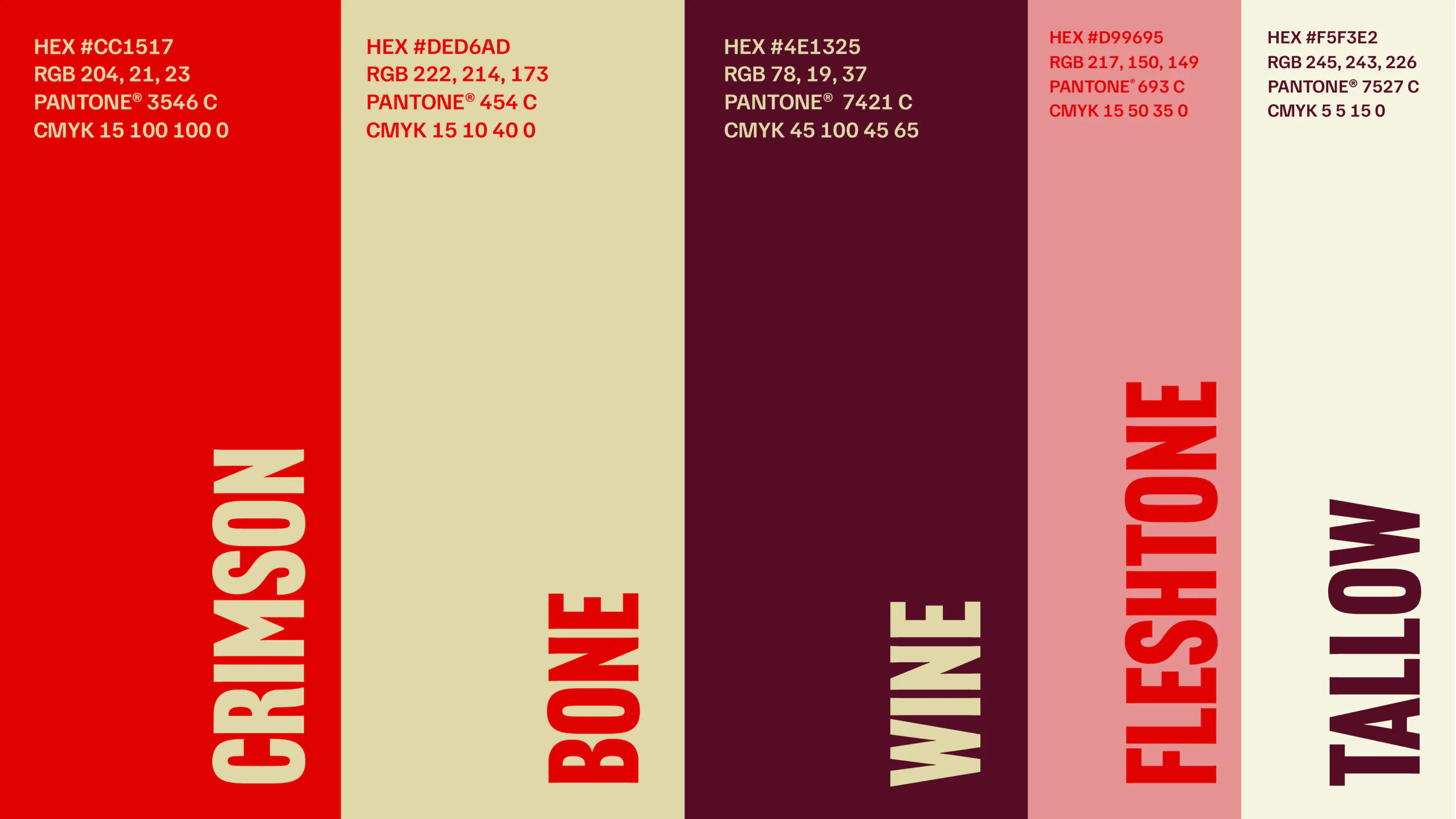
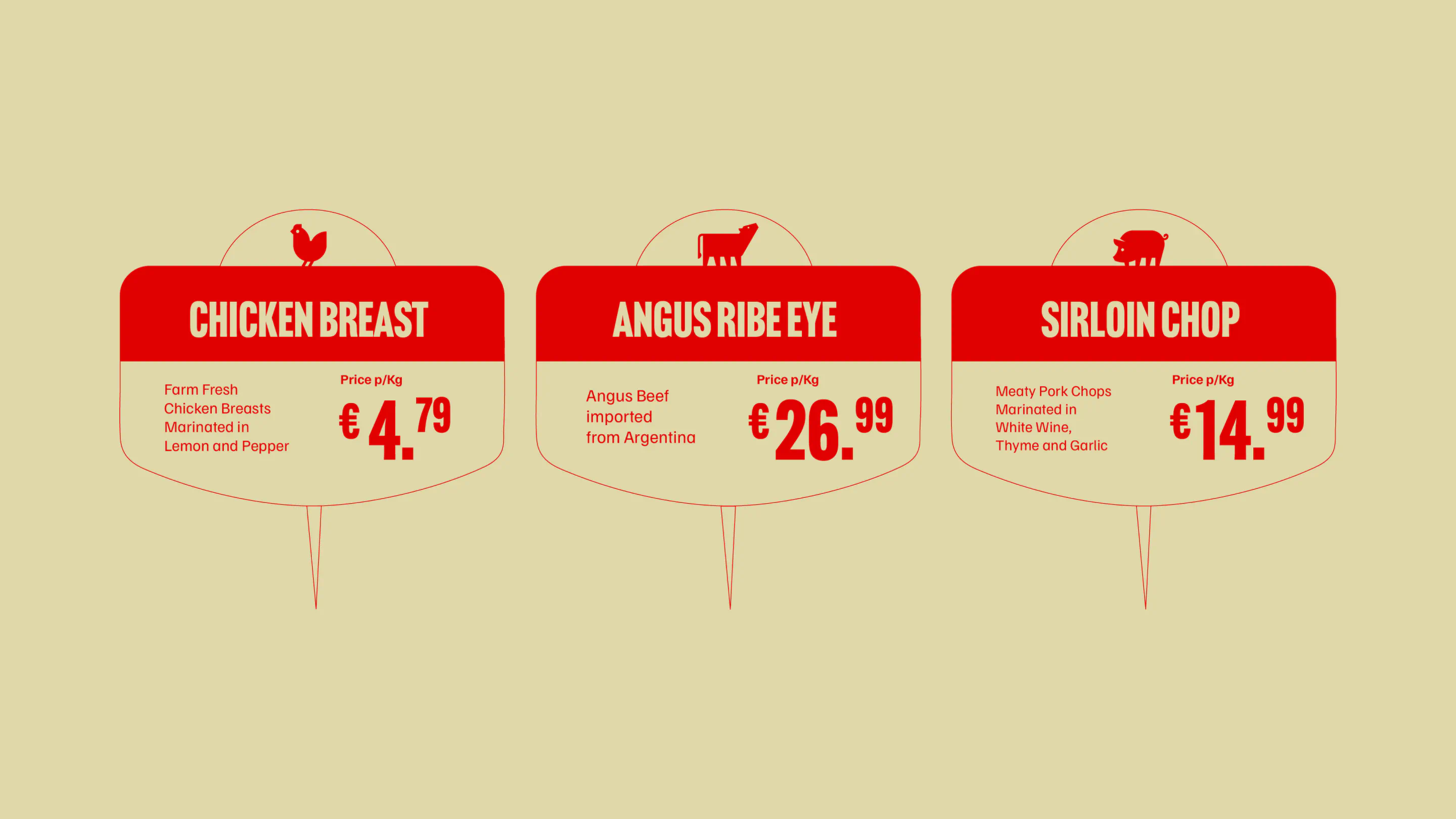
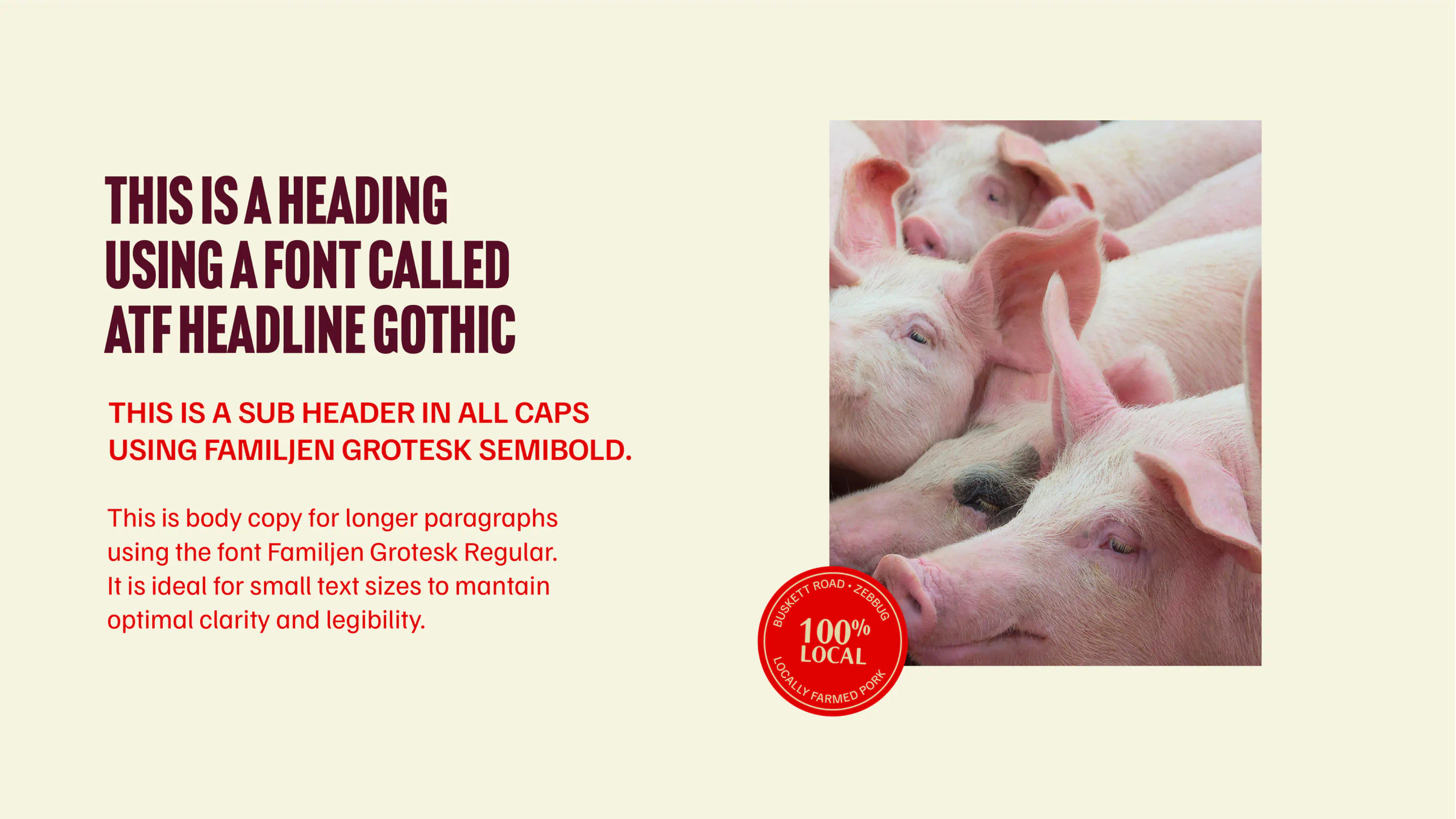
Visually, we leaned into heritage without feeling dated. Original archival photography from the farm’s early years became a key brand asset, reimagined using duotone halftone treatments to create a distinctive, nostalgic yet contemporary aesthetic. The colour palette – Tallow, Bone, Wine, Fleshstone, and Crimson; was carefully developed to reference the meat industry while conveying warmth, appetite appeal, and professionalism.
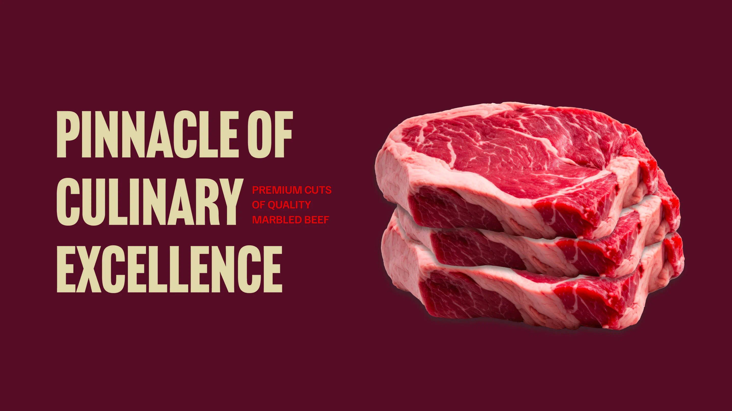
Typography played a central role in striking the balance between tradition and modernity. Bold, confident type choices give the brand presence and clarity, while refined details ensure a premium, considered feel.
The result is a unified brand that wears its history with confidence, clearly positioned to serve both consumers and food service partners with the authority that only decades of experience can deliver.


The results