Attard Bros Group Brand Refresh
Client:
Attard Bros Group
Project Date:
2025
Industry:
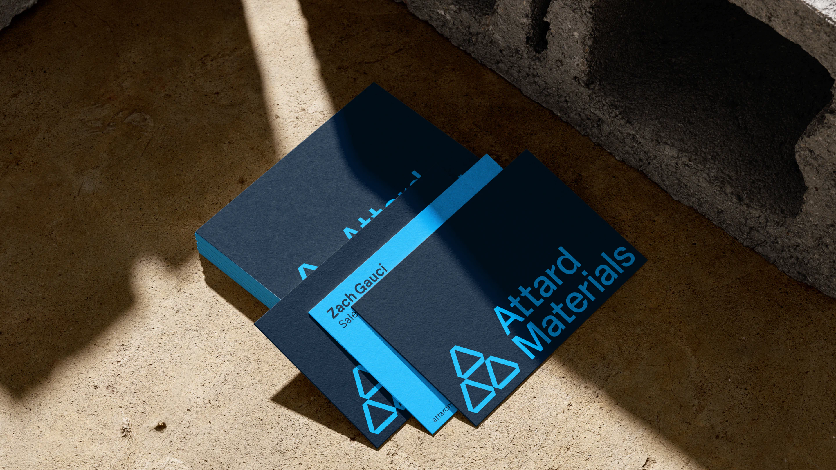
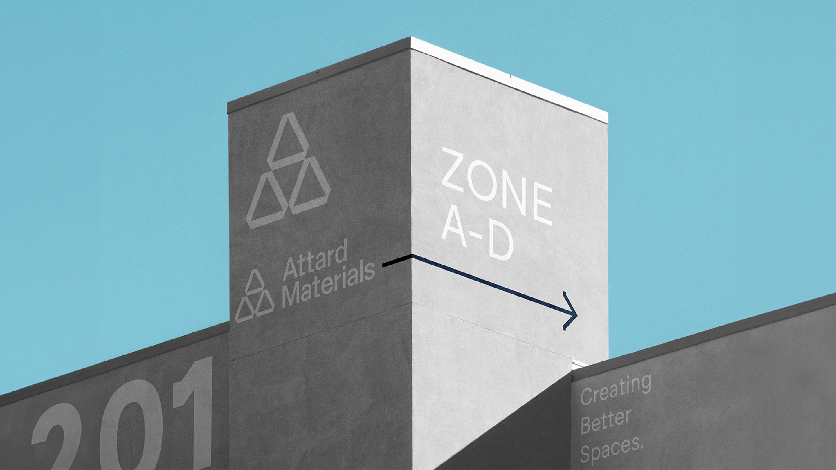
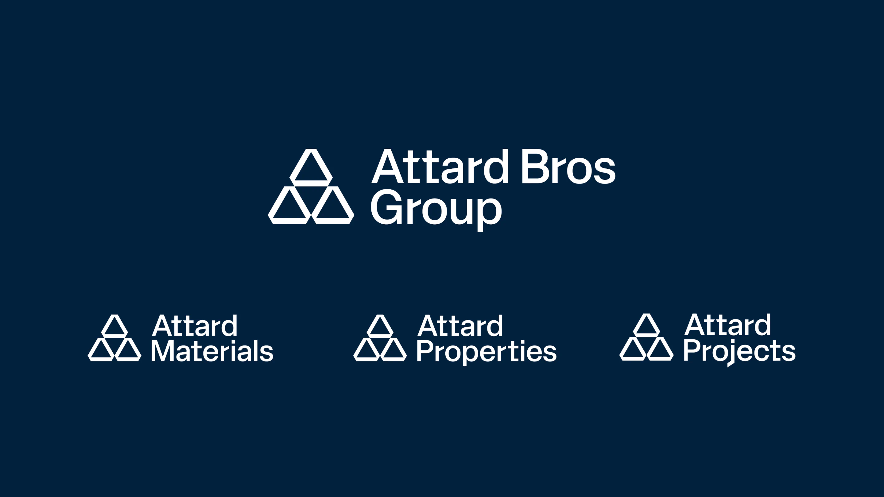
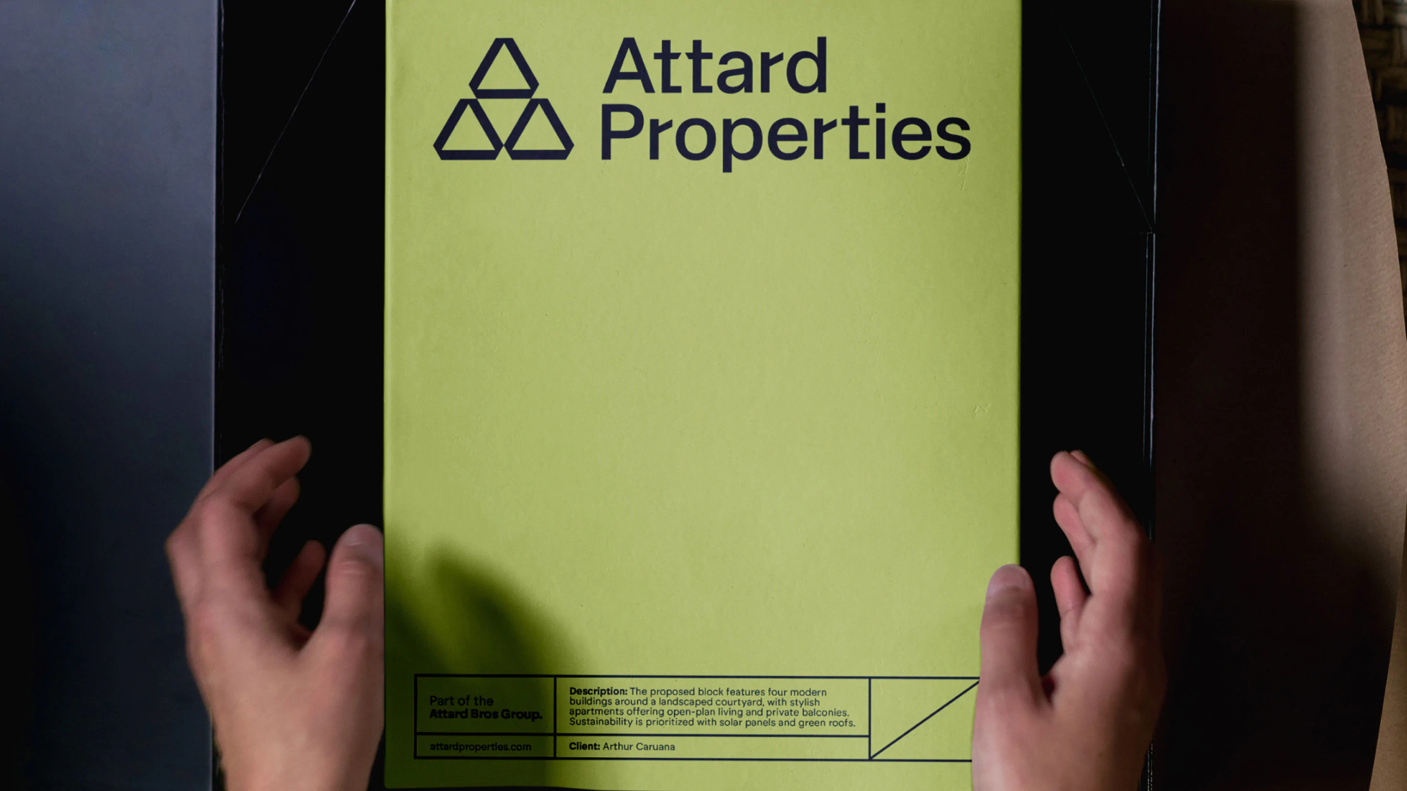
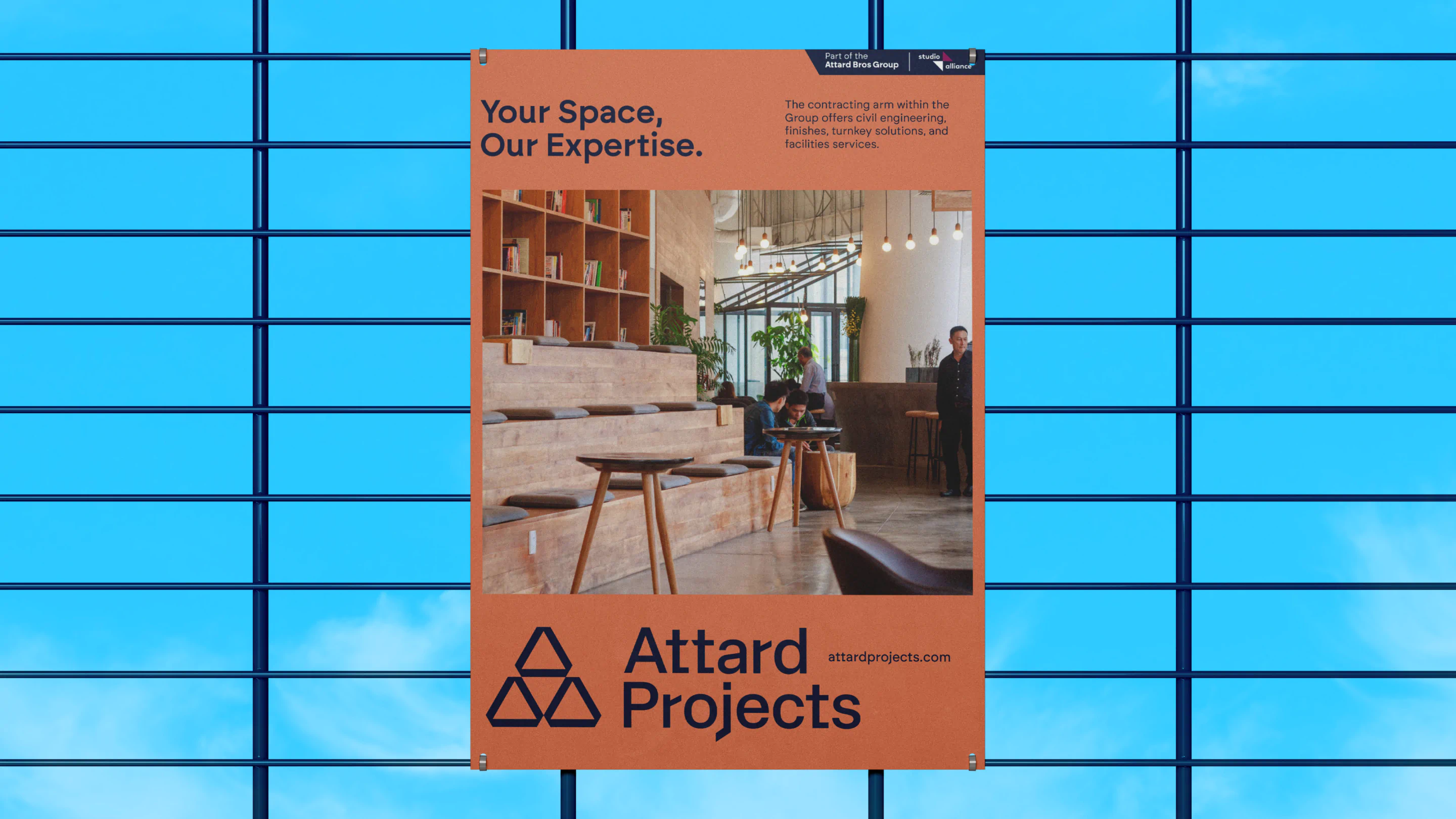
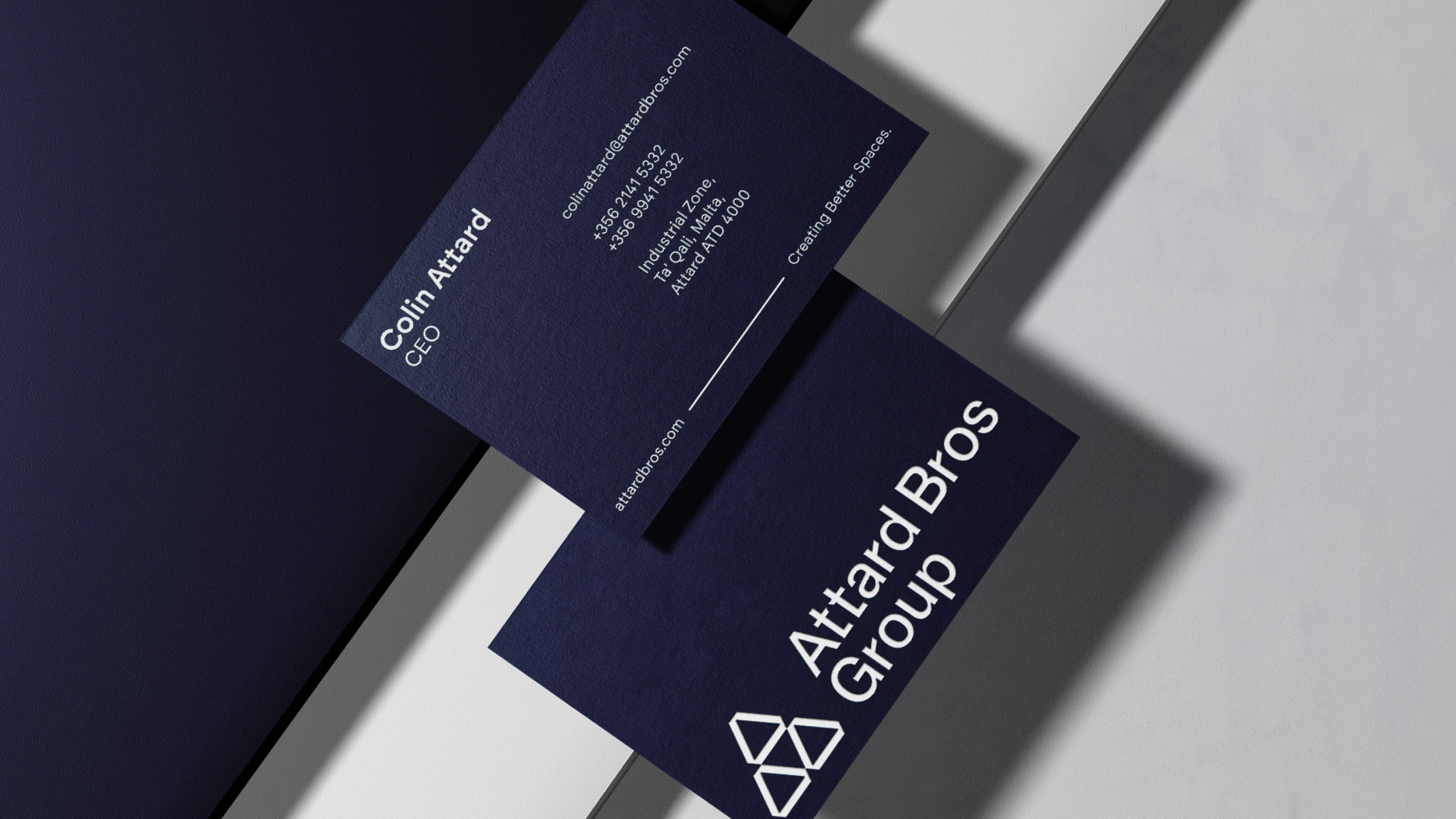
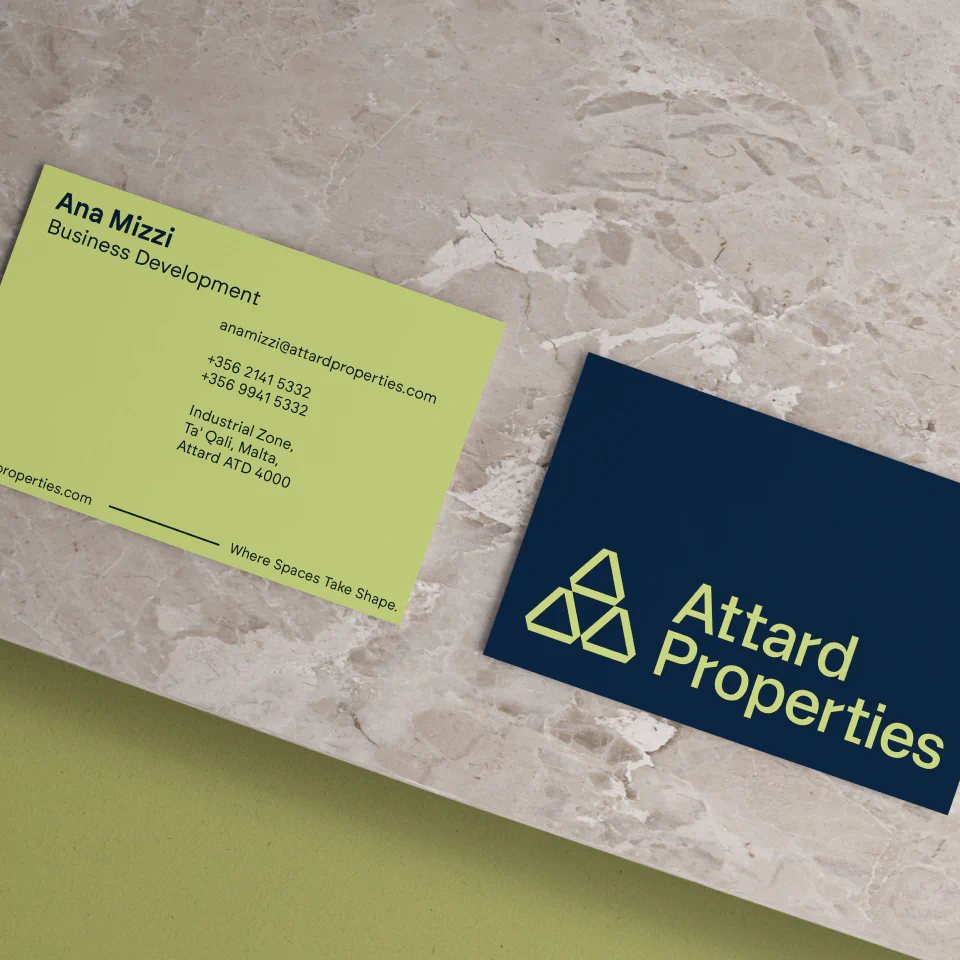
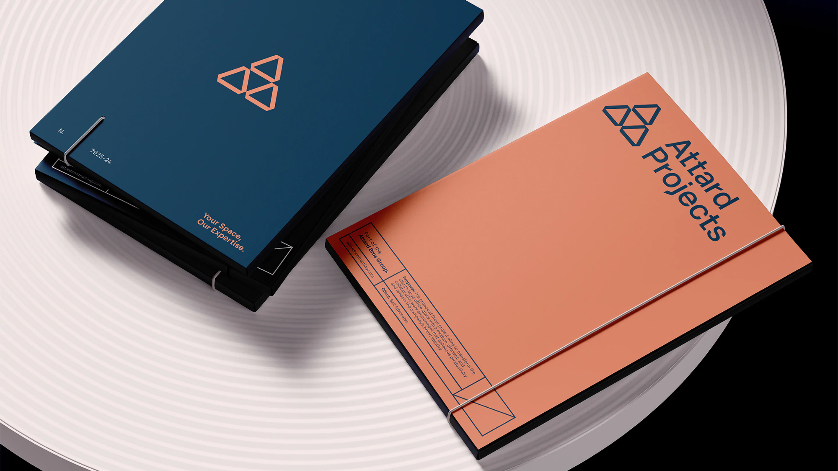
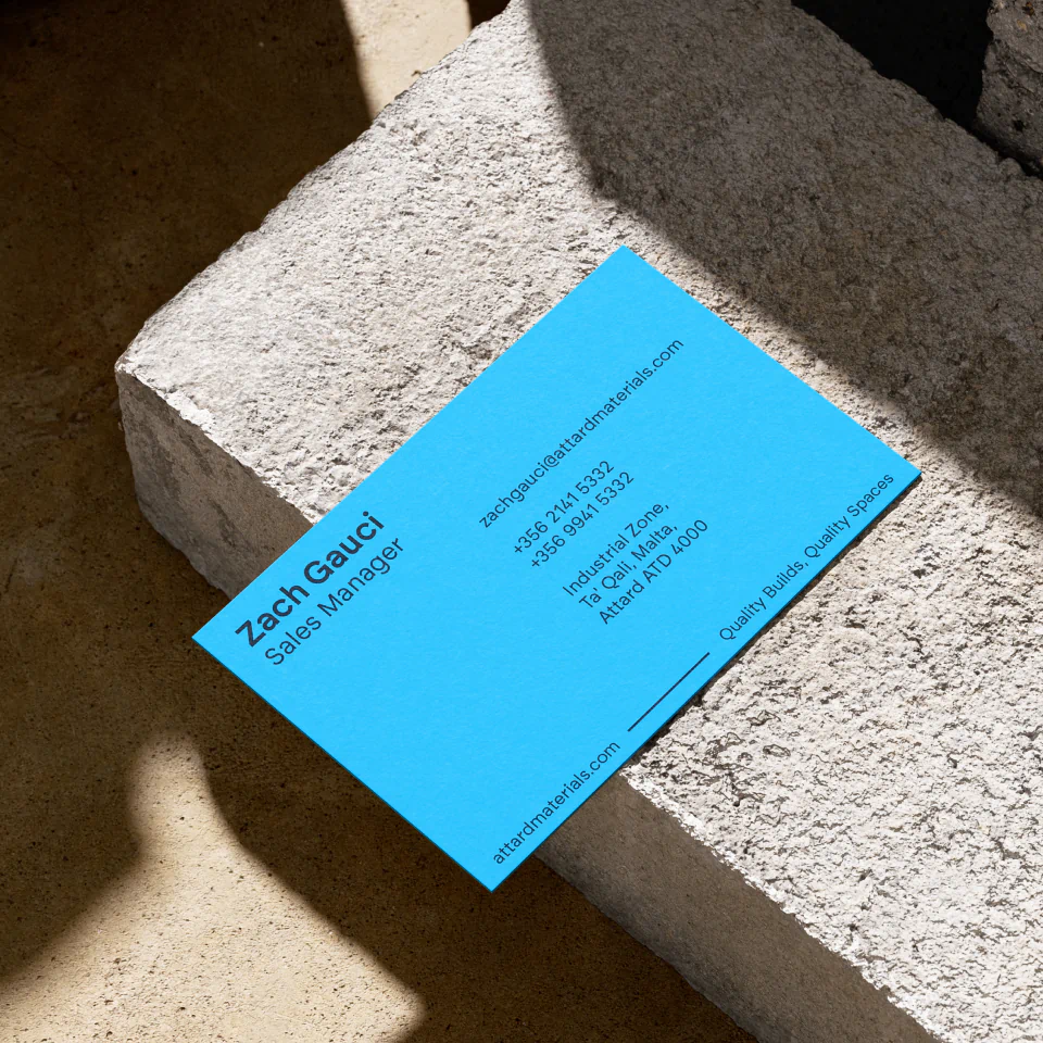
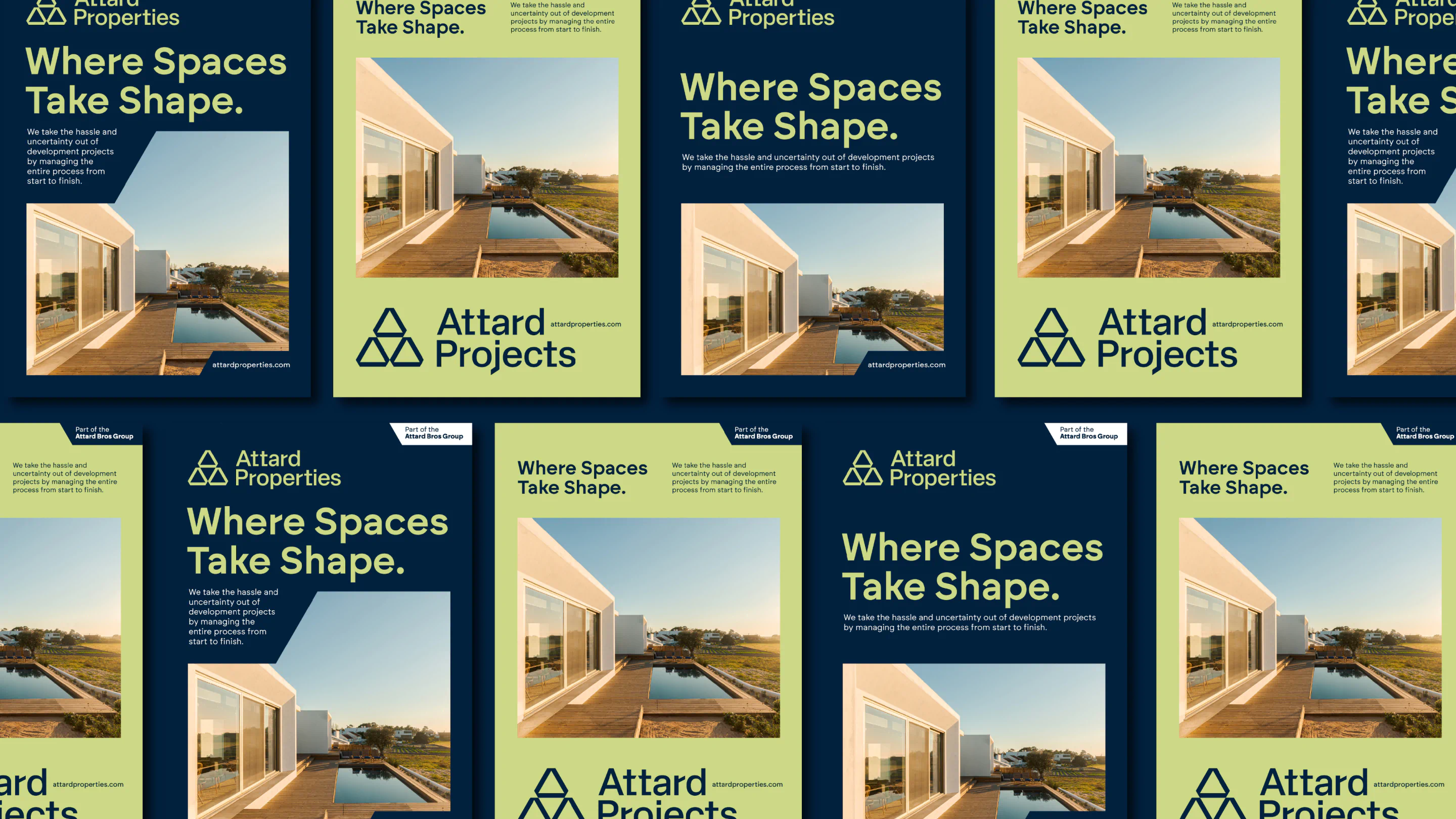
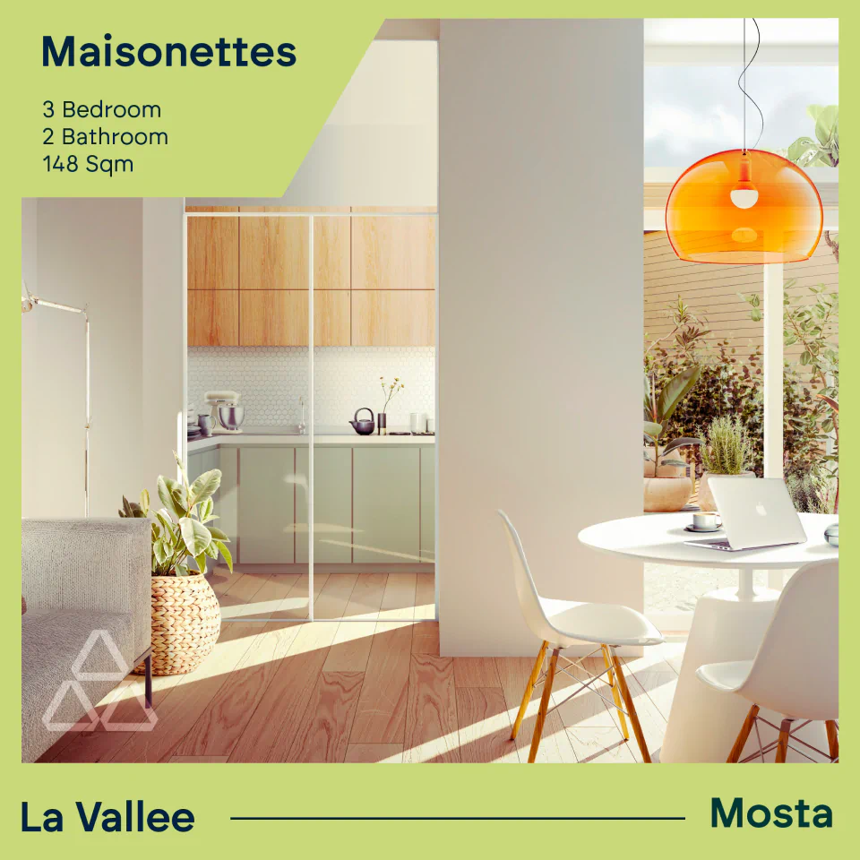
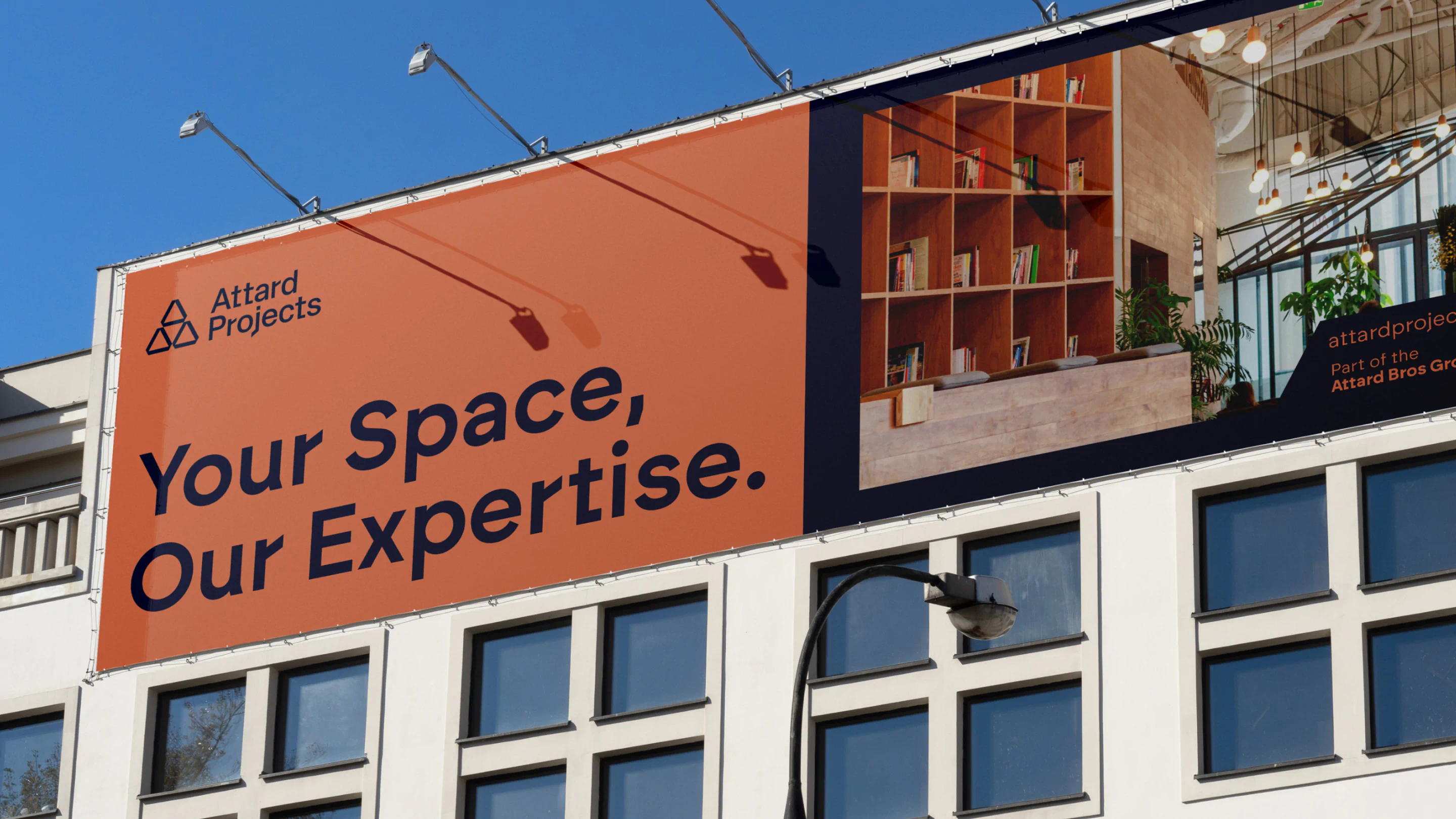
A legacy name refreshed. We created a corporate-ready identity for Attard Bros Group and applied it to its three sub-brands—Attard Materials, Projects, and Properties. Each sub-brand retains its individuality while clearly connecting back to the Group, underpinned by a consistent colour and typography system designed to last.
The Brief
Refresh the Attard Bros Group identity and create a unified branding system across its subsidiaries: Attard Materials, Attard Projects, and Attard Properties. The parent brand needed to project strength, heritage and professionalism—built to sit proudly in Malta’s most established boardrooms—while each sub-brand had to remain distinctive yet clearly connected to the group.
The Work
With decades of industry presence, Attard Bros Group stands as a legacy name in Malta’s construction and development sector. Our challenge was to craft an identity that honoured this deep-rooted reputation while steering the brand confidently into the future.
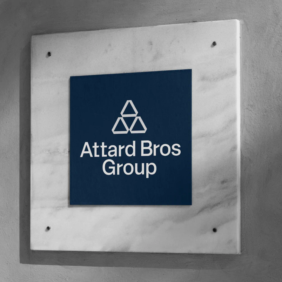
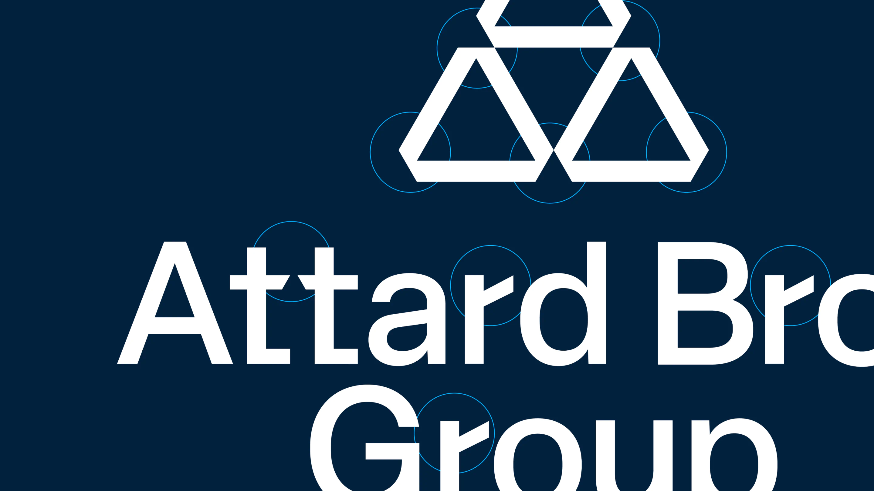
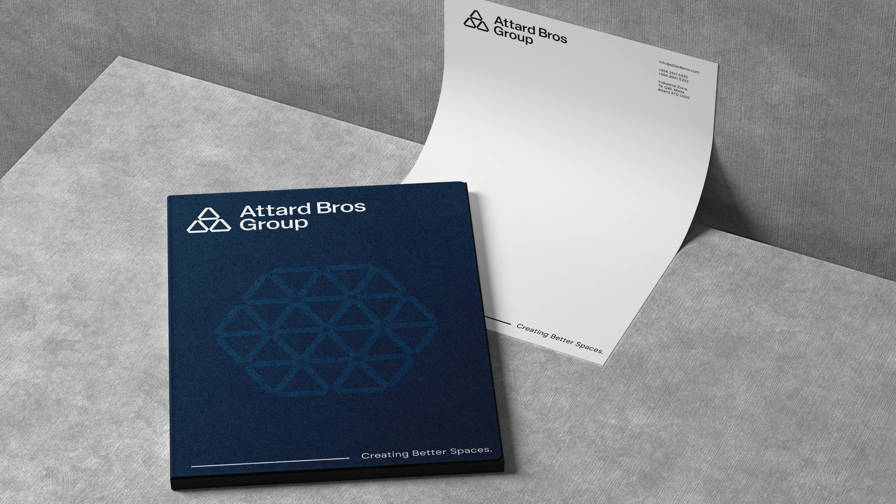
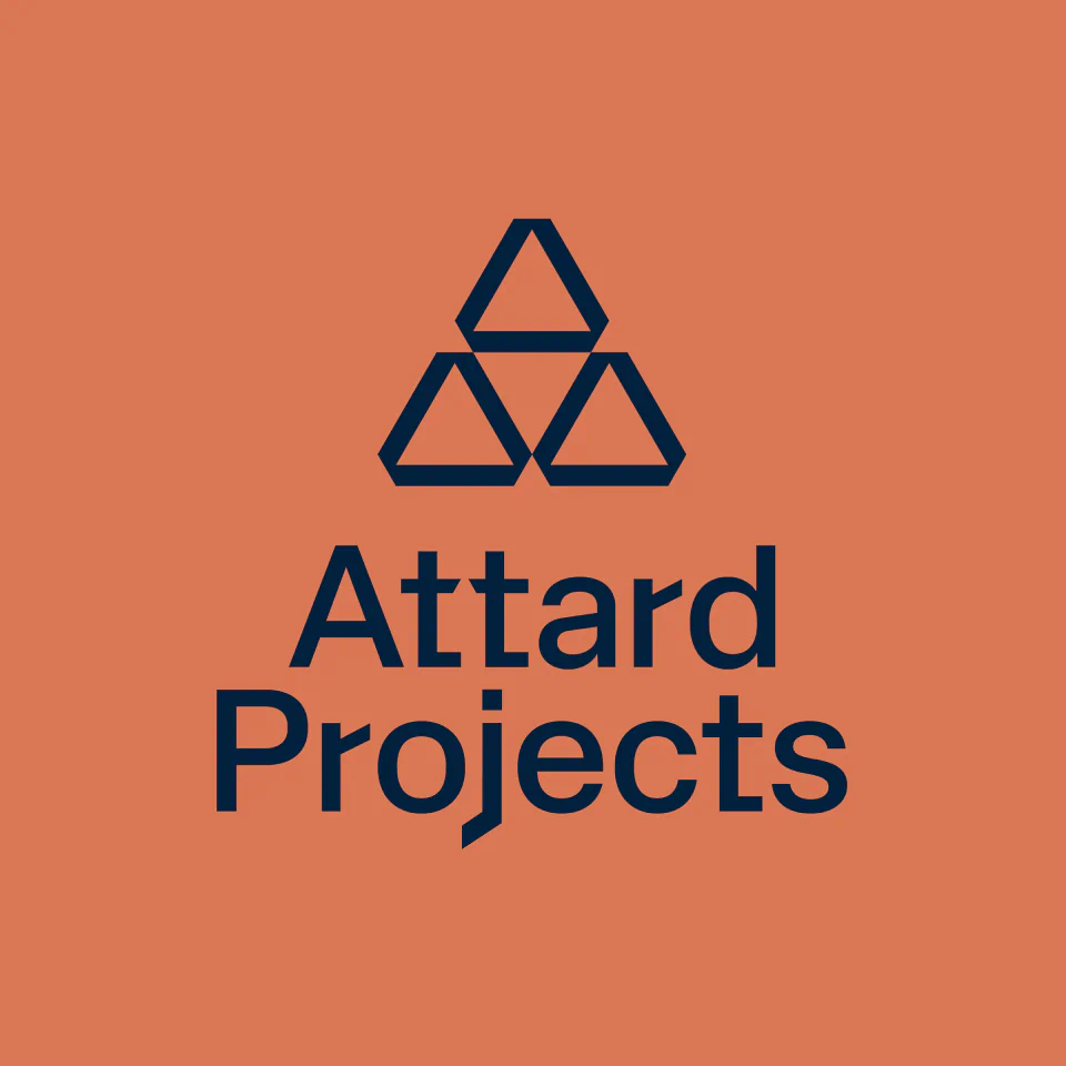
We began by evolving the core brand identity of Attard Bros Group. The existing triangular logo, though iconic, felt restrictive in application. Our design solution was to open up the shape—introducing a modern, geometric evolution that retained familiarity while allowing for greater layout flexibility across touchpoints.
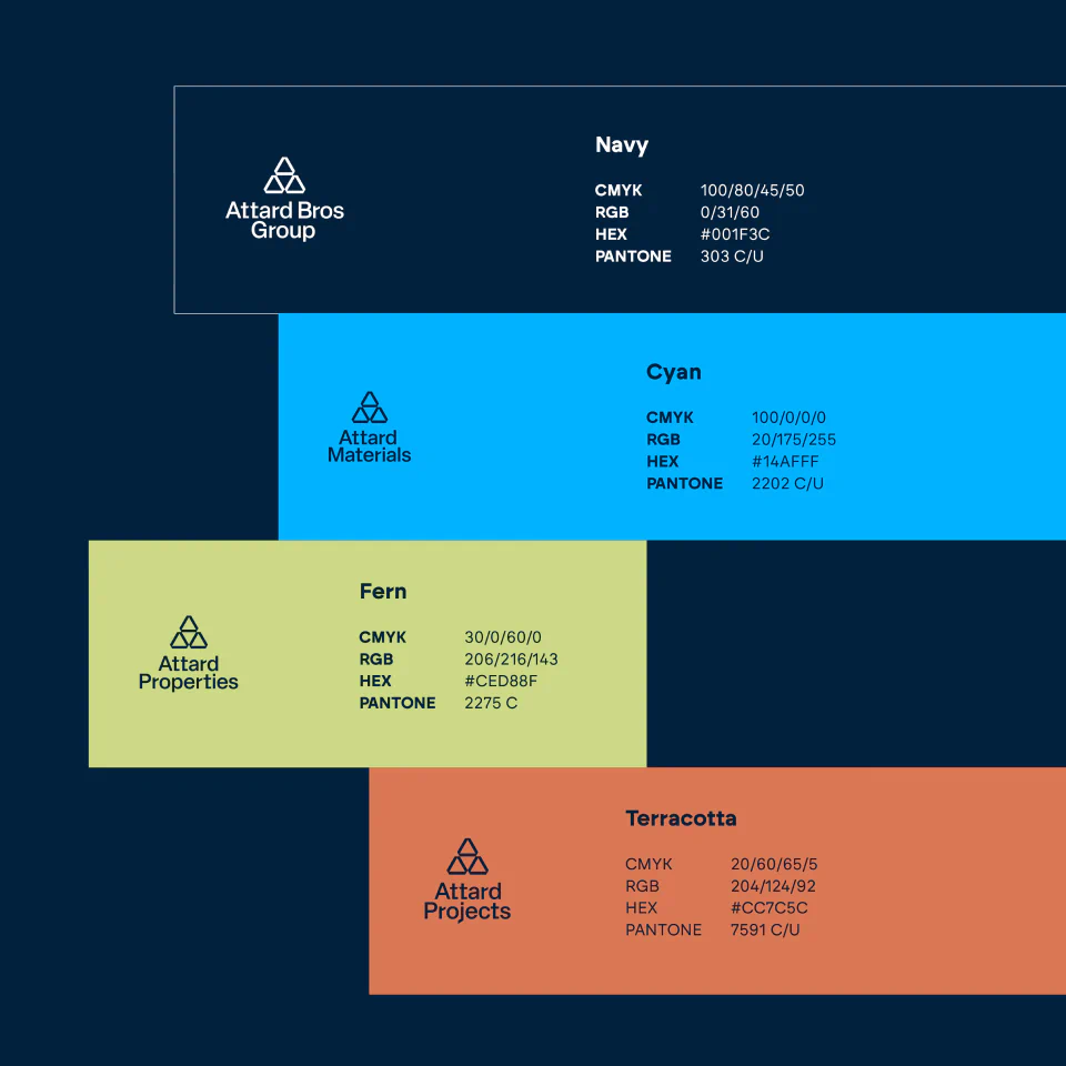
Visually, we introduced a deep navy as the main brand colour—projecting confidence, reliability and trust. This core colour would then bleed into each sub-brand, anchoring them to the group while allowing for the use of a distinct, complementary colour to define each entity. The result is a coherent system with room for individuality.
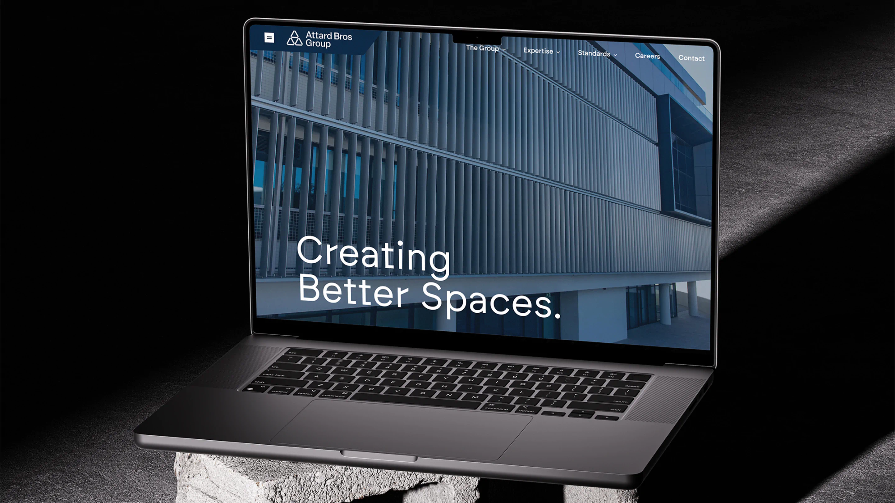
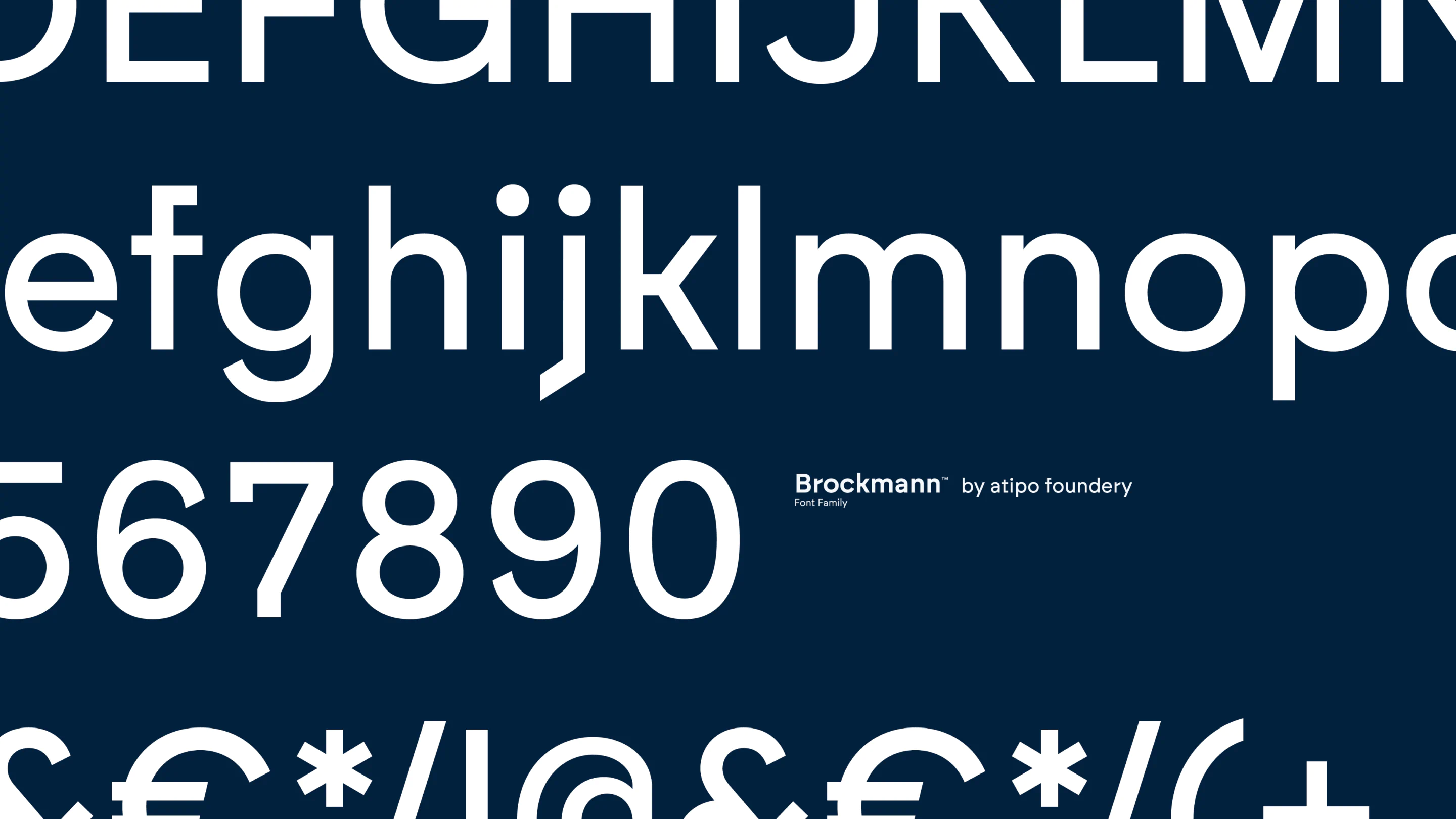
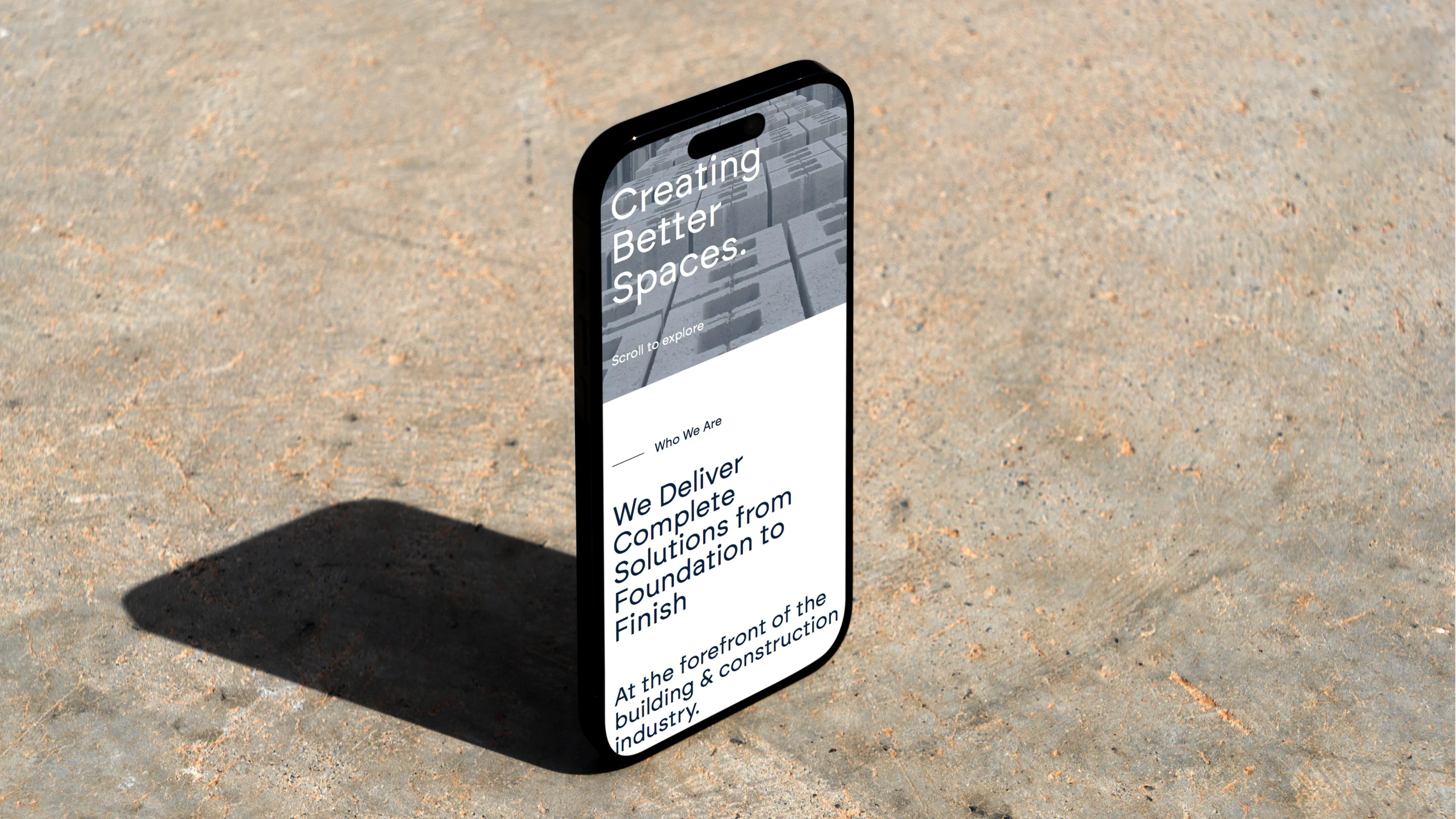
For typography, we selected a geometric sans serif—a modern, structured typeface that communicates professionalism and precision. It’s clean, legible and strong enough to stand tall on everything from signage to digital platforms.
Each sub-brand was carefully crafted with its target audience in mind. Attard Materials, in particular, required a powerful and grounded presence—positioned to resonate with builders, contractors and workmen alike. The visual identity we created for it is simple yet assertive, reflecting the practical, reliable nature of the brand.
Ultimately, the new identity system builds on the Group’s core values—quality, reliability, trust, and integrity. This is a brand designed to lead today and endure for years to come.






The results