A New Brand Identity for Swivel
Client:
Swivel
Project Date:
2026
Industry:

Swivel was evolving from a B2C-focused operator into a B2B technology provider for emerging gaming verticals. We created a sharper, more authoritative identity designed to communicate innovation, reliability and ambition, giving the brand a visual system built for enterprise audiences and global growth.
The Brief
Reposition Swivel from a B2C-focused operator into a leading B2B technology provider for emerging gaming verticals. Our goal was to translate the brand’s track record in performance into a professional, authoritative identity that could resonate with enterprise stakeholders, communicate technical reliability and position Swivel confidently for growth in high-potential markets.
The Work
Swivel was evolving, but its identity hadn’t caught up. The existing brand had been shaped around a more playful, B2C-facing world, which no longer reflected the company Swivel was becoming: a B2B iGaming platform provider with ambitions to lead through technology, innovation and emerging gaming verticals.
We needed to make that shift visible. The new identity had to feel cutting-edge without becoming cold, professional without becoming predictable, and confident enough to position Swivel as a technology authority that enterprise partners could trust.
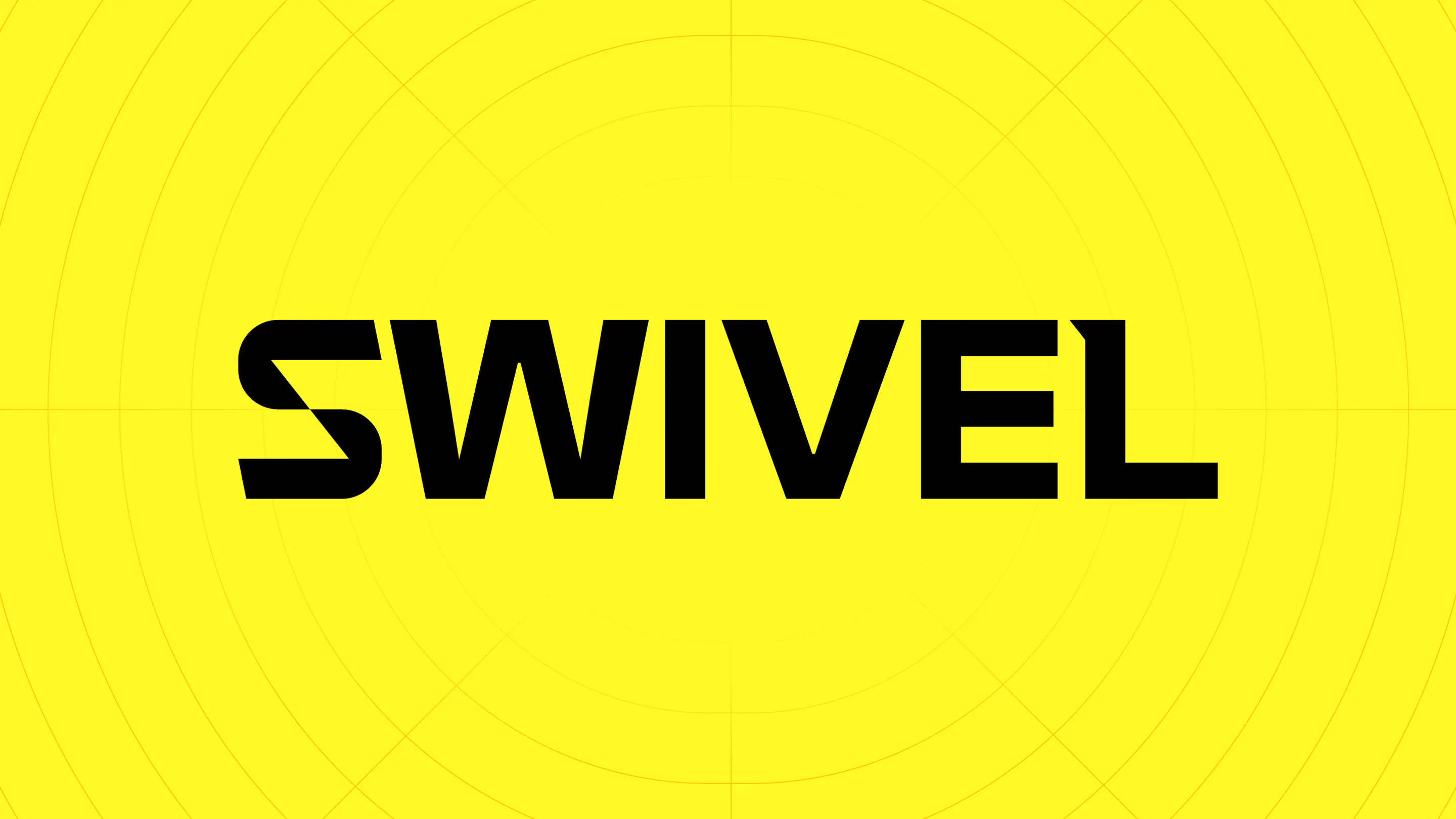
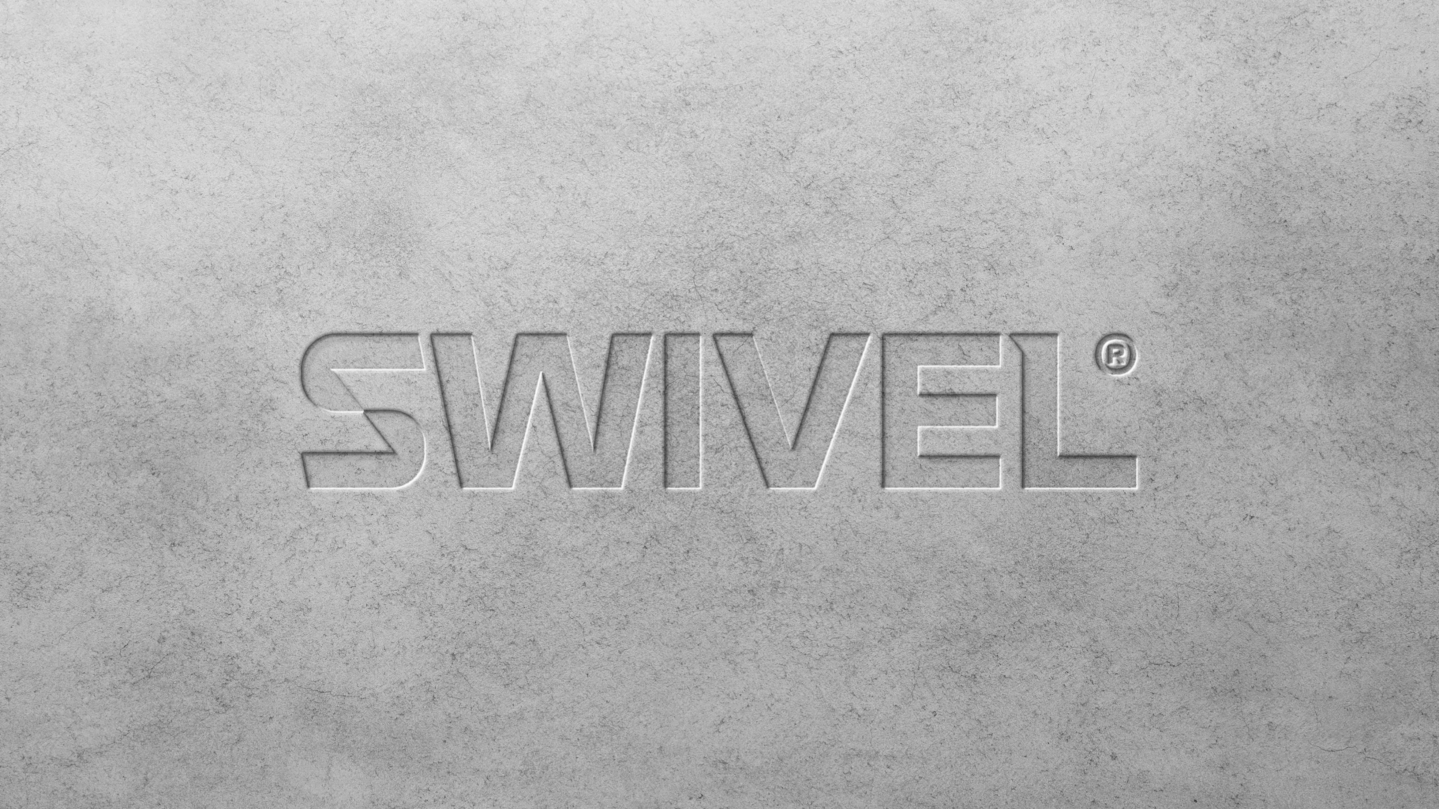
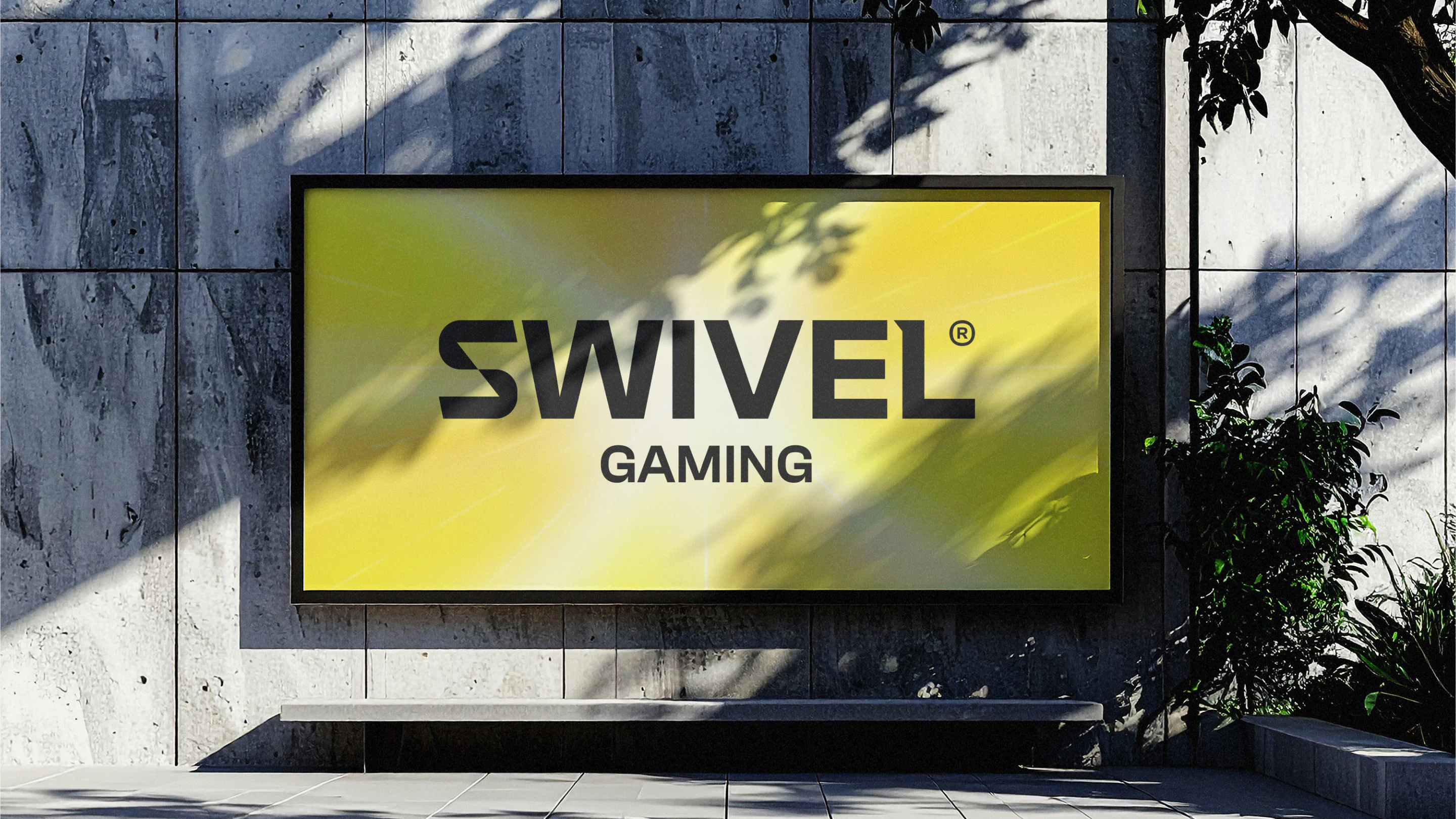
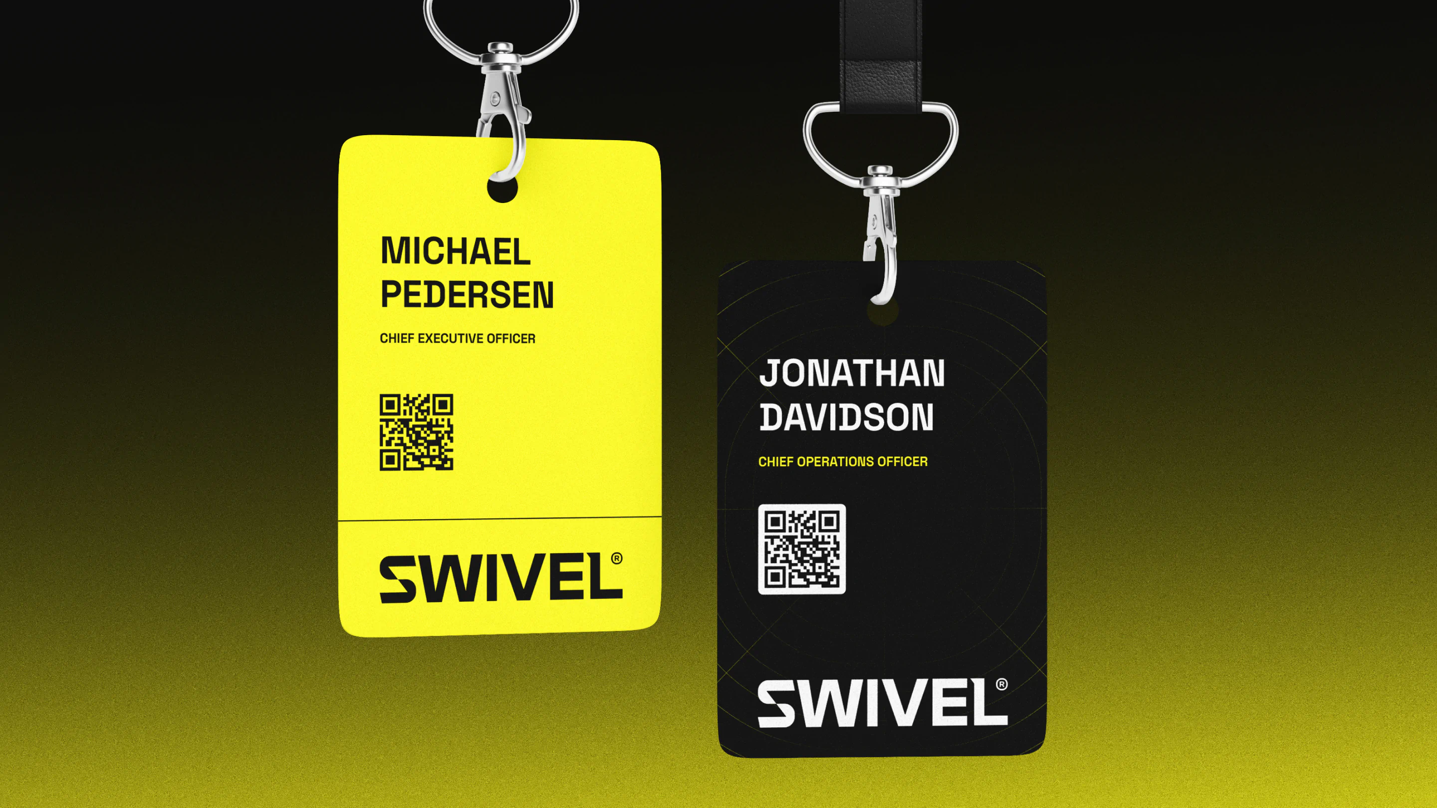
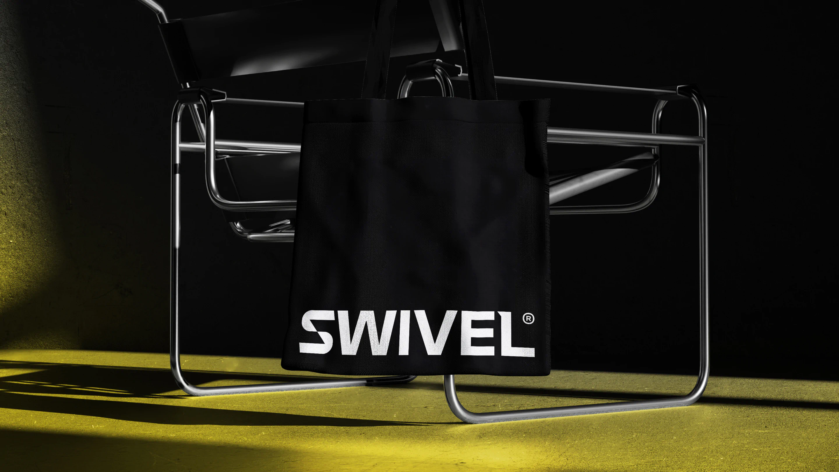
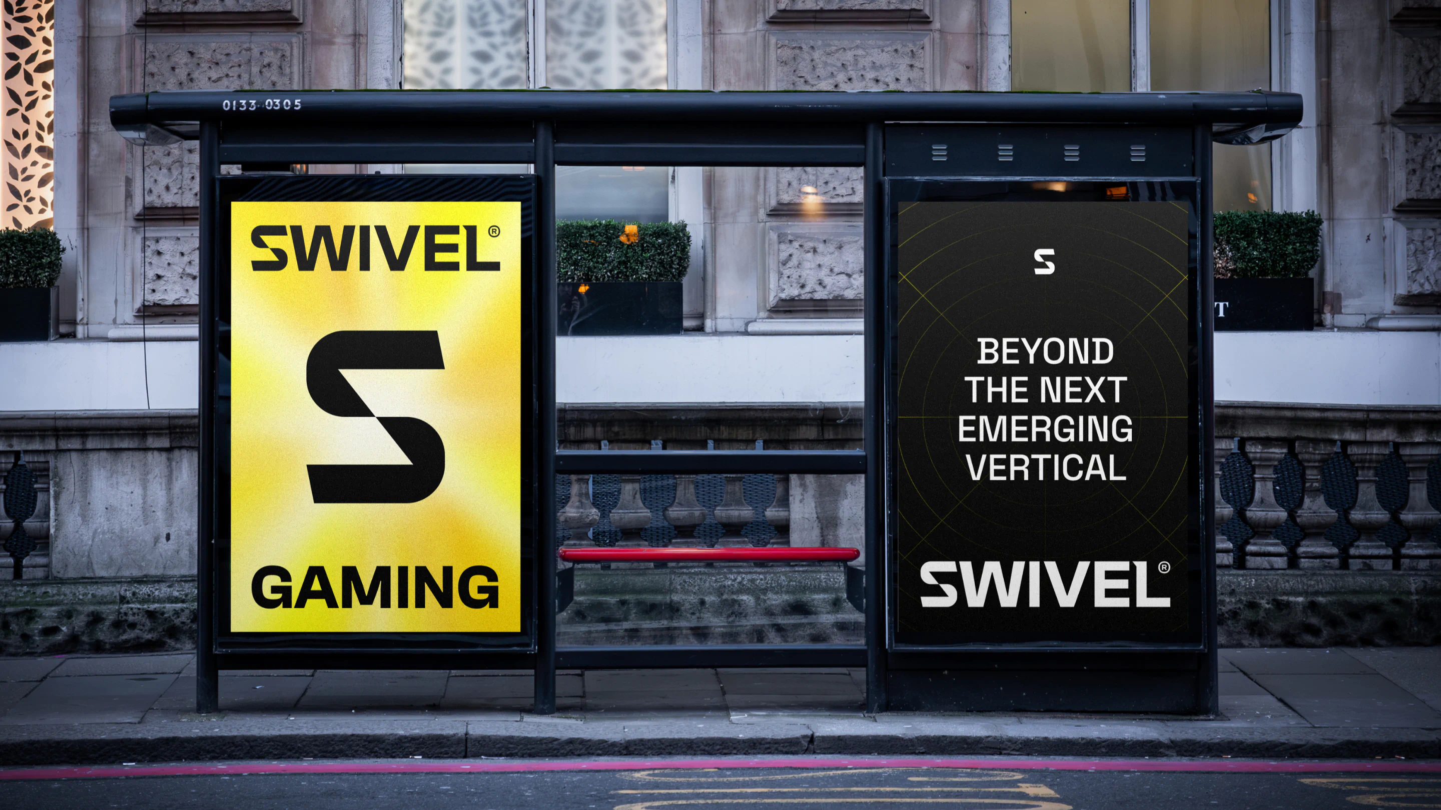
We began by moving away from the softer, more gamified aesthetic and introducing a much sharper visual language. At the centre of the identity is a clean, crisp wordmark defined by purposeful cuts and angles. These details give the brand a sense of precision and forward motion, reflecting the technical thinking and progressive mindset behind the business.
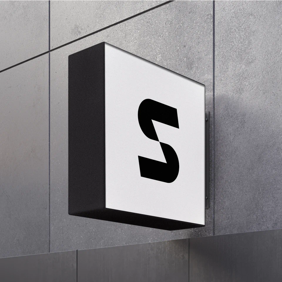
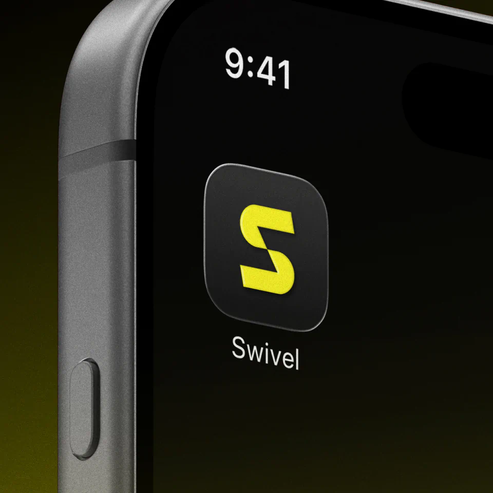
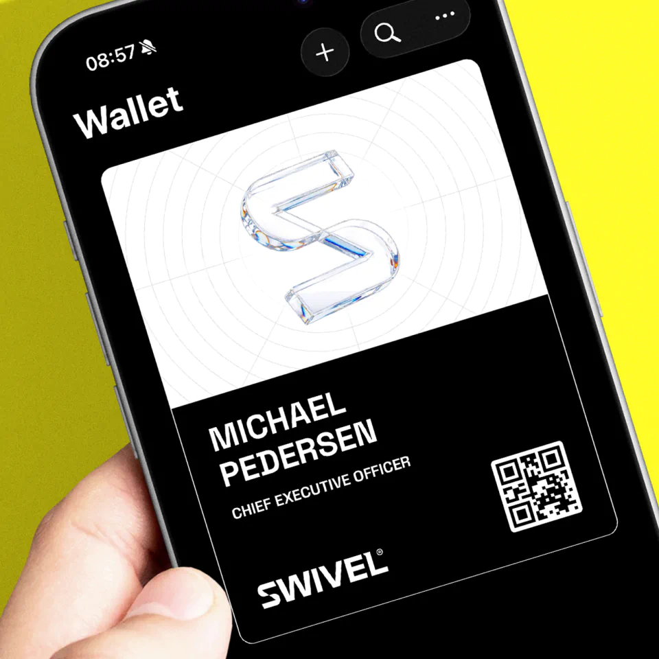
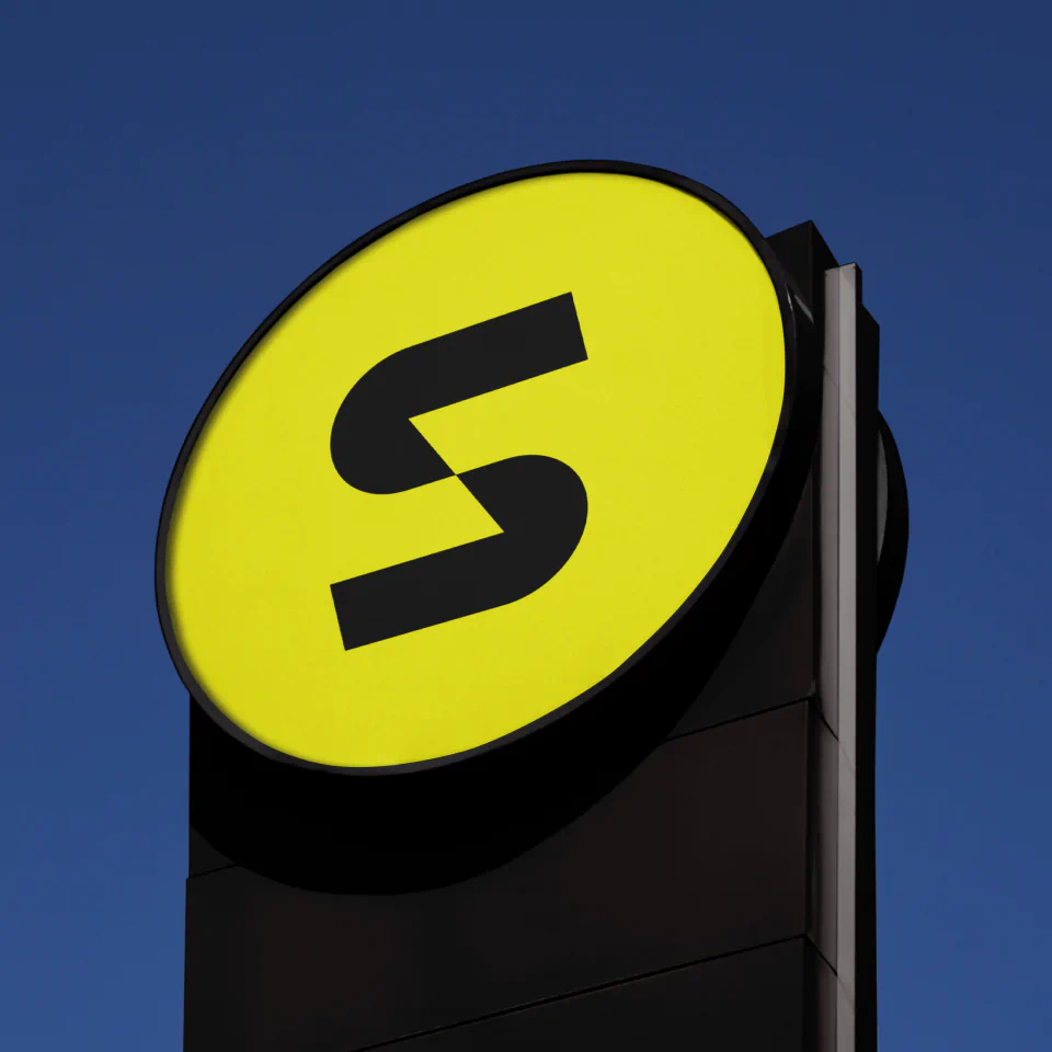
From the wordmark, we developed a standalone icon using the customised ‘S’. Its mirrored cuts across the upper and lower forms create a distinctive, ownable mark that can work across digital environments at different scales. We also brought the idea of movement into the logo animation, using a swivelling, pivoting motion to give the brand name a visual expression and reinforce its ability to adapt, evolve and open new directions.
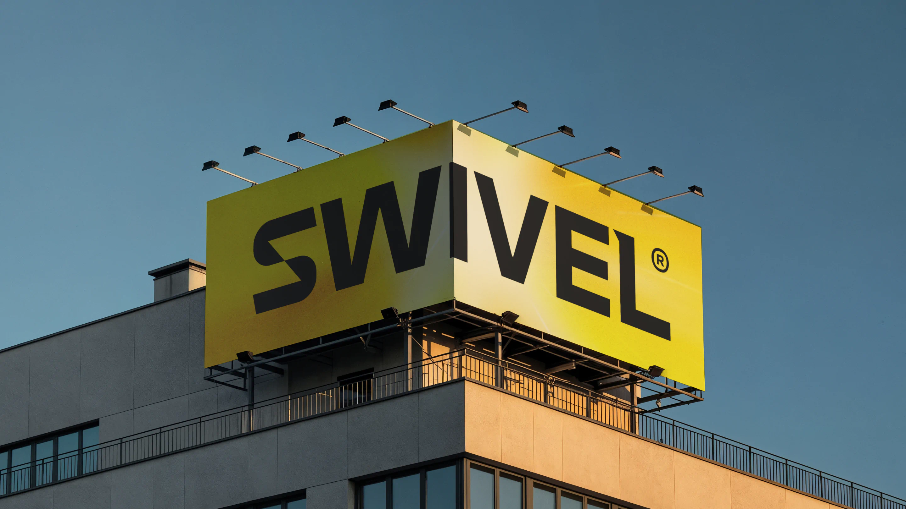
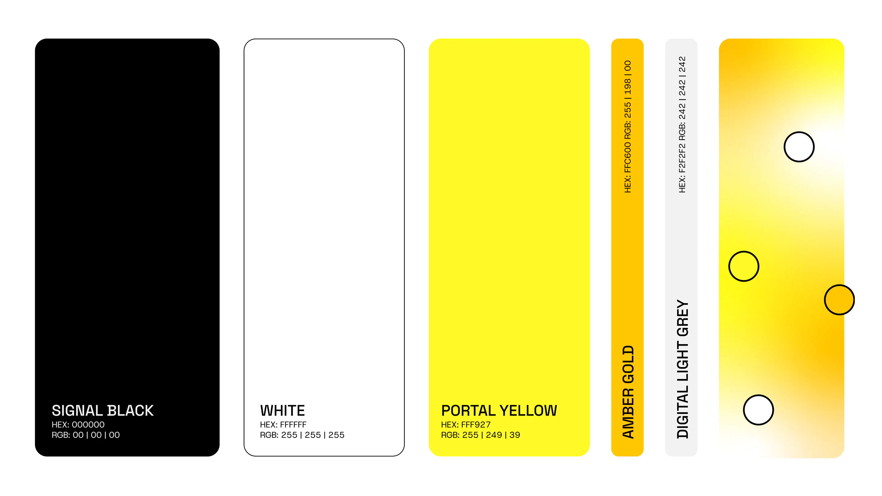
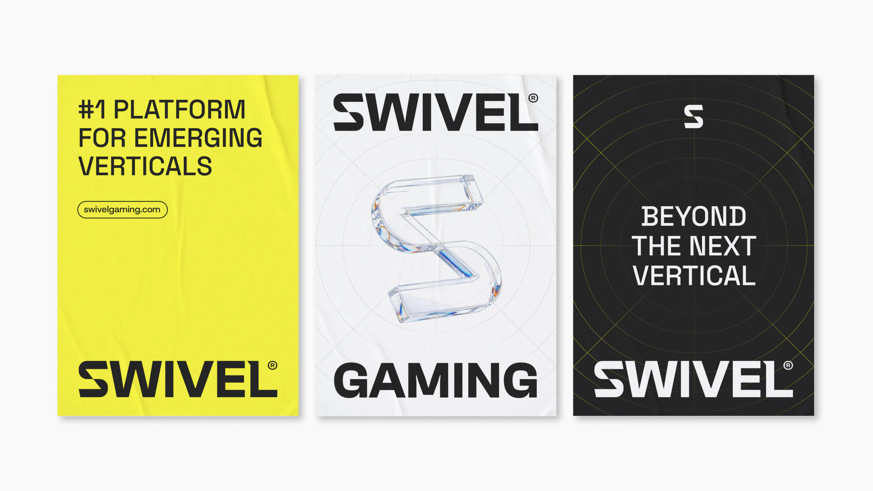
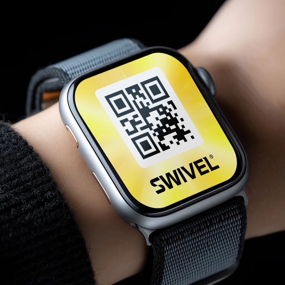
Colour played an equally important role in signalling the change. Portal Yellow became the defining brand colour, paired with Signal Black and white to create a high-contrast palette that feels impactful, modern and unmistakably digital.
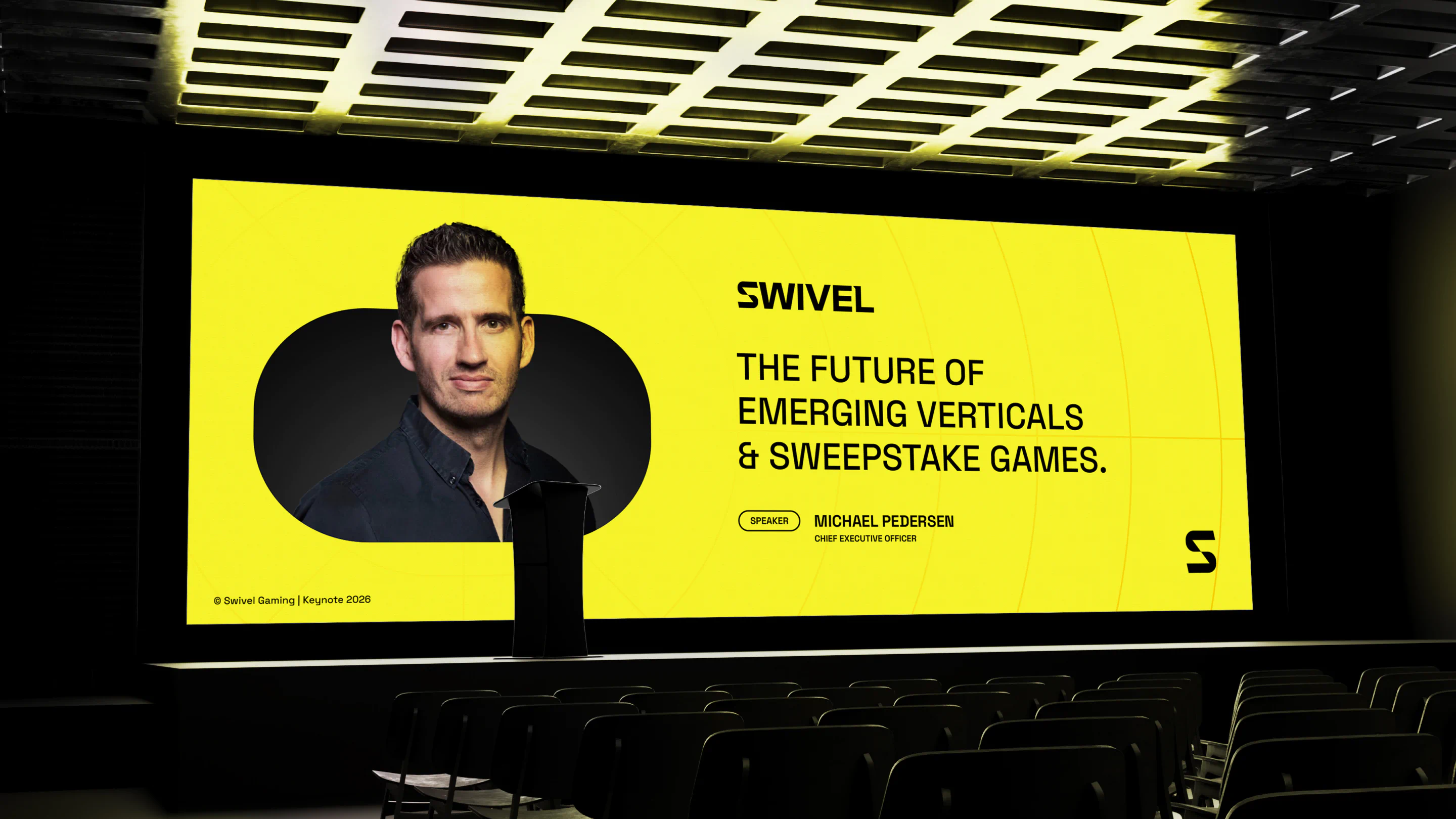
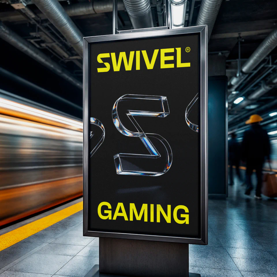
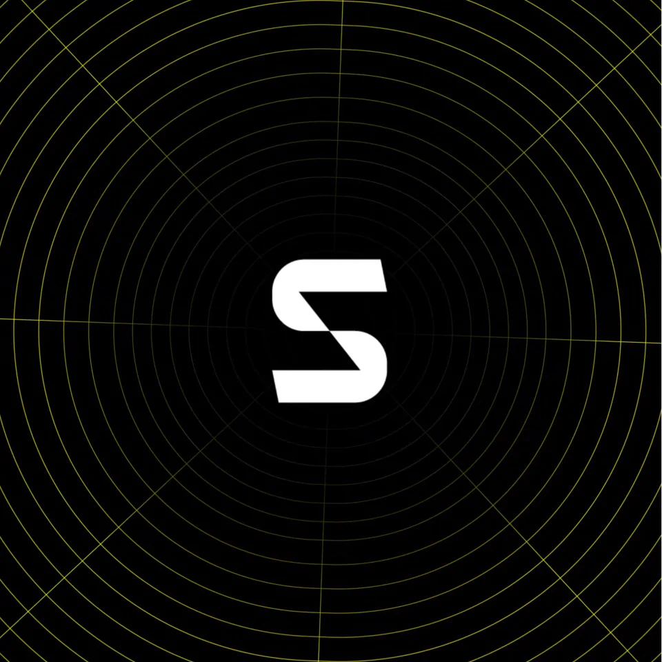
Finally, we expanded the visual world with an abstract infinite tunnel inspired by the upper and lower forms of the ‘S’. Used as a graphic device across the identity, it creates a sense of depth, momentum and possibility: a gateway into the evolving world of iGaming and the opportunities still ahead.
Together, these elements transformed Swivel into a sharper, more focused B2B brand, designed to look as ambitious and forward-thinking as the technology behind it.




The results