ANRO Brand Identity
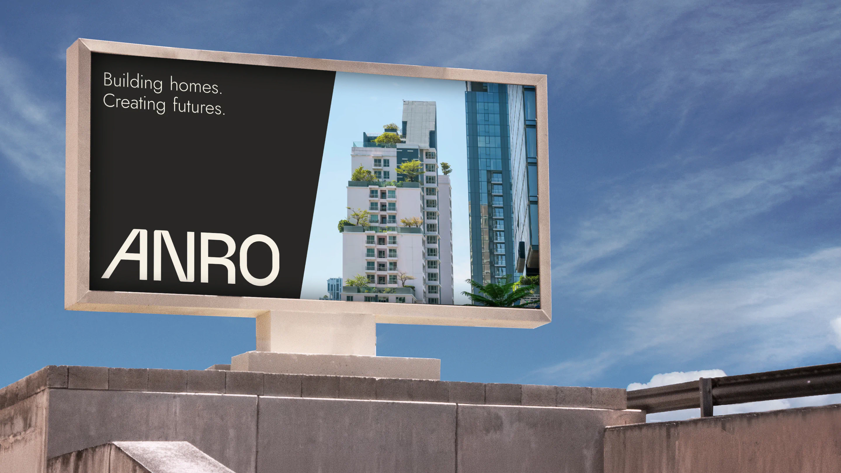
As Farrugia Developments transitioned to ANRO, we created a distinctive identity for a property developer with its sights set on the future. From a customised wordmark and grounded, nature-inspired palette to a flexible graphic pattern and clean visual language, we built a confident brand designed to inspire trust across Malta and Gozo.
The Brief
As Farrugia Developments transitioned to ANRO, we were tasked with creating a new logo and brand identity that reflected the company’s values of excellence, innovation and quality. Our challenge was to establish a strong, professional and progressive identity that inspires trust among investors, businesses and property developers across Malta and Gozo.
The Work
Property development is built on trust. It’s about the quality of what stands today and the confidence people have in what comes next. When Farrugia Developments set out to become ANRO, we saw an opportunity to create an identity that felt established from day one, while making room for a more progressive future.
We began with a clear creative direction: strong, solid and grounded, but never overly industrial. ANRO needed to speak with confidence to investors, established businesses and those developing property across Malta and Gozo. Rather than relying on heavy-handed construction cues, we explored a refined visual language with minimal layouts, clean typography and a sense of quiet assurance.
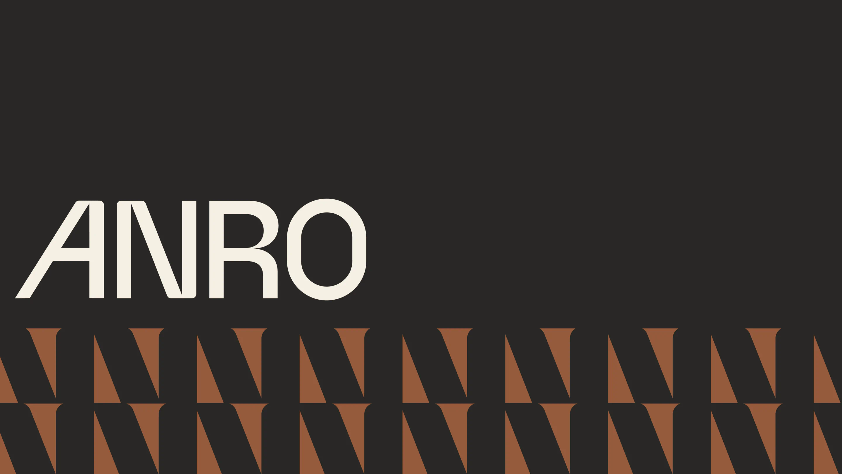
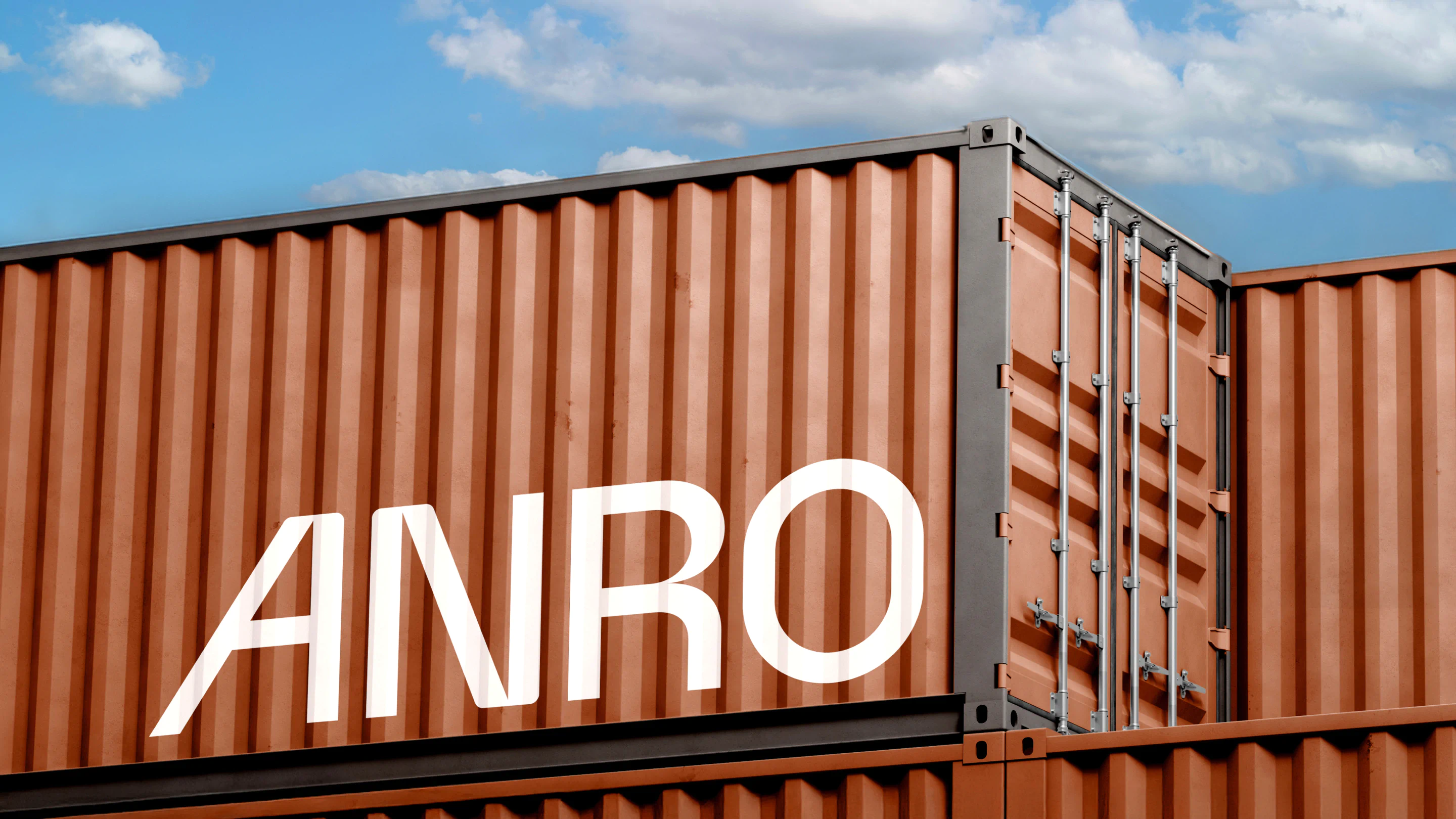
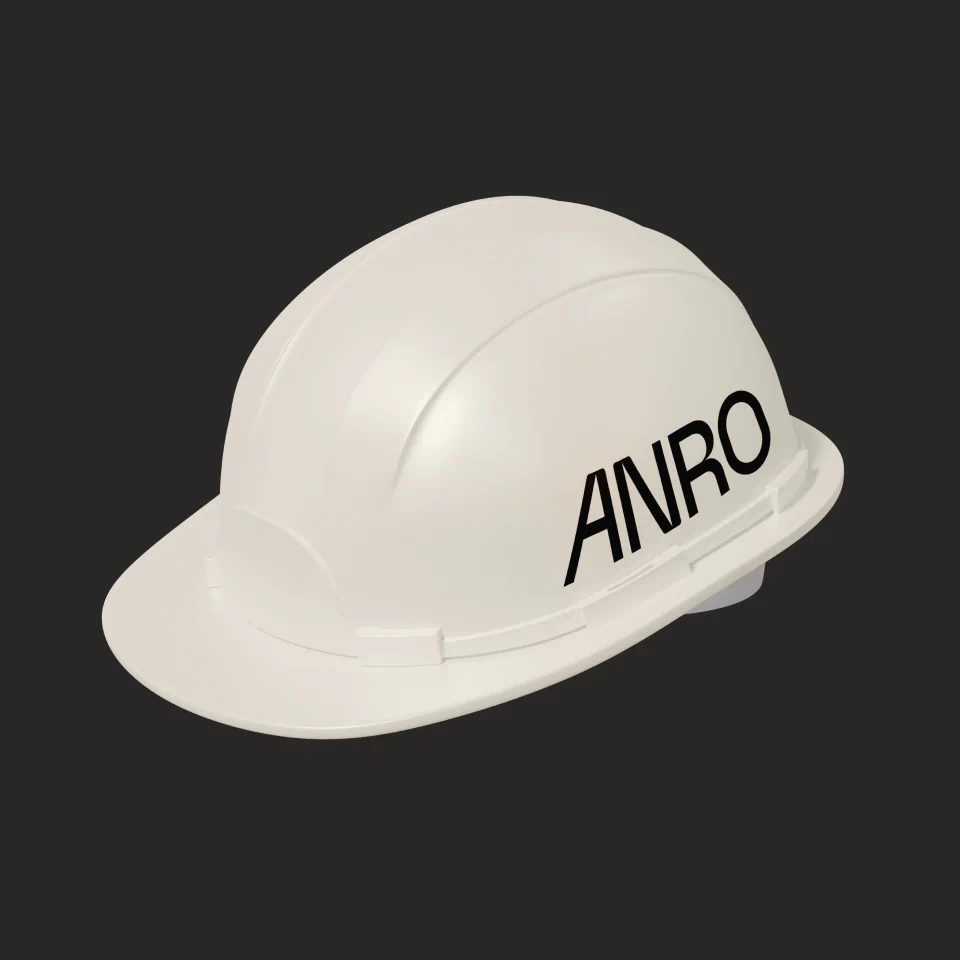
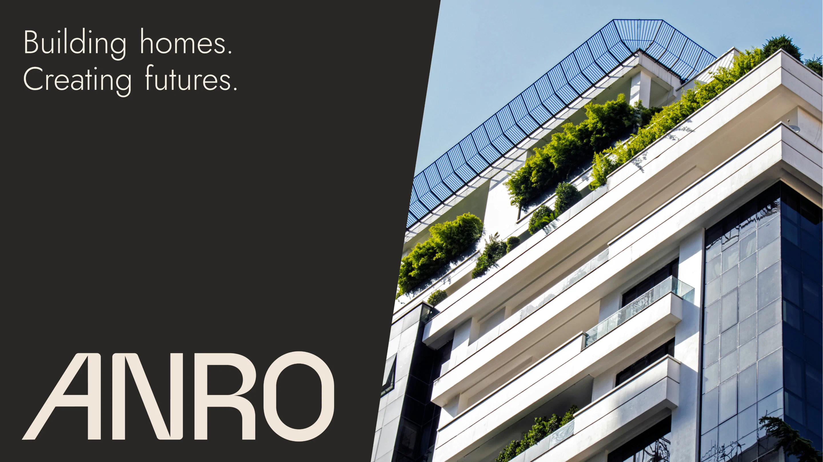
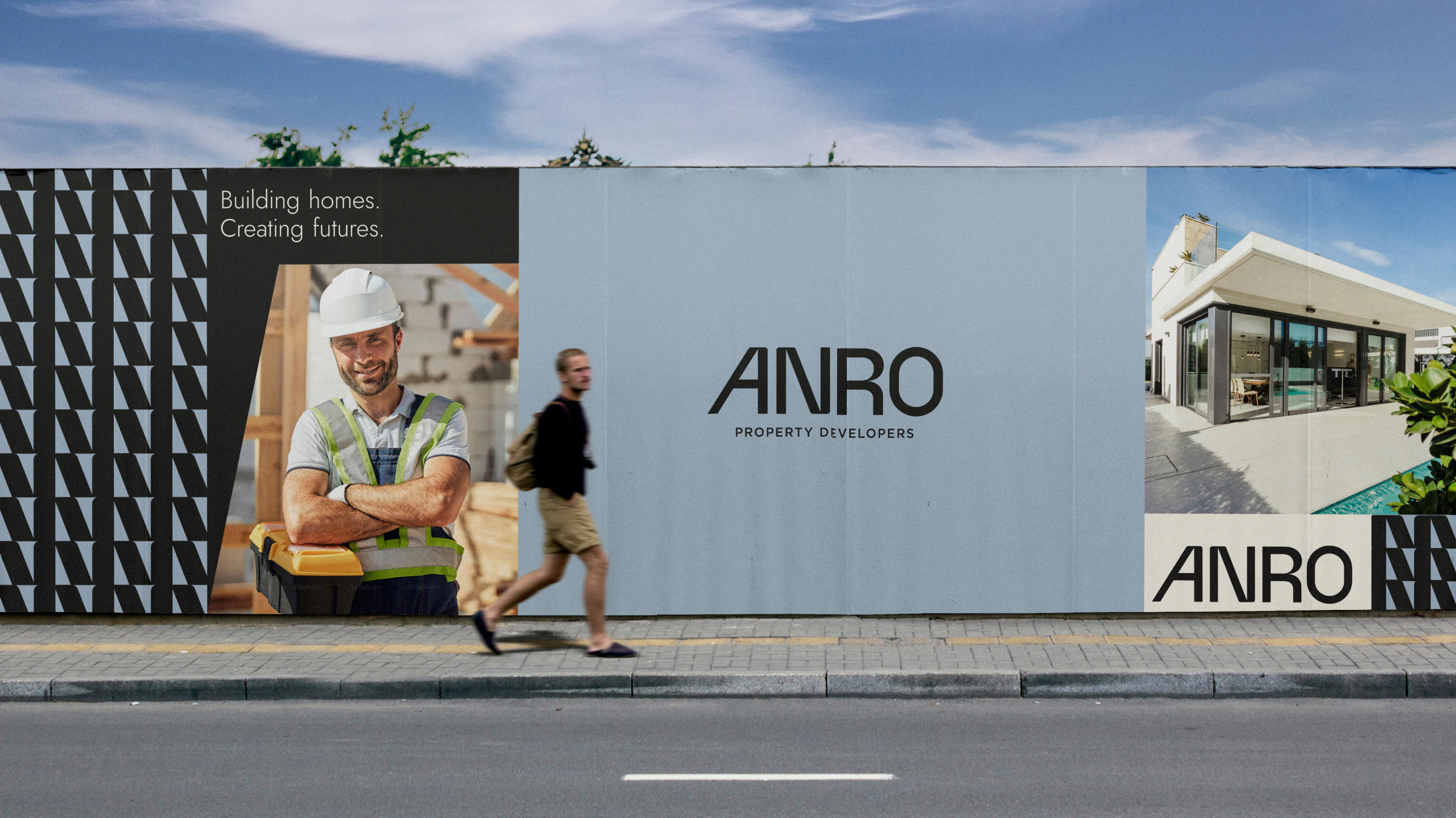
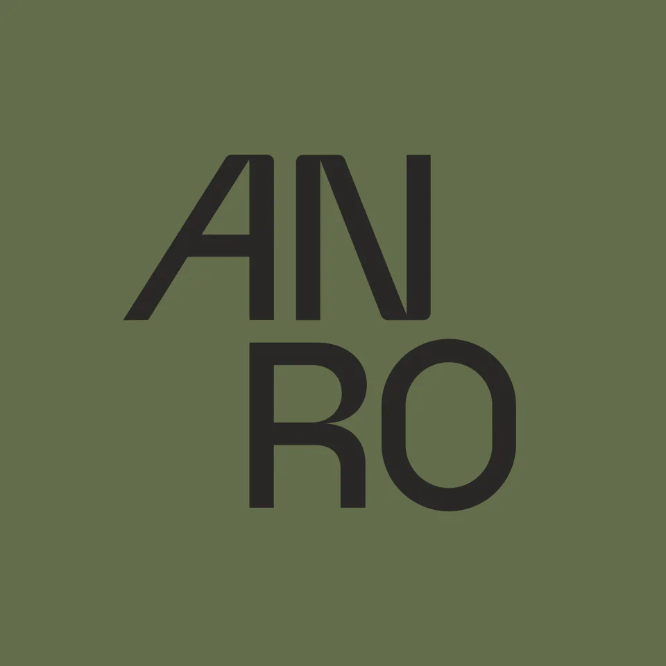
At the centre of the identity is a customised wordmark. Its simplicity gives ANRO a recognisable, modern presence, while considered adjustments introduce a character of its own. We slanted the ‘A’ to give it a taller, building-like silhouette, a subtle nod to architecture and the spaces ANRO helps shape. We then narrowed selected points and softened certain angles, balancing the strength associated with property development with a more approachable feel. The result is a mark that feels solid without being rigid.
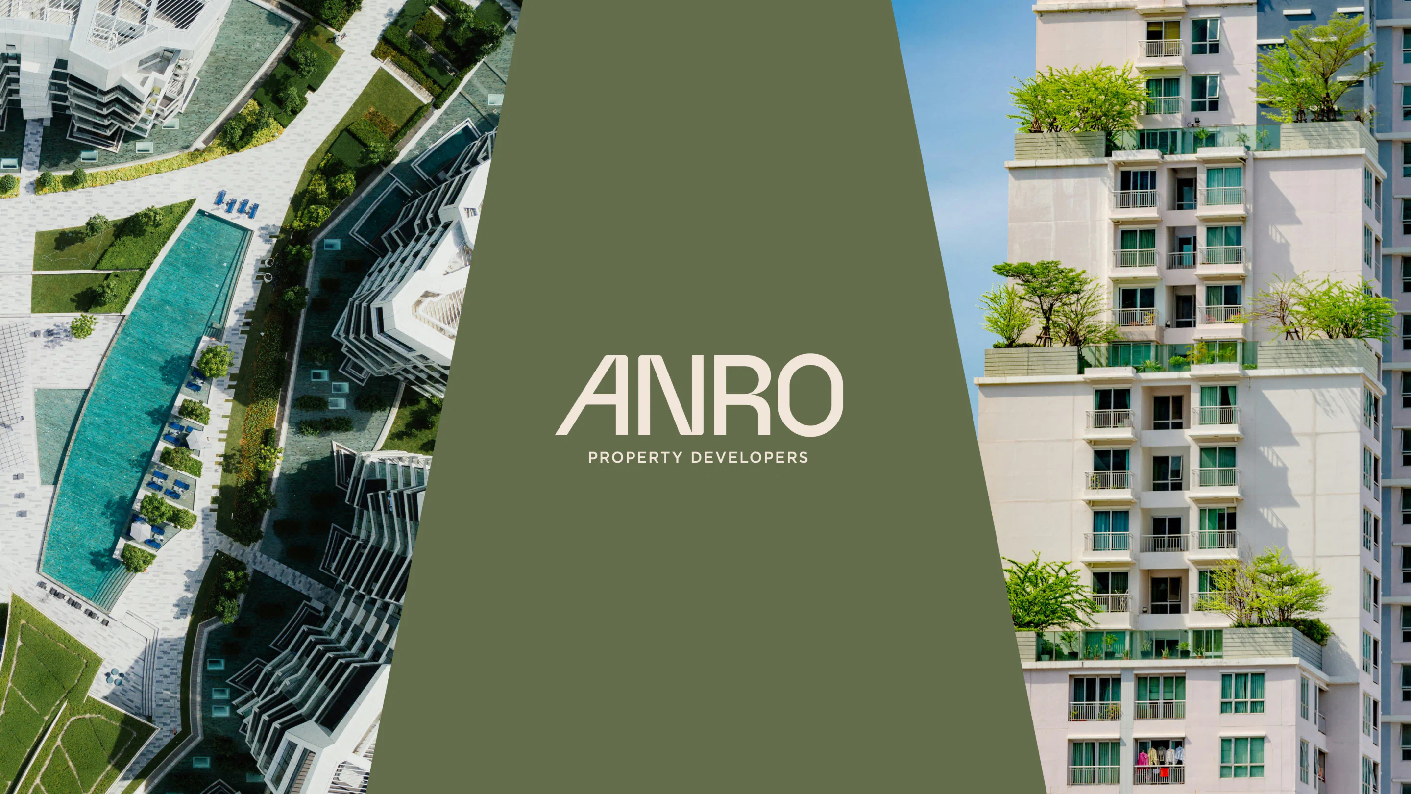
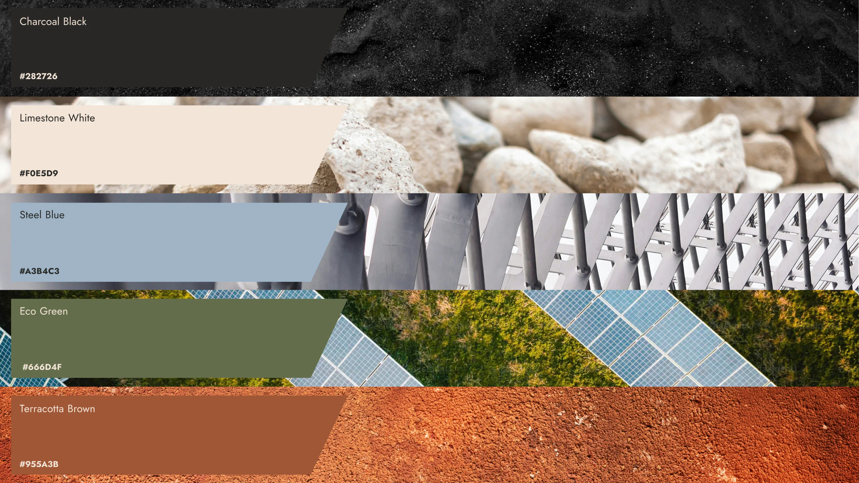
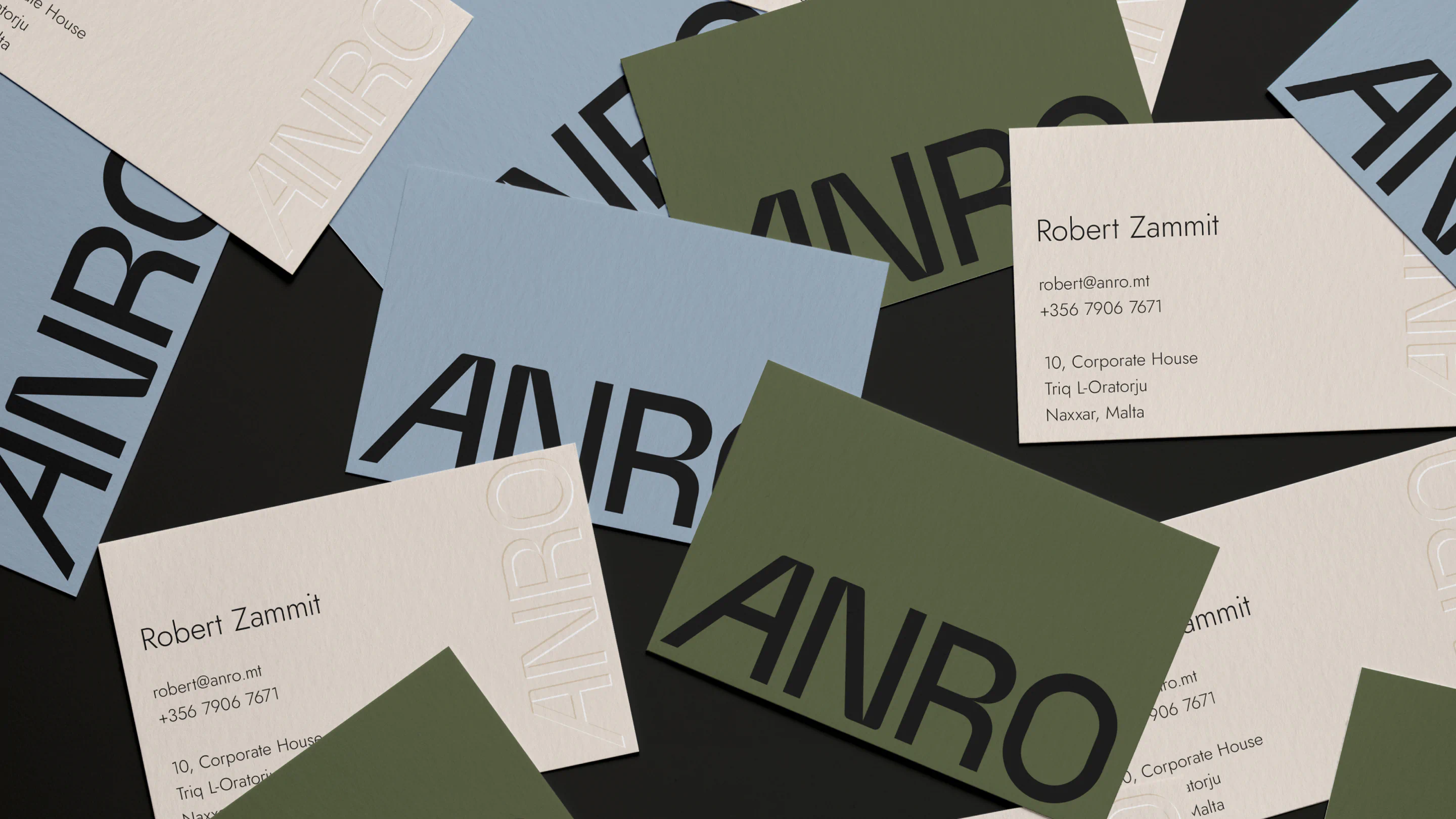
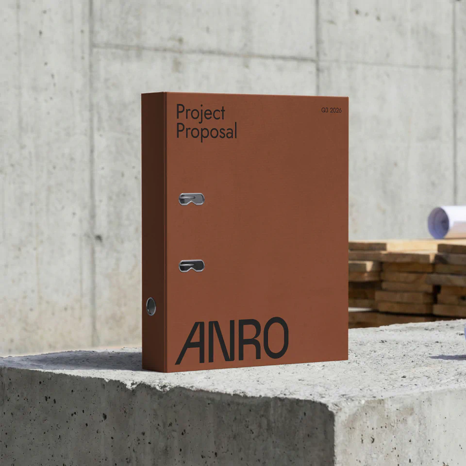
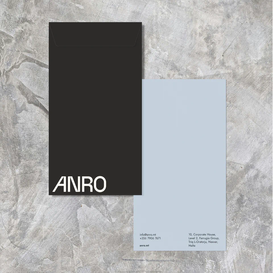
Colour brought another layer of meaning. We chose charcoal and limestone as the foundation of the palette, borrowing from the character of the earth and built environment. Accents of steel blue, moss green and terracotta introduced depth and versatility, taking cues from both natural and industrial materials.
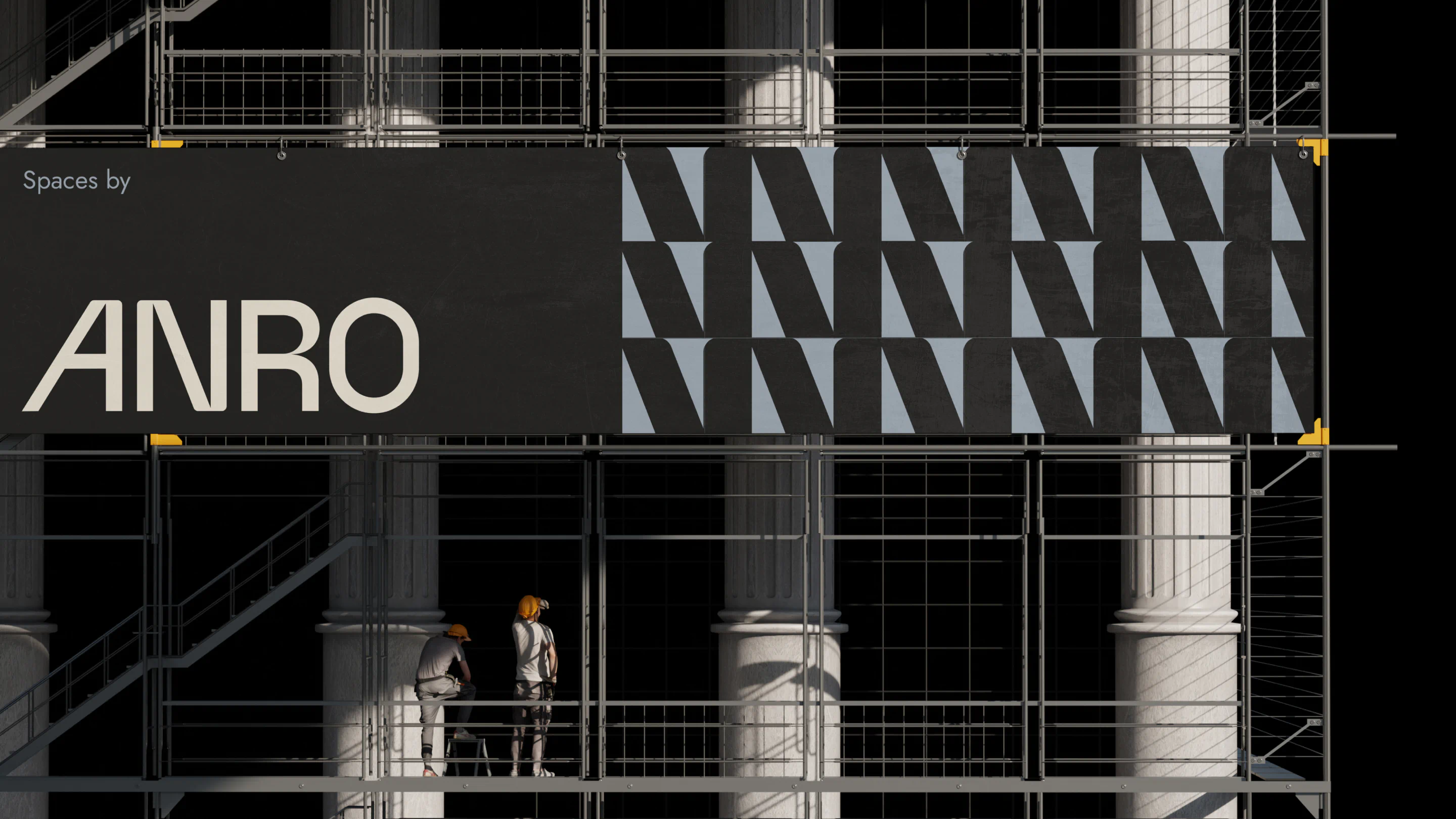
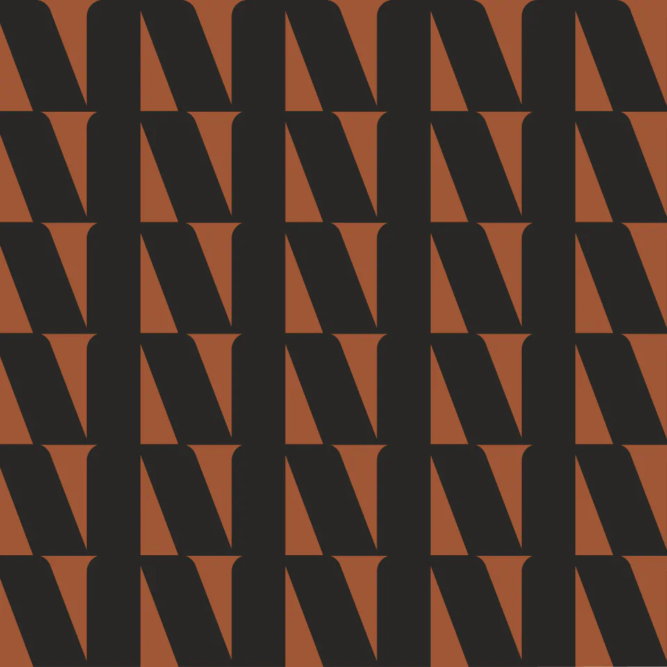
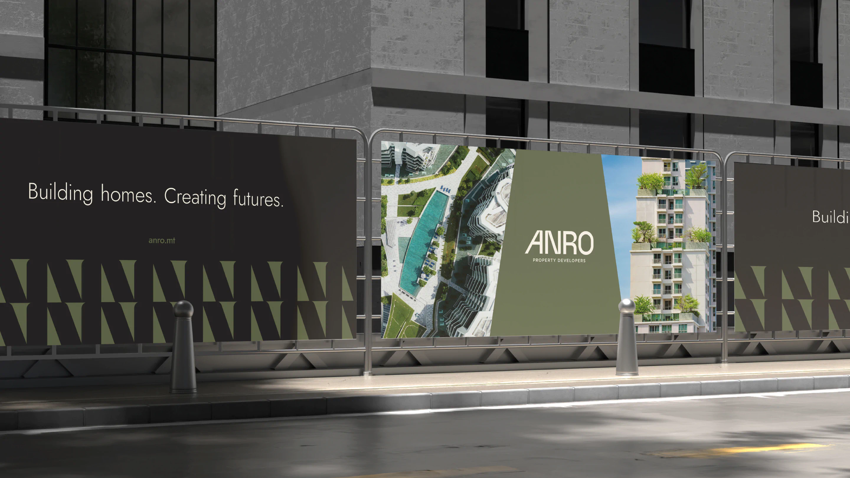
To extend the identity beyond the logo, we developed a graphic pattern from the tip of the ‘N’ in the wordmark. This detail creates continuity across brand applications without competing with the main identity.
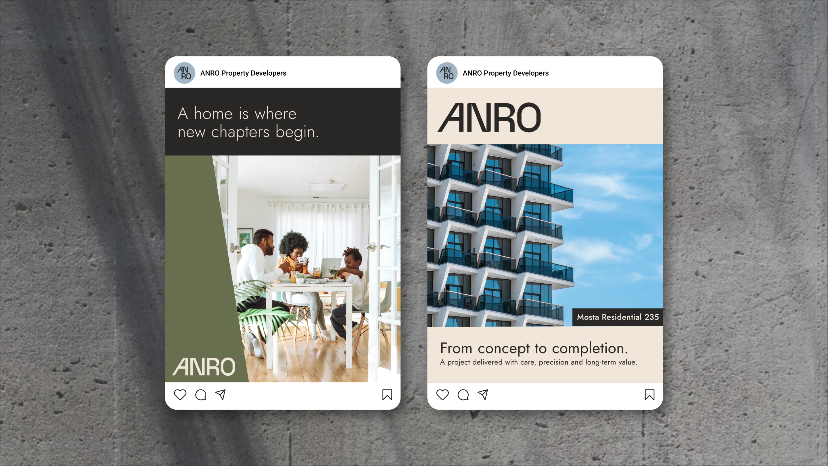
The same visual language carried through to ANRO’s new website, connecting its identity with a live digital presence.
From the wordmark to the wider visual system, every decision was designed to reflect ANRO’s commitment to quality, innovation and long-term relationships. A new name, with an identity grounded in where the business comes from and ready for what it builds next.


The results
The new brand identity was approved and successfully launched. ANRO’s refreshed brand is now live, alongside its newly developed website, establishing a consistent visual presence for the company.