Motherwell Bridge
Client:
Motherwell Bridge
Project Date:
2025
Industry:

Motherwell Bridge is a leading provider of cargo-handling equipment services and industrial inspections. They are also one of the many brands that form part of the Breakwater Group, a collective of specialist companies working across engineering, mobility, energy, and logistics. Over time, other companies within the group had refreshed their brands, it was time for Motherwell to do the same. They came to us for an identity and website refresh that would modernise the brand and place Motherwell Bridge in a strong position for future growth.
The Brief
Update the Motherwell Bridge brand and website, improve usability, and create visual consistency across the wider organisation.
The Work
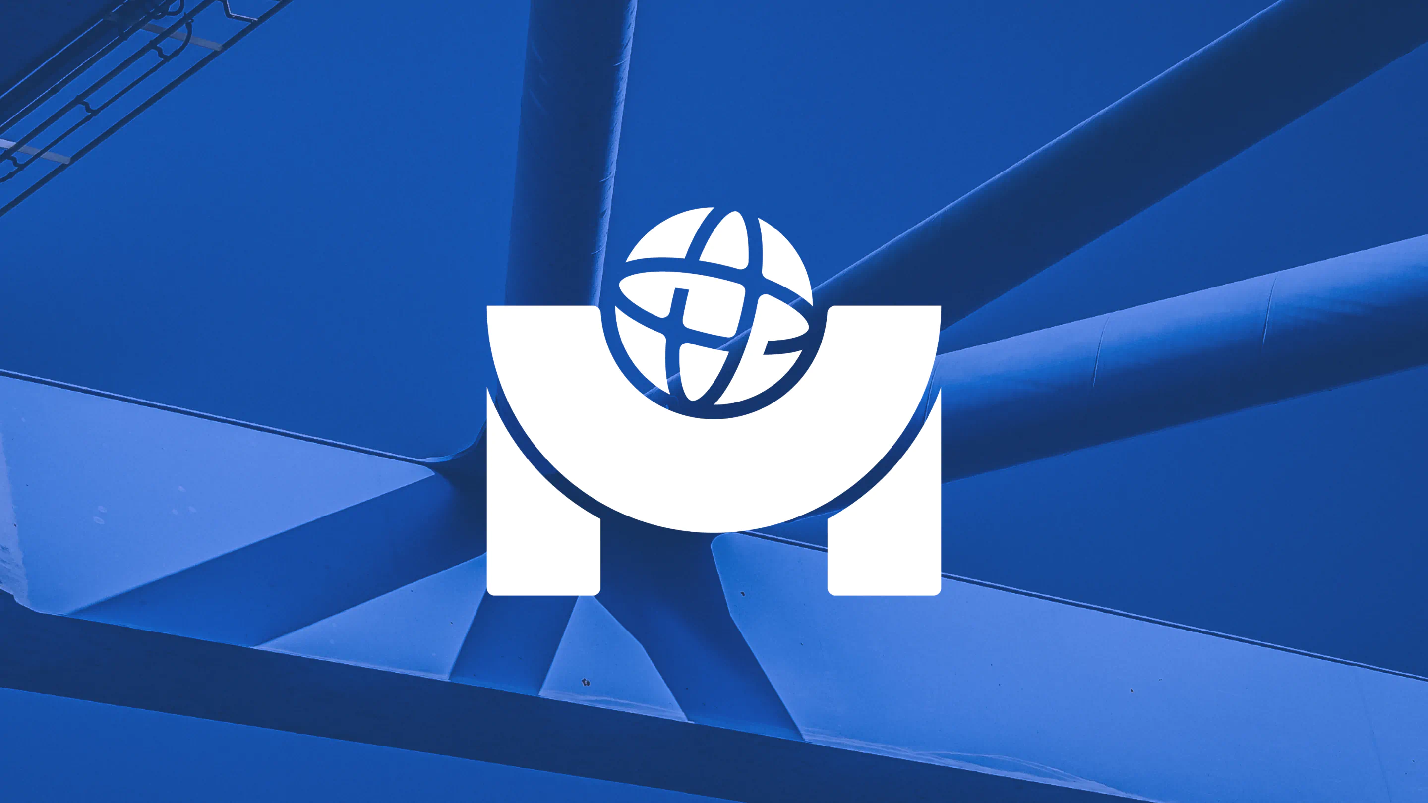
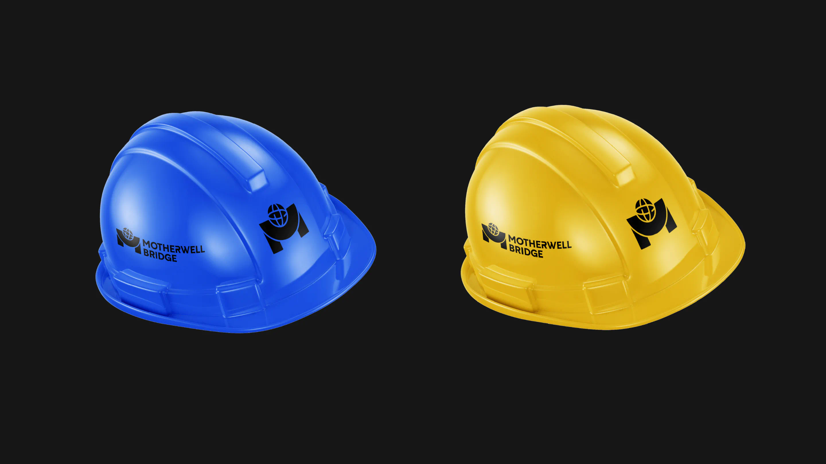
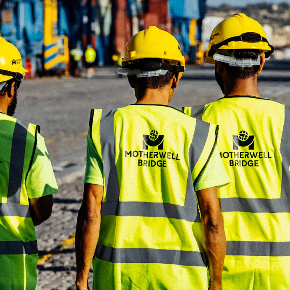
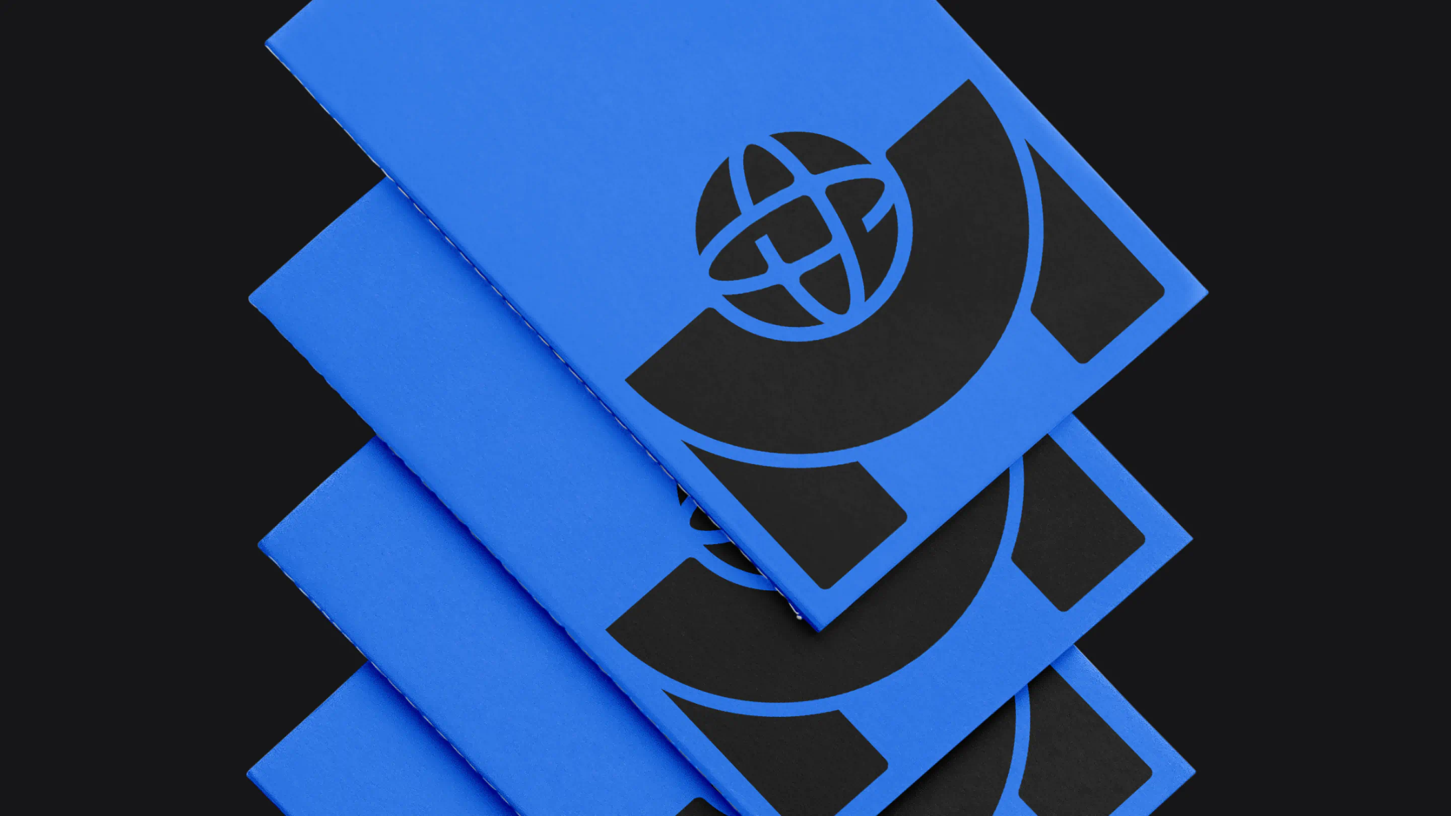
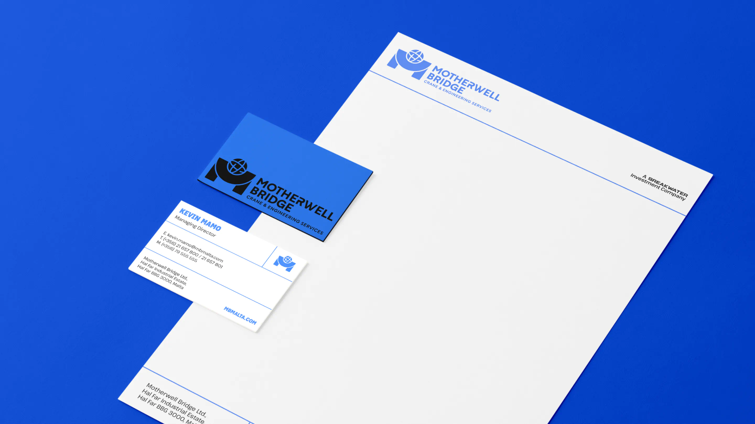
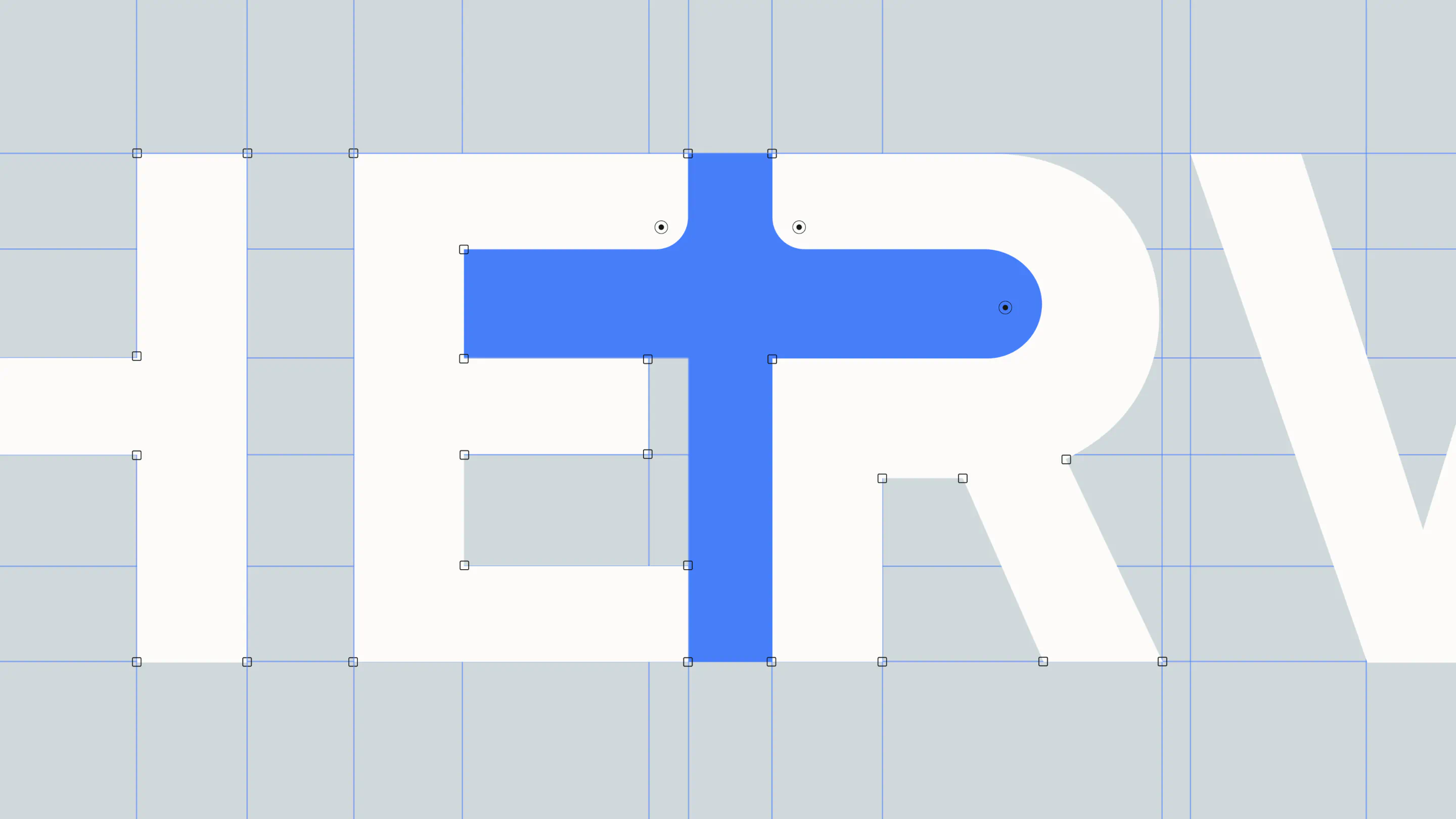
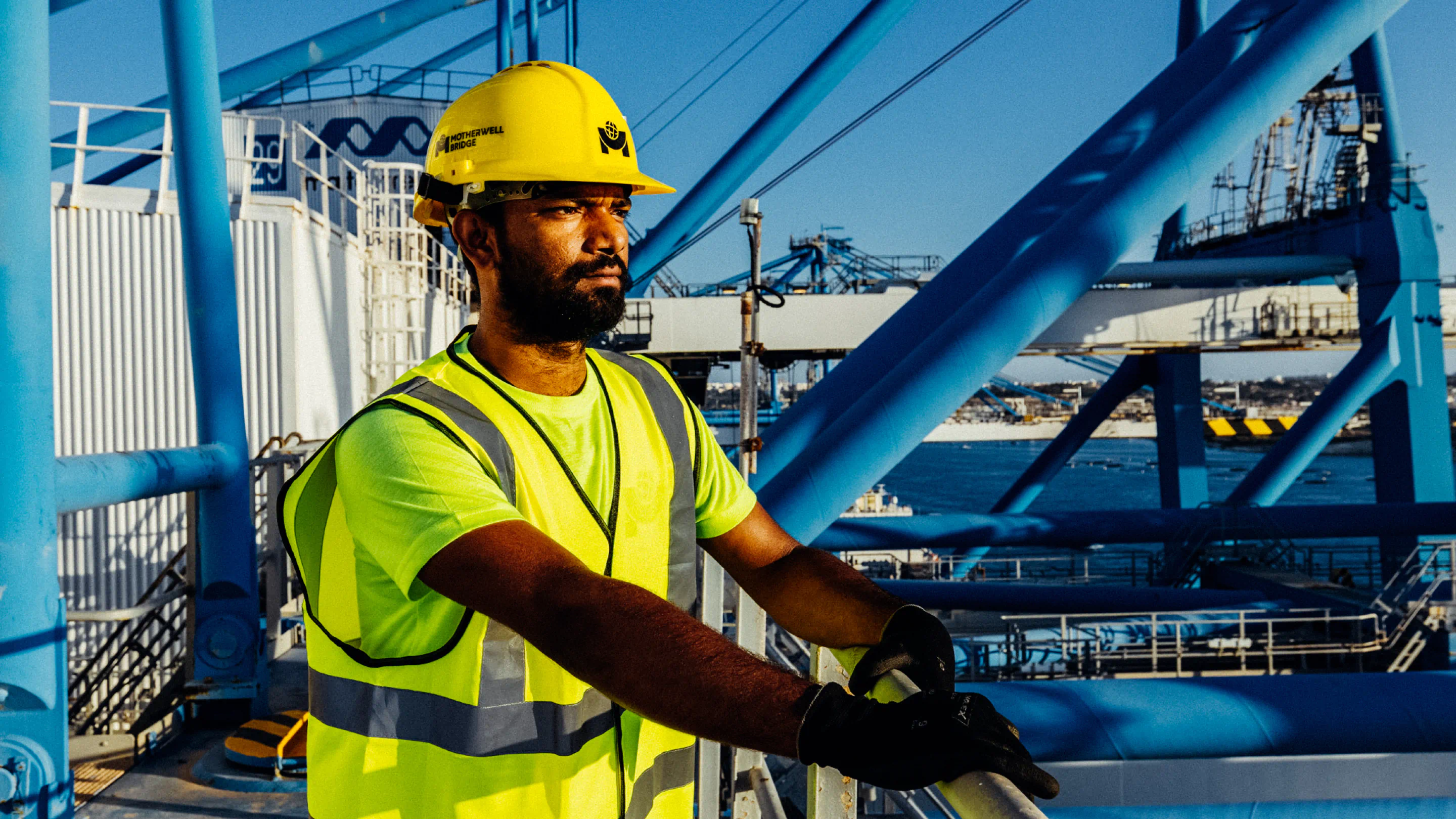
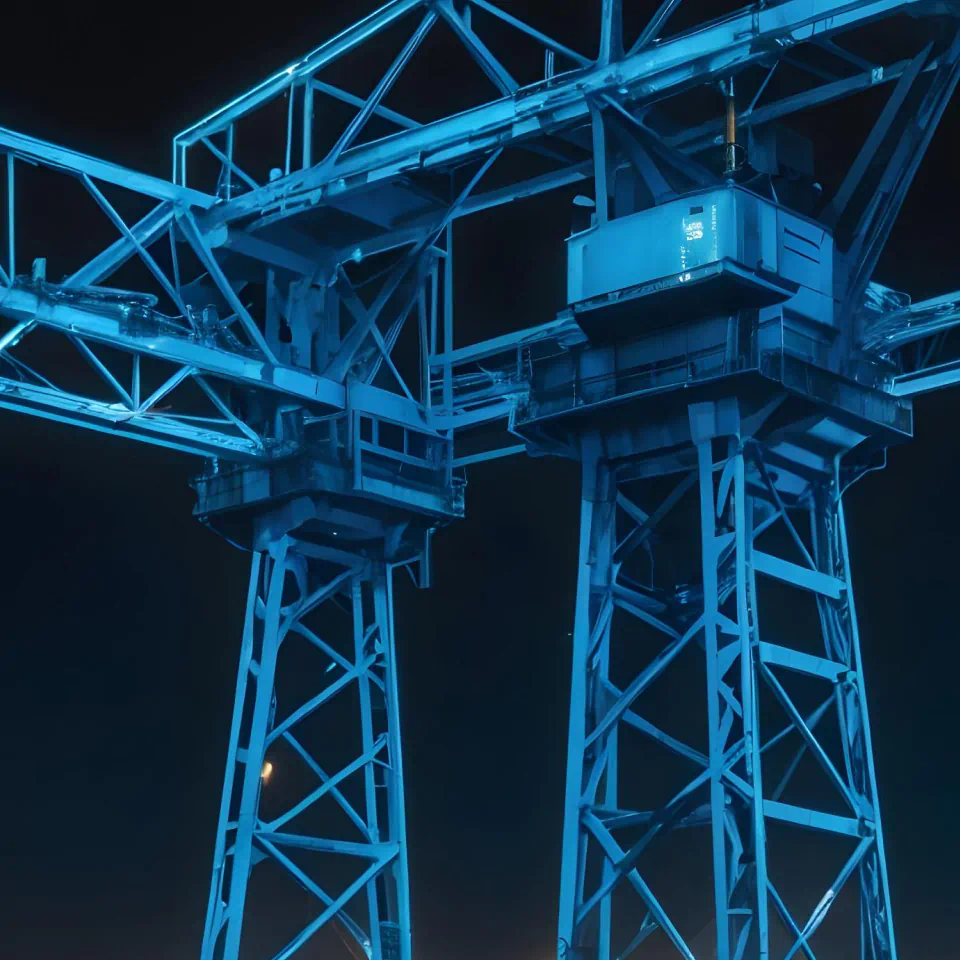
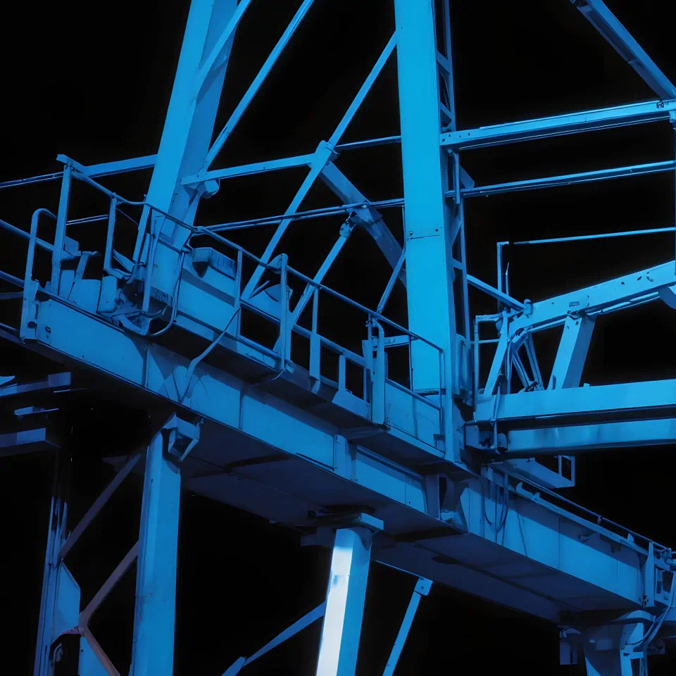
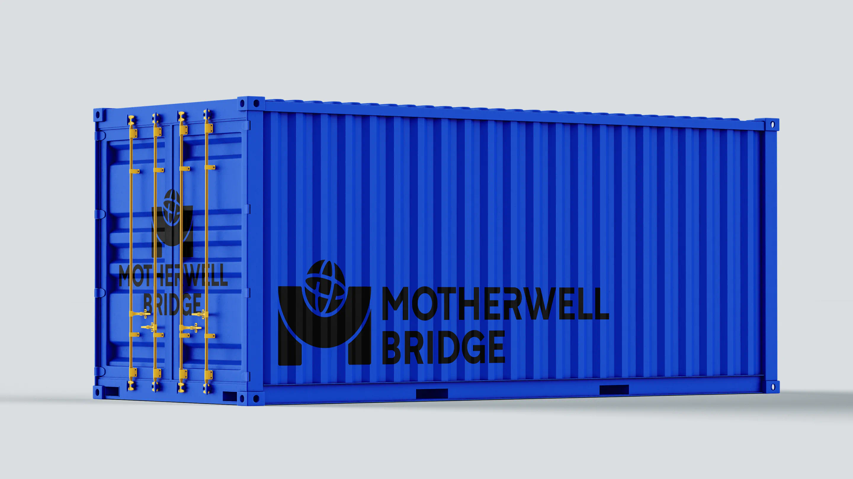
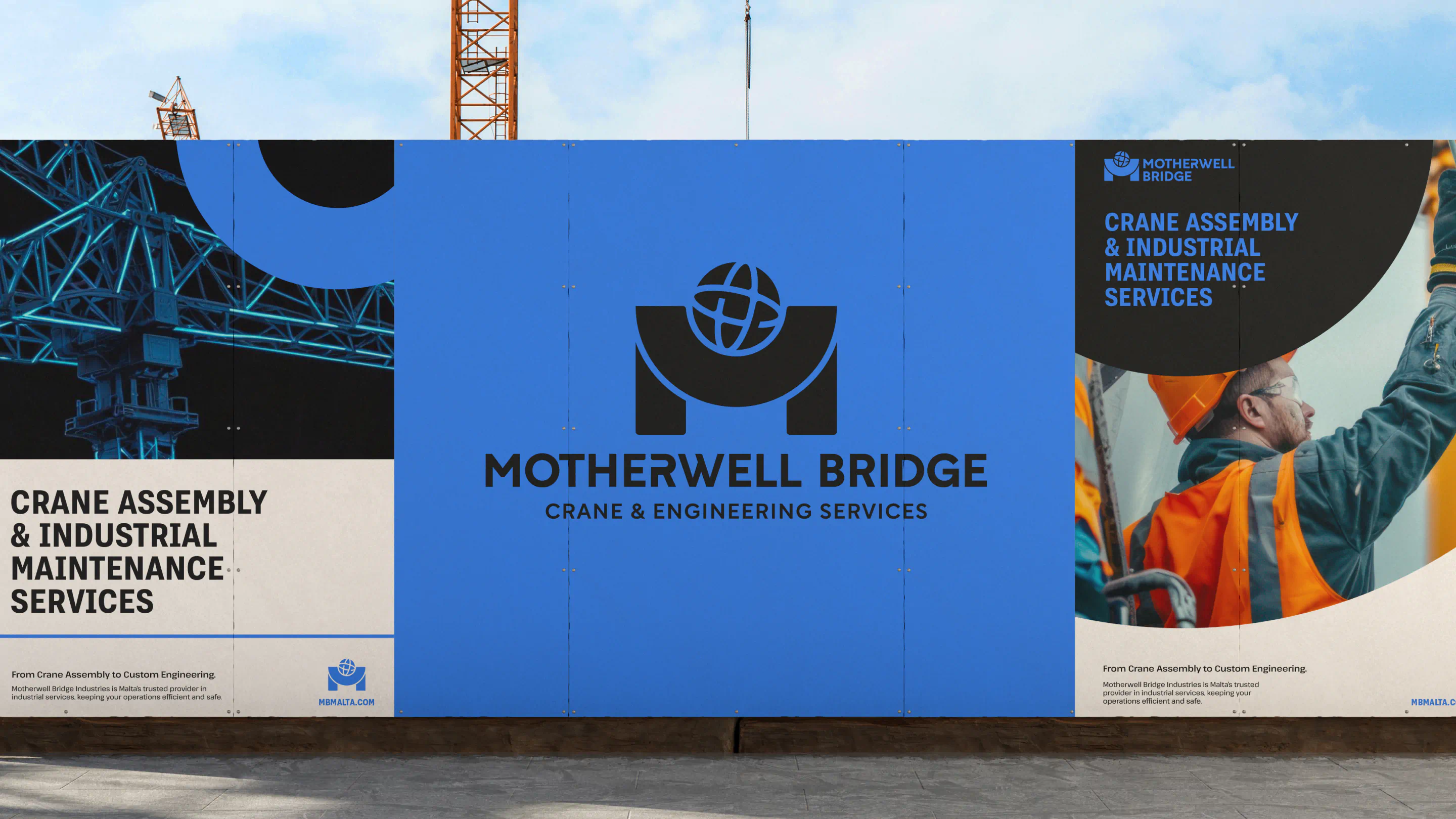
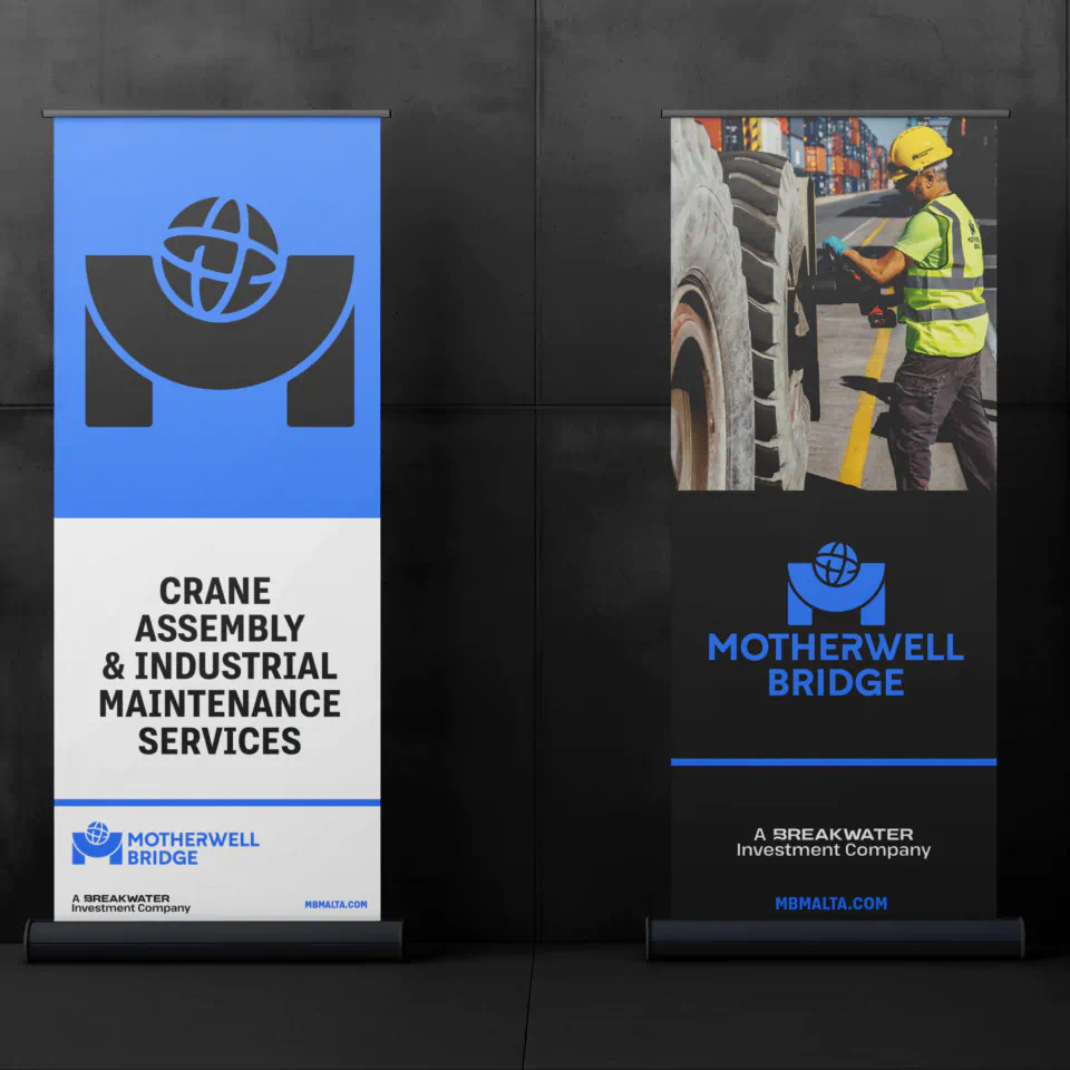
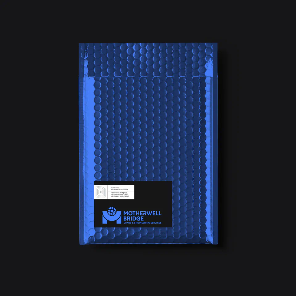
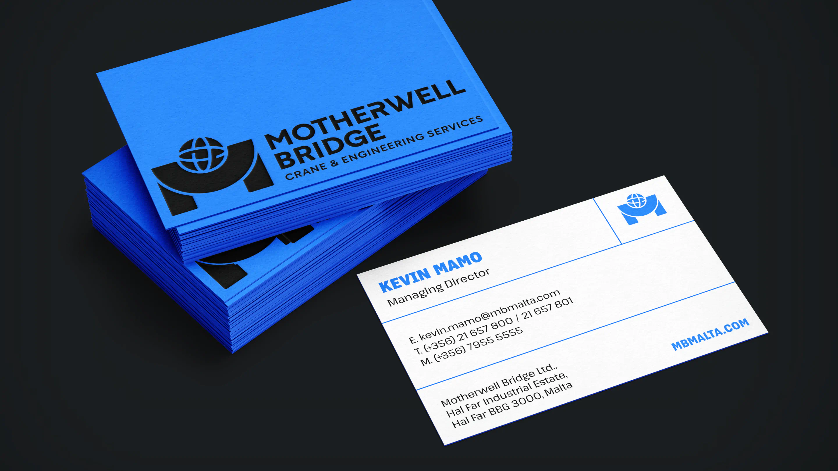
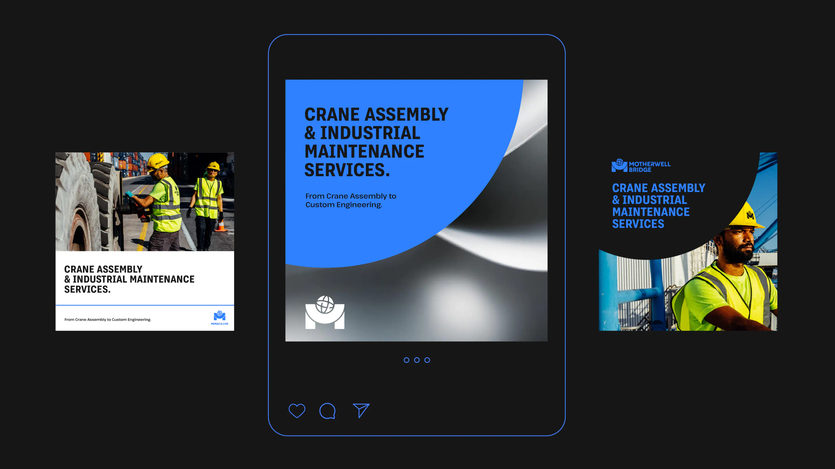
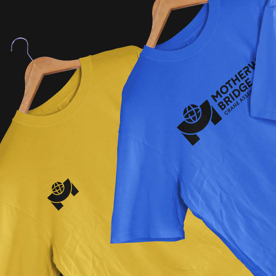
When it came to refreshing the Motherwell Bridge identity, we didn’t need to reinvent – we needed to refine. The goal was to modernise the brand while staying true to its heritage and recognisable assets. We kept the signature ‘M’ for continuity, while evolving the surrounding globe from a light outline into a solid, structured form that feels more grounded and engineered. We also updated the colour palette, making the blue more saturated and introducing industrial tones like yellow, black, and grey – colours drawn from the machinery, equipment, and dockyard environment. This wasn’t just an aesthetic choice; it helped root the brand in its real-world context, reinforcing familiarity and authenticity. Yellow also reflects the strong emphasis placed on health and safety – a constant across all areas of their work. Knowing the brand would live primarily in outdoor, industrial settings – from hard hats and high-vis gear to heavy machinery – we designed a system that would remain visible, professional, and adaptable across a wide range of real-world applications.
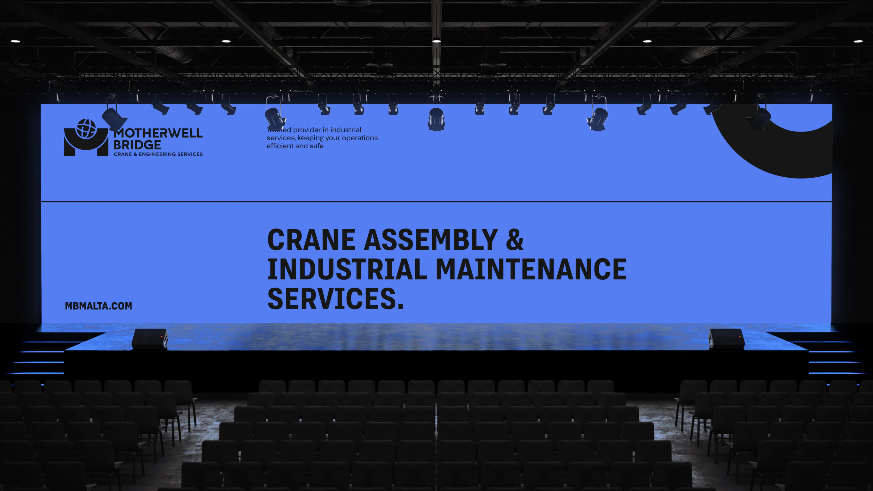
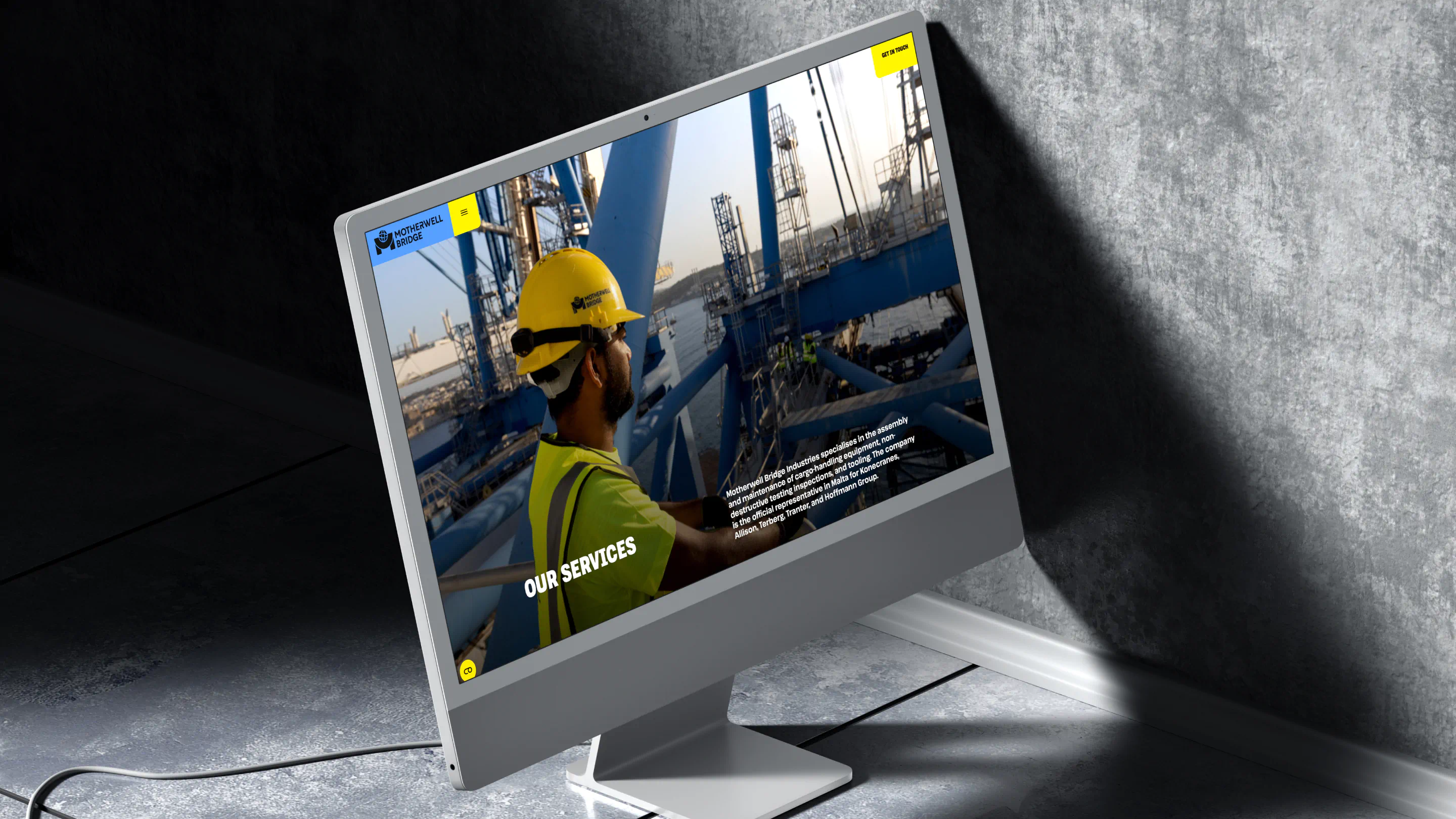
With the refreshed identity in place, we also redesigned the Motherwell Bridge website. Built in Webflow, the new site simplifies navigation and gives the brand a cleaner, more modern digital presence. Bold visuals help communicate the scale and precision of their work, while multilingual functionality makes the site more accessible to users across key markets – including French, German, Italian, Portuguese, and Spanish. The result is a more unified, professional brand – built to perform across industrial sites, digital platforms, and everything in between.


The results