Knights College
Client:
Knights College
Project Date:
2025
Industry:
Knights College set out to reposition for local and global growth. We delivered a bold new name, brand identity, digital experience, and launch campaign—including campaign photography—positioning the college as a confident, smart choice for students.
The Brief
CMBS was ready to evolve. With bold plans for local and global growth, the college needed a name and identity to match its vision. Our challenge: craft a brand and digital experience that takes CMBS into the next phase of their journey—to create a brighter, bolder future for their people and students, reach new audiences, and firmly establish itself as a confident choice in higher education.
The Work
The transformation from CMBS to Knights College began with a question. What does education need to be today, and tomorrow?
For Knights, the answer was clear: education must be more flexible, more forward-thinking, and more connected to real-world opportunity. It needs to embrace digital tools, support diverse learning journeys, and offer qualifications that open doors. For the team at Knights, this meant equipping students with not just knowledge, but momentum — so when they graduate, they’re confident, capable, and in demand in the workplace.
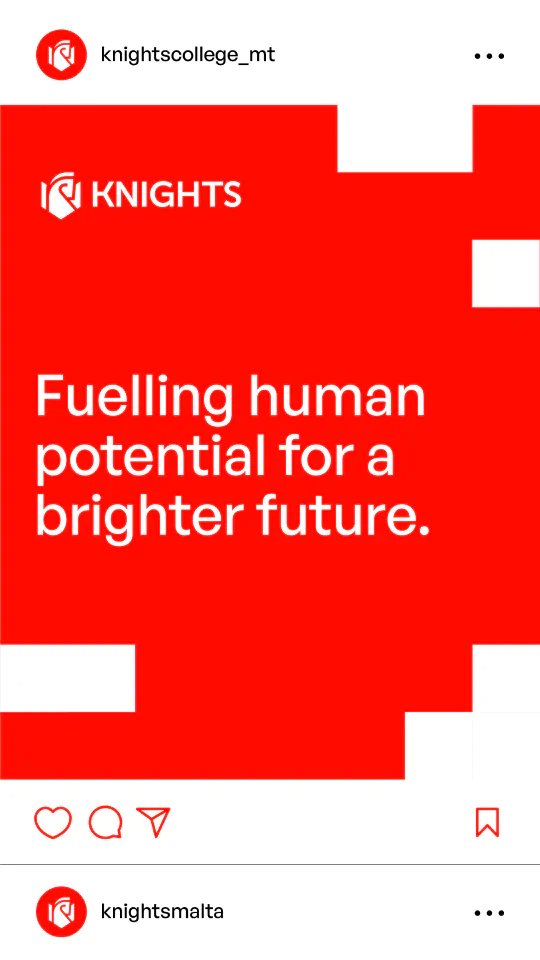
With this as our starting point, it was clear this rebrand was much more than a name change. It was about redefining what the college stood for and how it could better serve students in Malta and beyond. Together with the leadership team, we revisited the institution’s core values and vision, building a new brand framework and purpose: fuelling human potential for a brighter future.
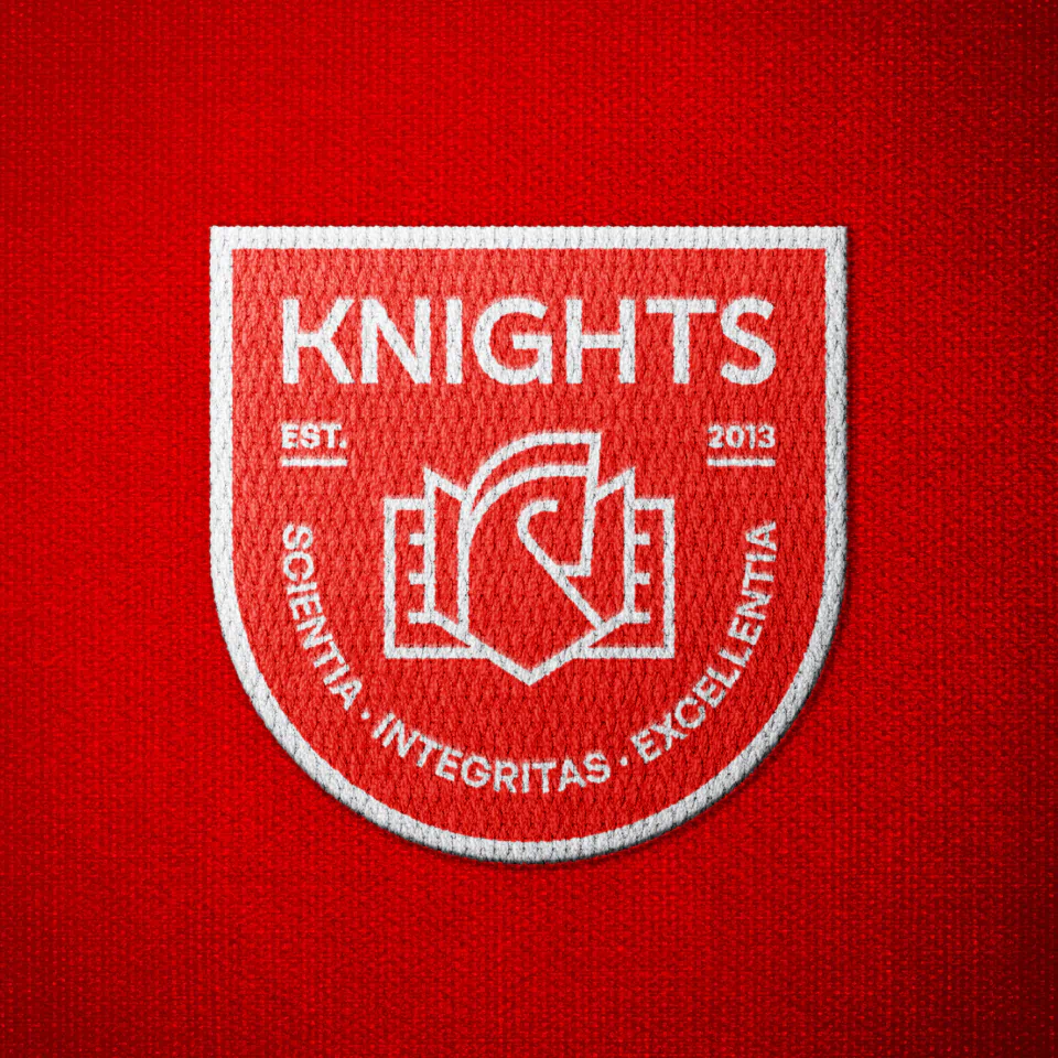
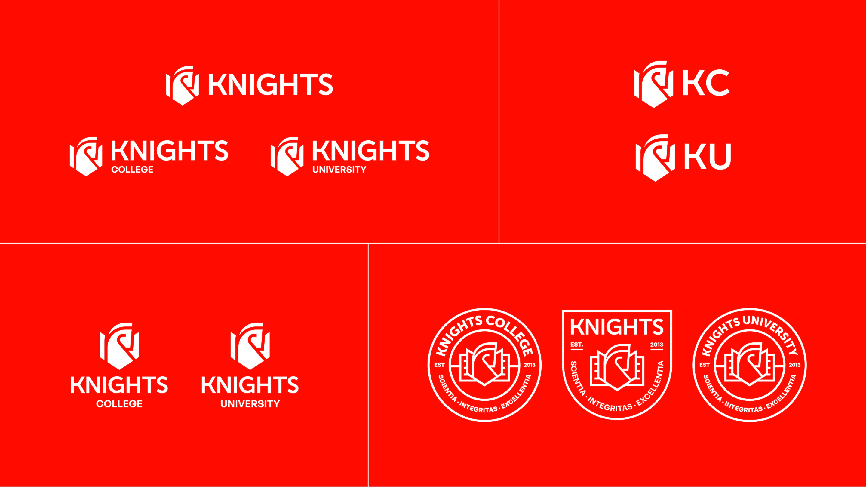
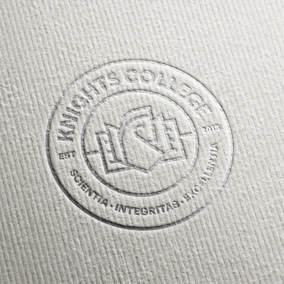
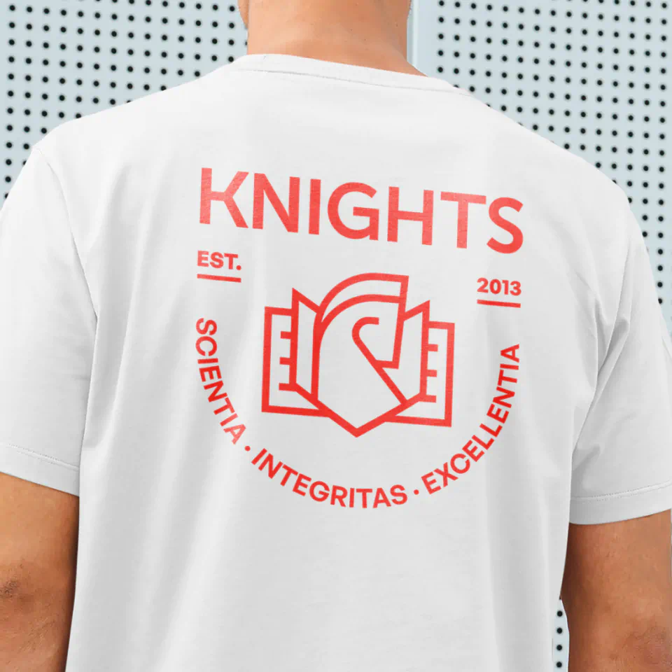
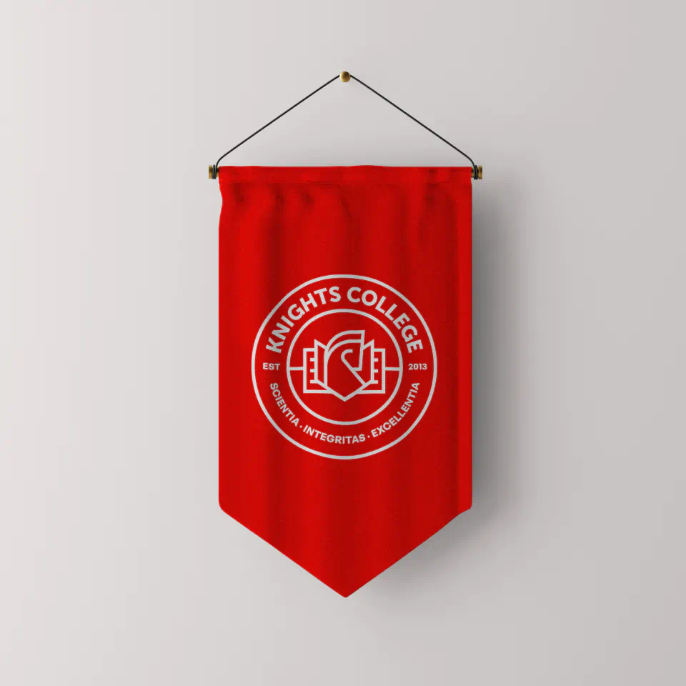
To reflect this renewed purpose, we needed a name that carried meaning, energy, and ambition. Knights College was the one. Inspired by the knight chess piece from the original CMBS logo, ‘Knights’ connects the new brand to its roots while capturing the spirit of the new brand. Known for its agility and ability to make bold, strategic moves, the knight is the only chess piece that moves in an L-shape, leaping over anything in its path. A fitting metaphor for a college that’s willing to think differently and take unconventional routes to move forward.
That symbolism goes even deeper. ‘Knights’ also holds personal meaning for Morgan Parnis, the college’s CEO, as it’s also the name of a favourite lecturer who left a lasting impression on him as a student. Combined with the cultural and historical significance of knights in Malta, the name carries depth and authenticity, respecting its origins while embracing a future with purpose.
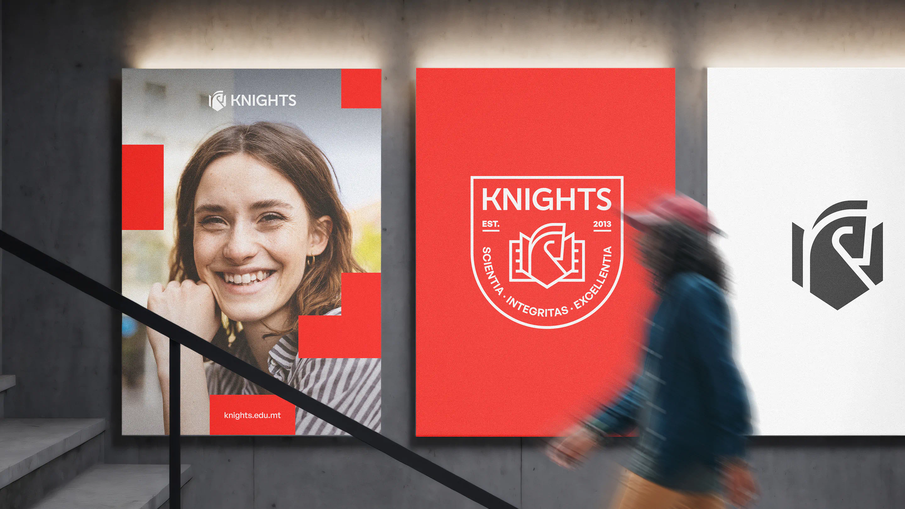
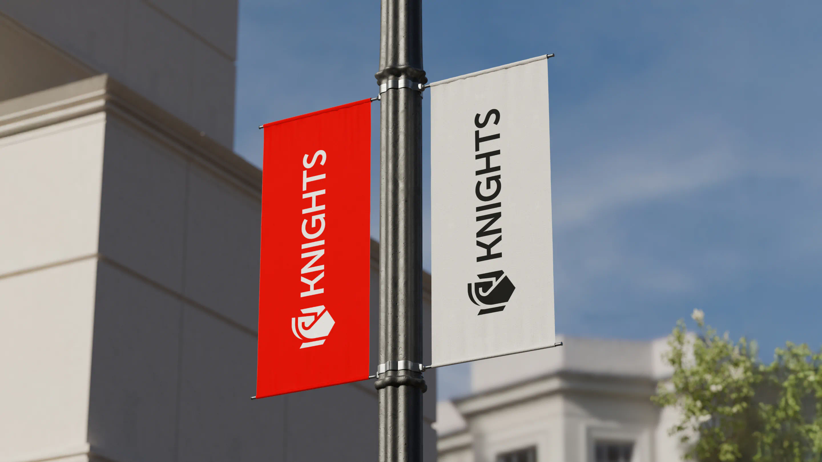
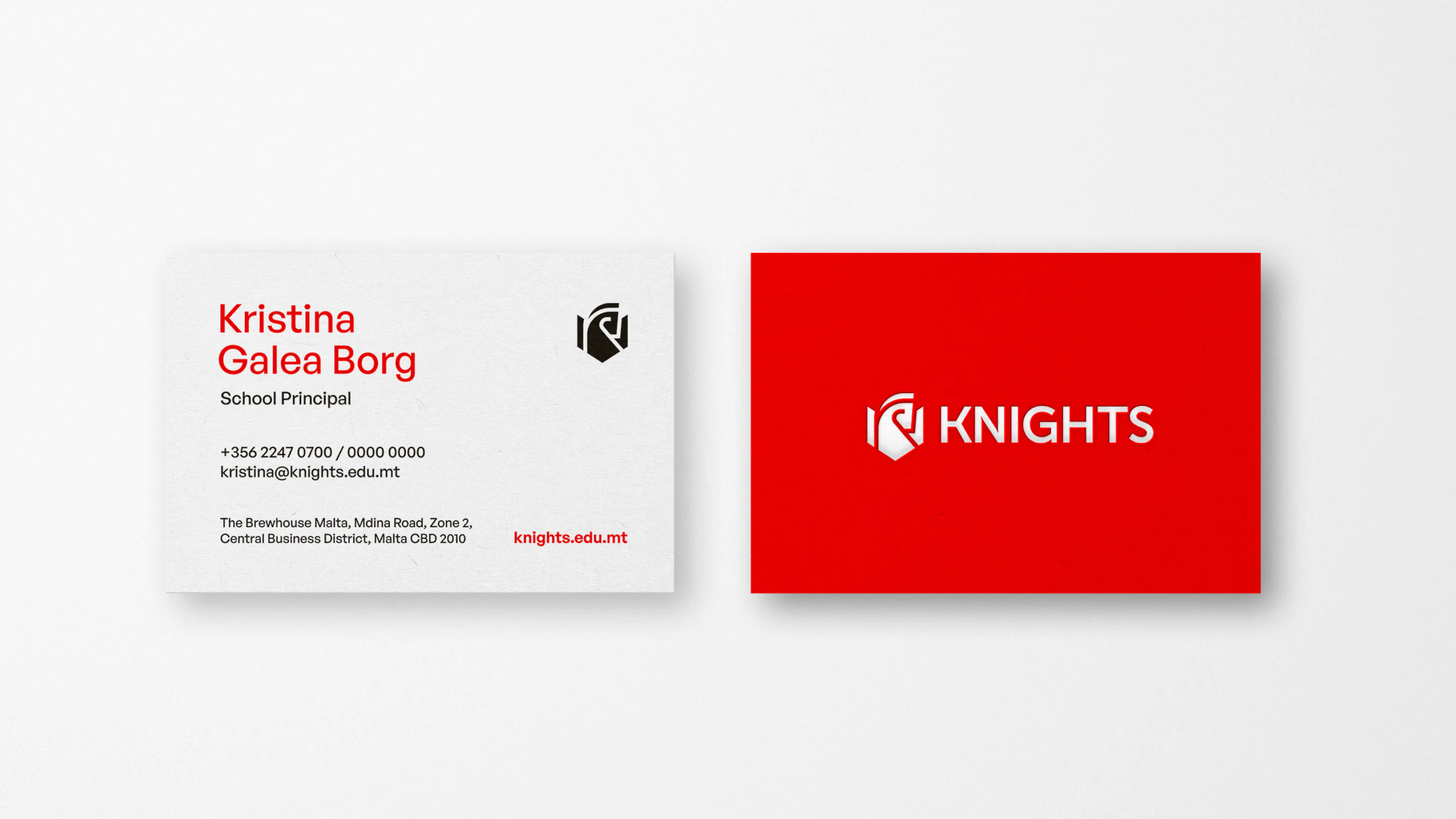
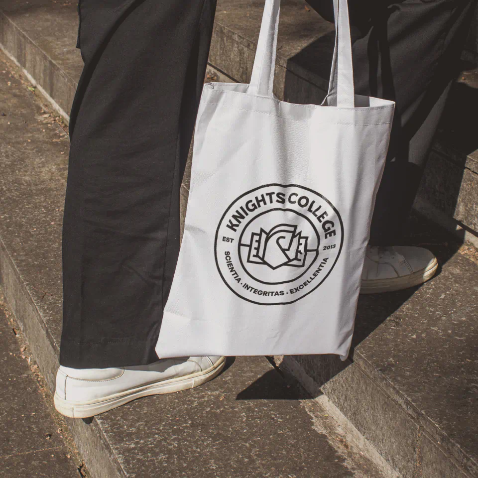
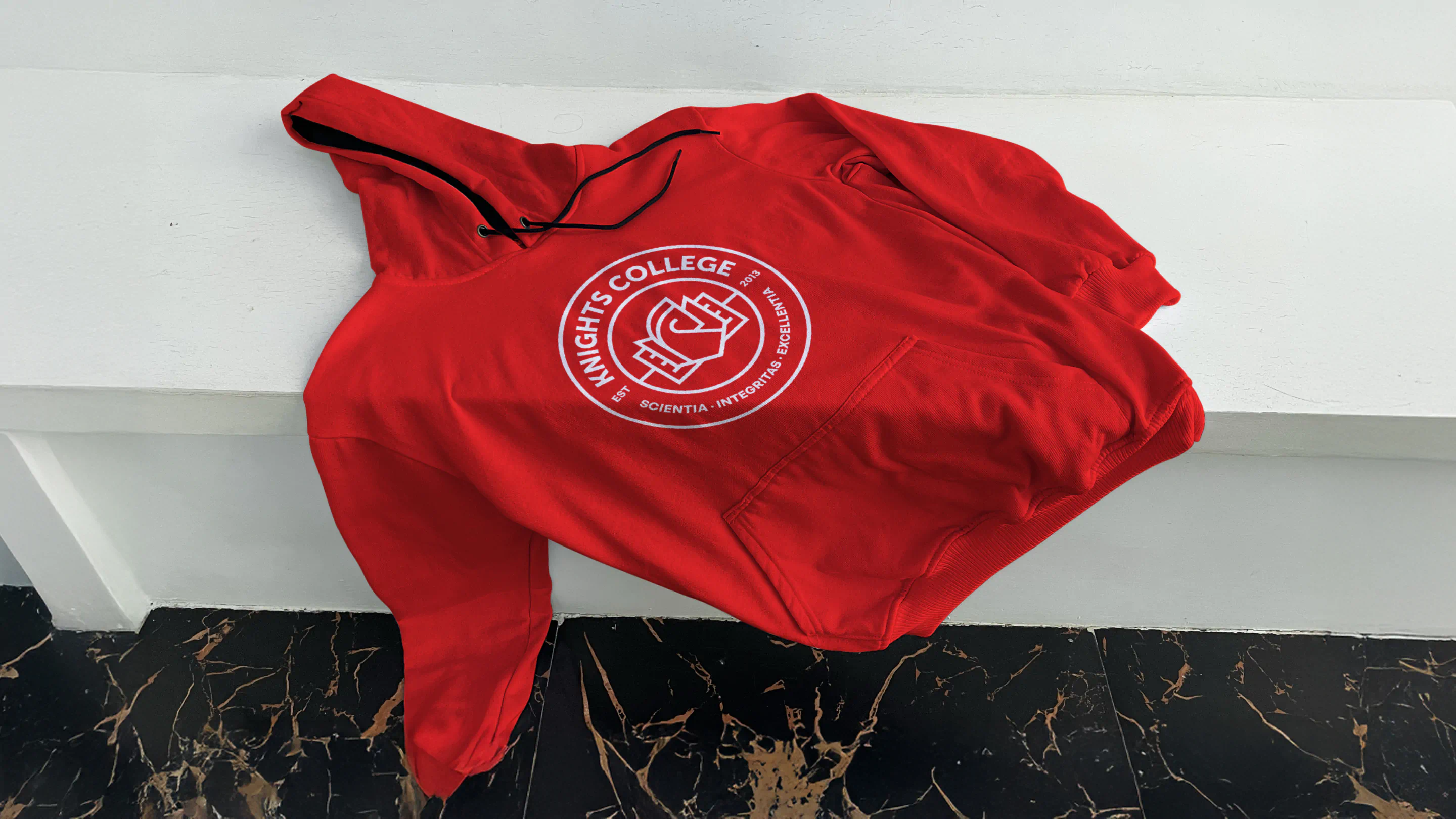
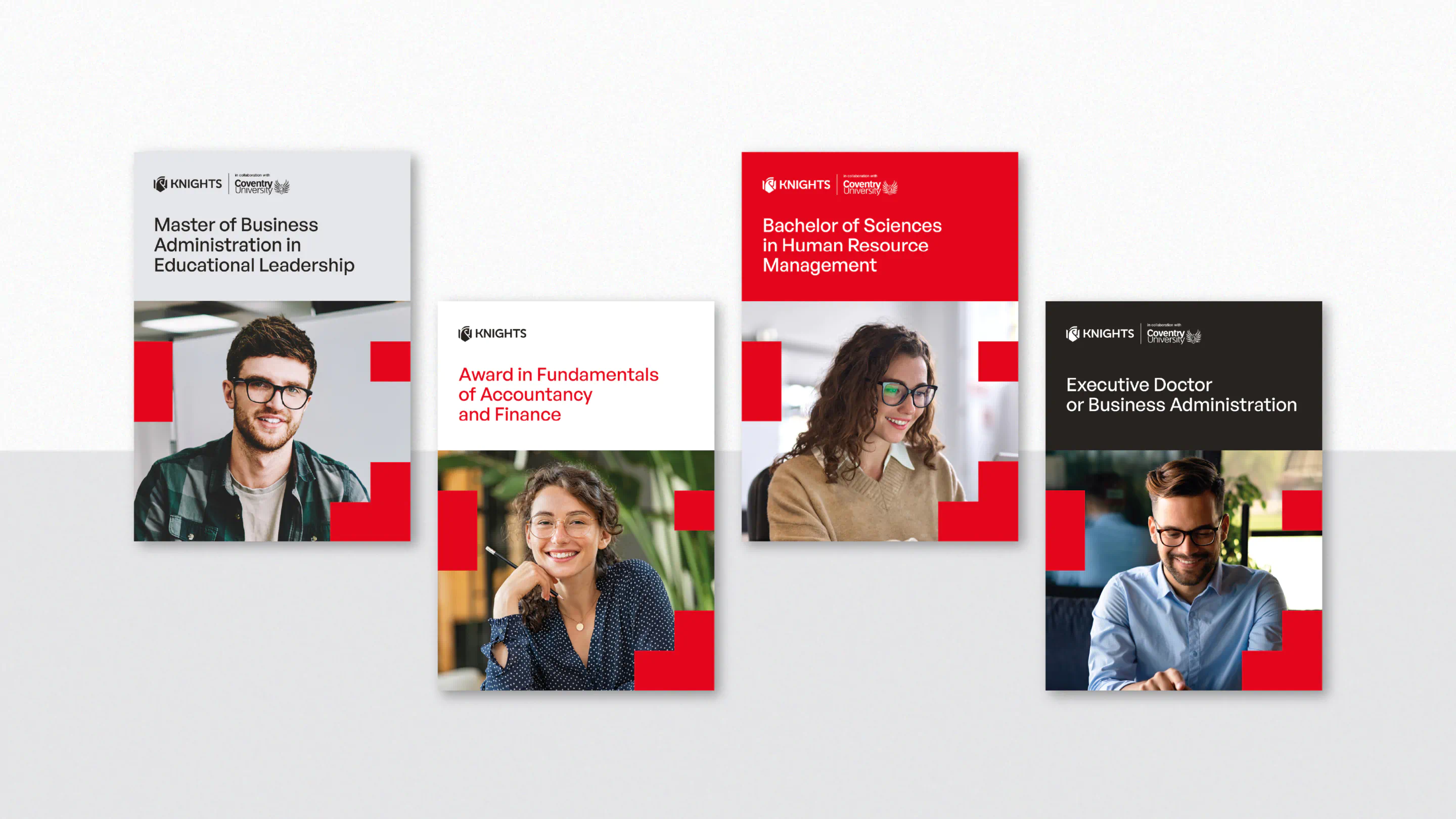
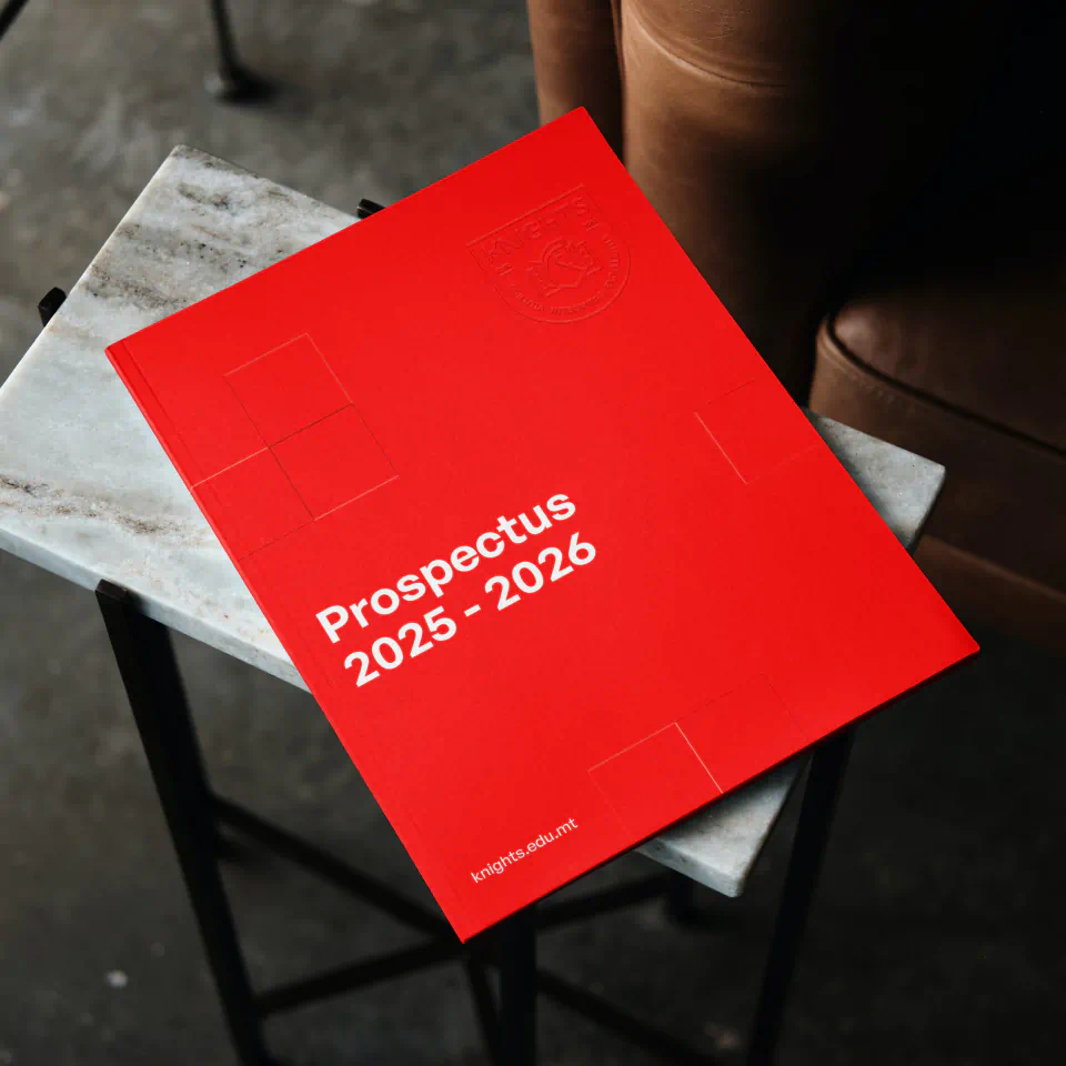
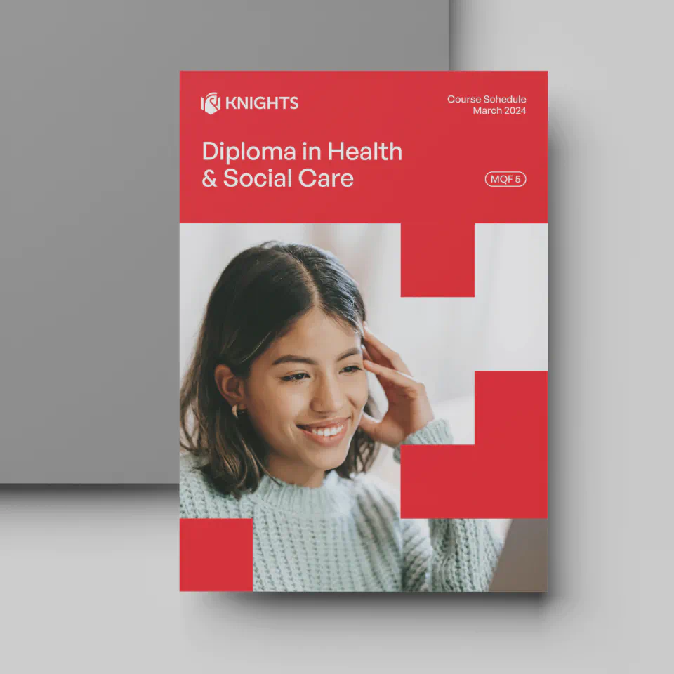
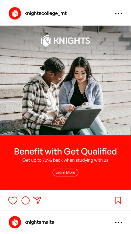
With a bold new name secured, we crafted a confident visual identity designed not just to look fresh but to give students something they can be proud to represent. Powered by the vibrant Knights Red, we developed a flexible logo system that included a primary logo and a custom emblem. Paired with clever details like the knight’s unique L-shaped move in red to add more interest and diversity to the wider visual system. This variety of design elements allowed us to keep the brand looking fresh and cohesive across all touchpoints and merchandise. Whether on hoodies, water bottles, bags, or lanyards, every item was designed to look cool, unique, and something students would be proud to wear every day.
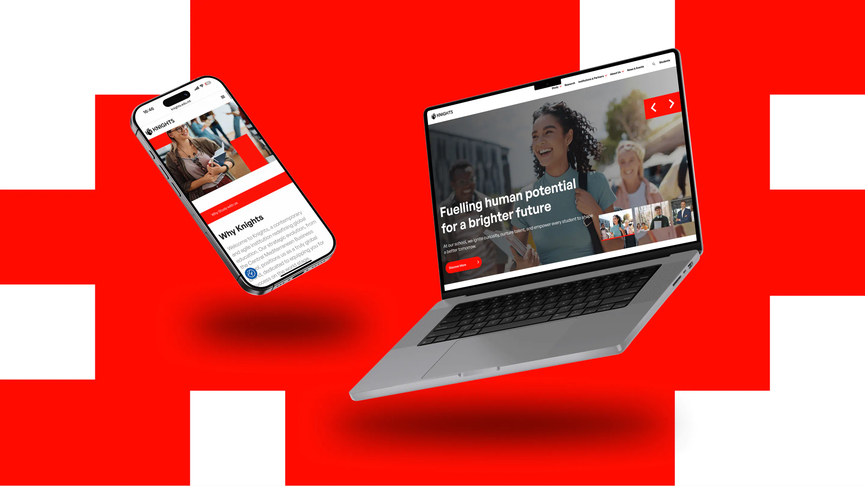
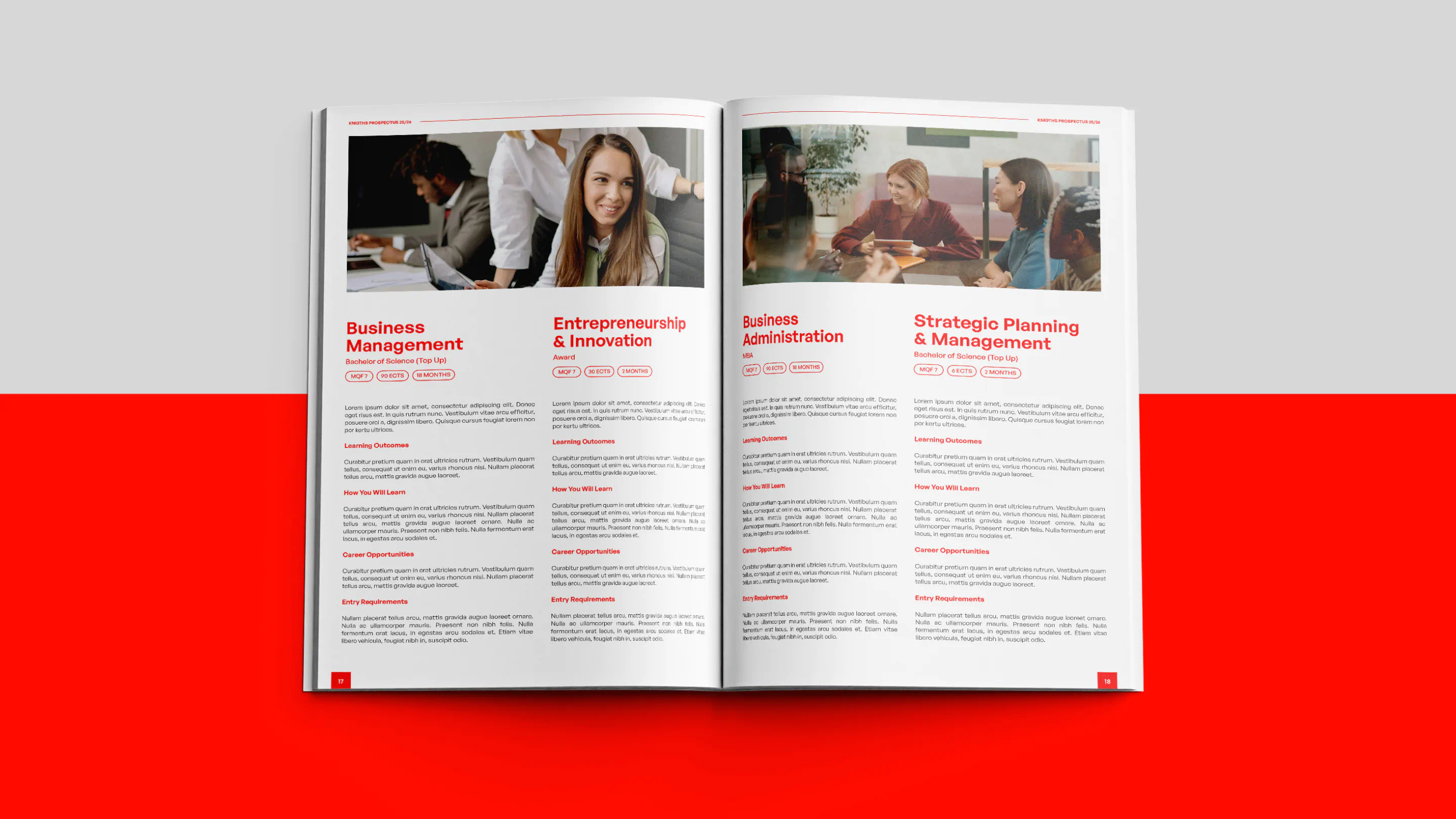
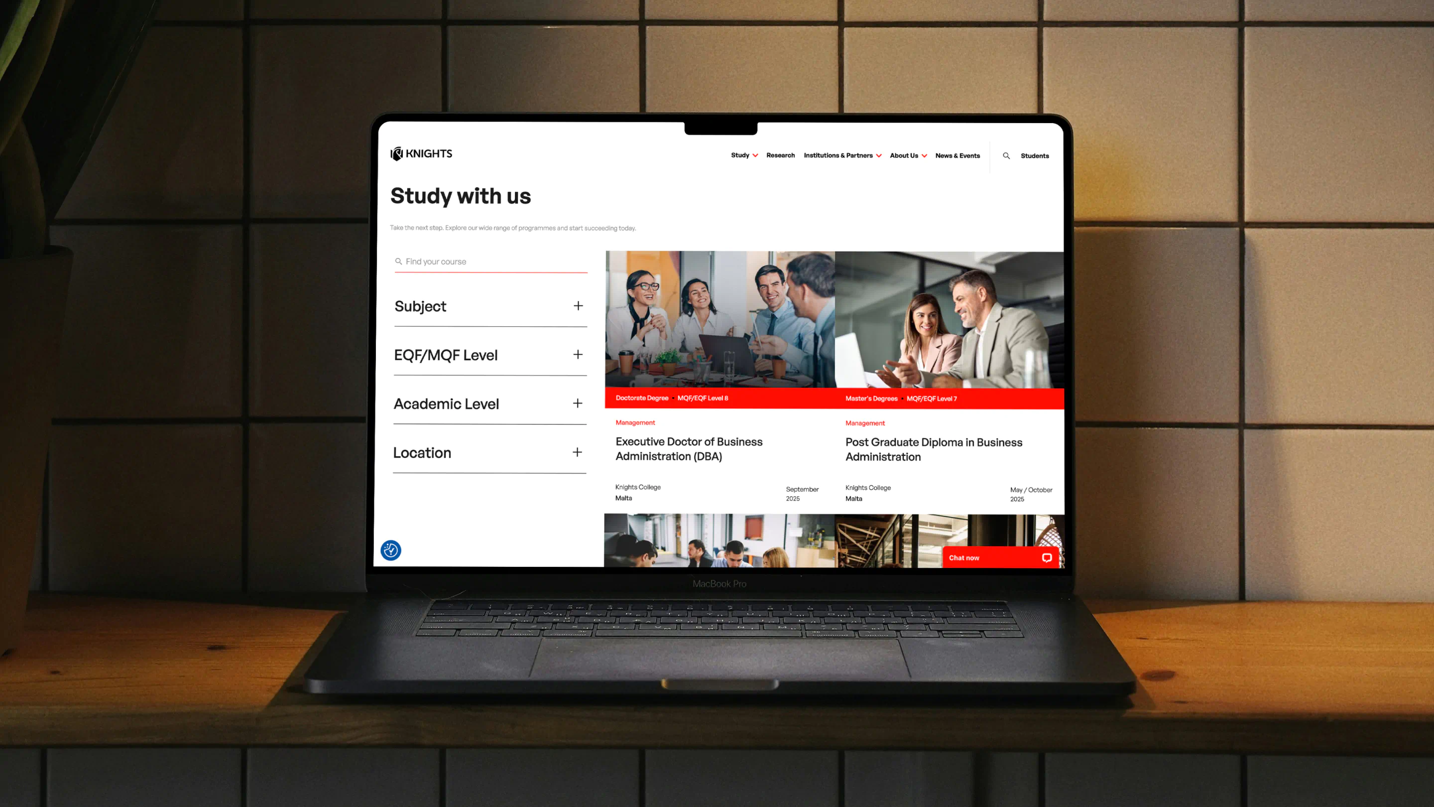
Next, we reimagined the website as a vital part of the student journey. Clear and easy to navigate, it highlights the college’s expanding reach, diverse courses, and growing regional footprint, making it simple for students to find their next step.
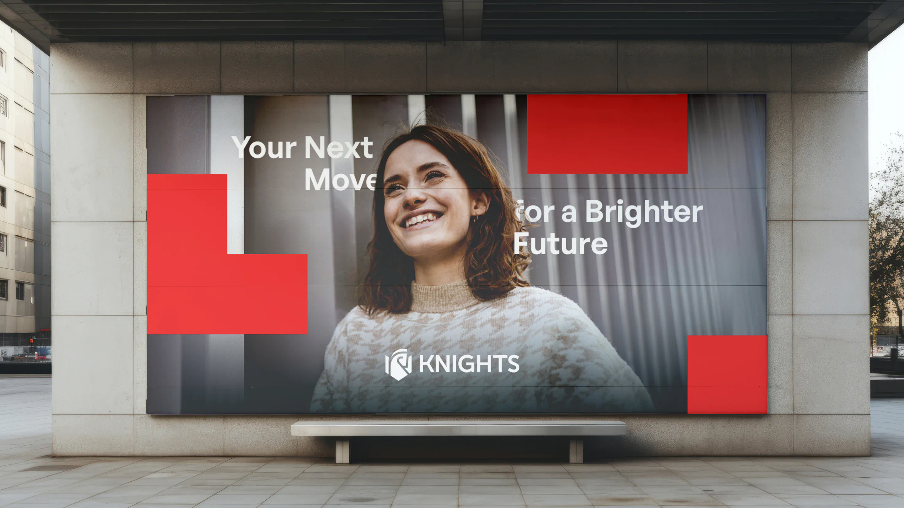
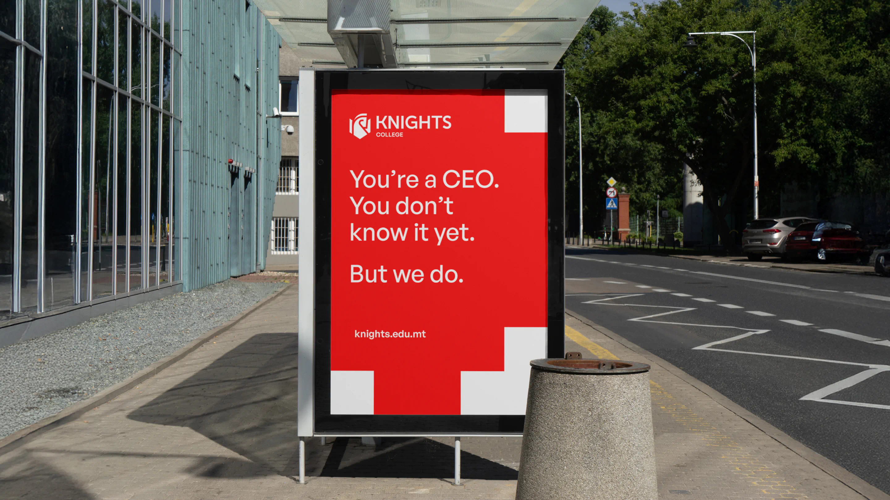
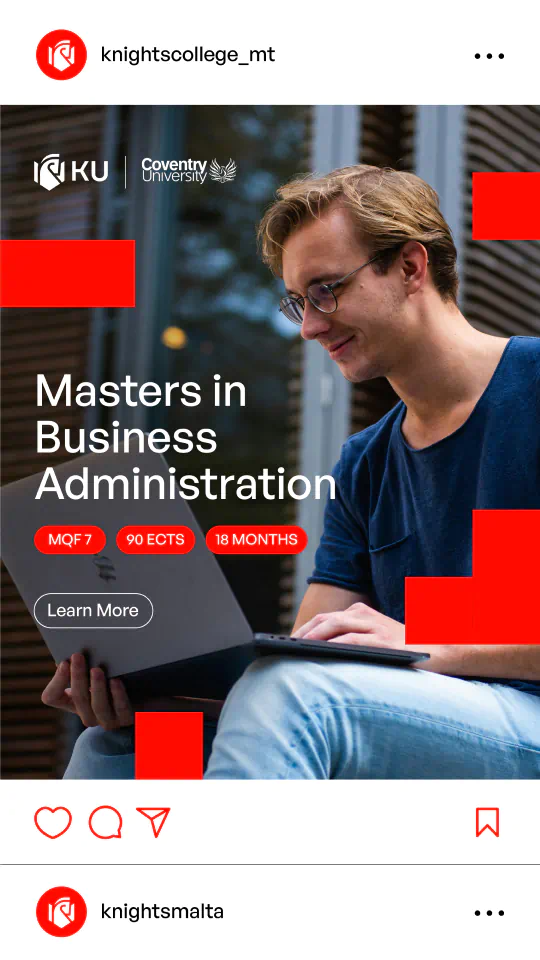
Our final winning move was a bold multi-phase campaign to launch the new brand with impact. Recognising that no one’s journey to education is the same, we decided that the message shouldn’t be either. We created a range of confident, inspirational messages designed to speak directly to different kinds of students.Lines like ‘You’re a CEO. You don’t know it yet. But we do.’ and ‘We’ll take you from A to ACCA.’ were crafted to reinforce the brand’s positioning—showing Knights as a brand that recognises your potential, champions your journey, and stands as a credible choice for ambitious students ready to shape the future.
Kristina Galea Borg
School Principle
Working with BRND WGN on our recent rebrand has been an exceptional experience. Their professional approach and knowledgeable staff truly stood out. What impressed us most was their remarkable ability to adapt to our team, many of whom are non-marketers. They expertly guided us through the complexities of the rebrand, making what could have been a challenging process feel intuitive and manageable. This collaborative environment fostered significant personal and professional growth for our entire team. We highly recommend BRND WGN for their expertise and their commitment to ensuring a truly empowering journey.


The results