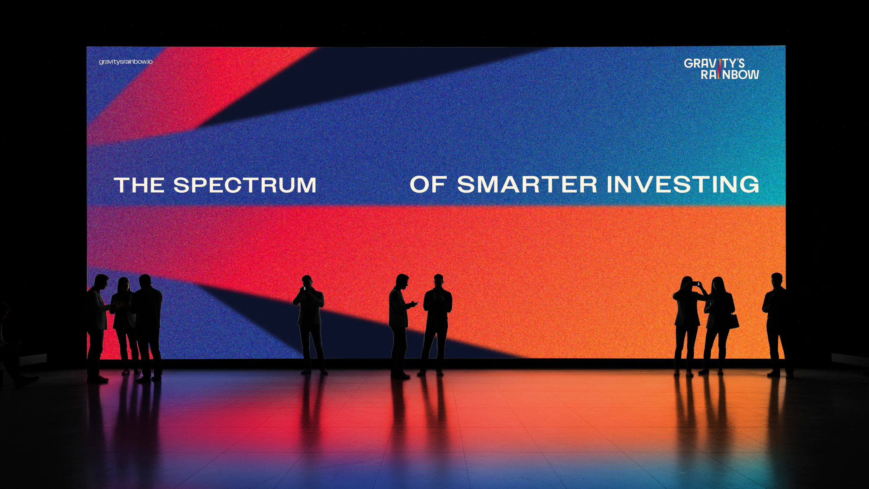
Gravity’s Rainbow Branding
Клієнт:
Дата проєкту:
2026
Індустрія:
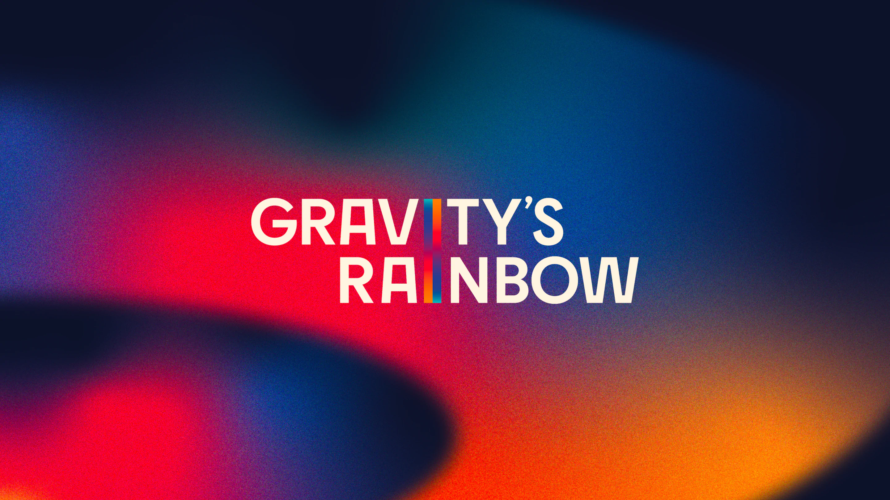
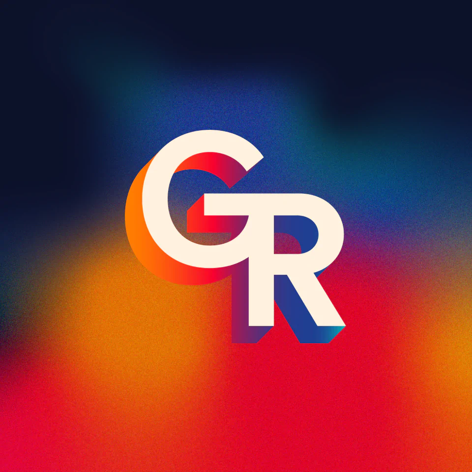
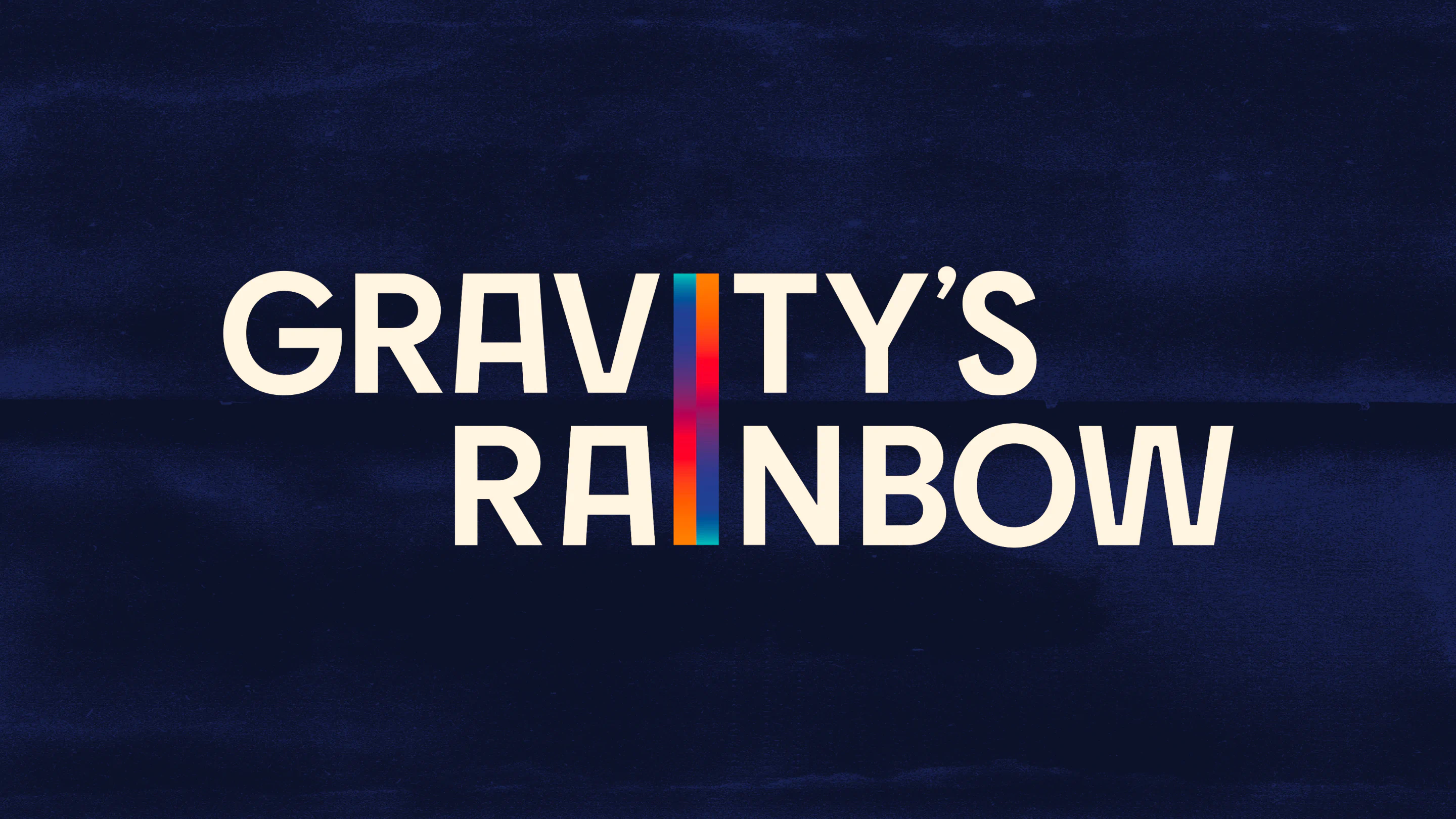
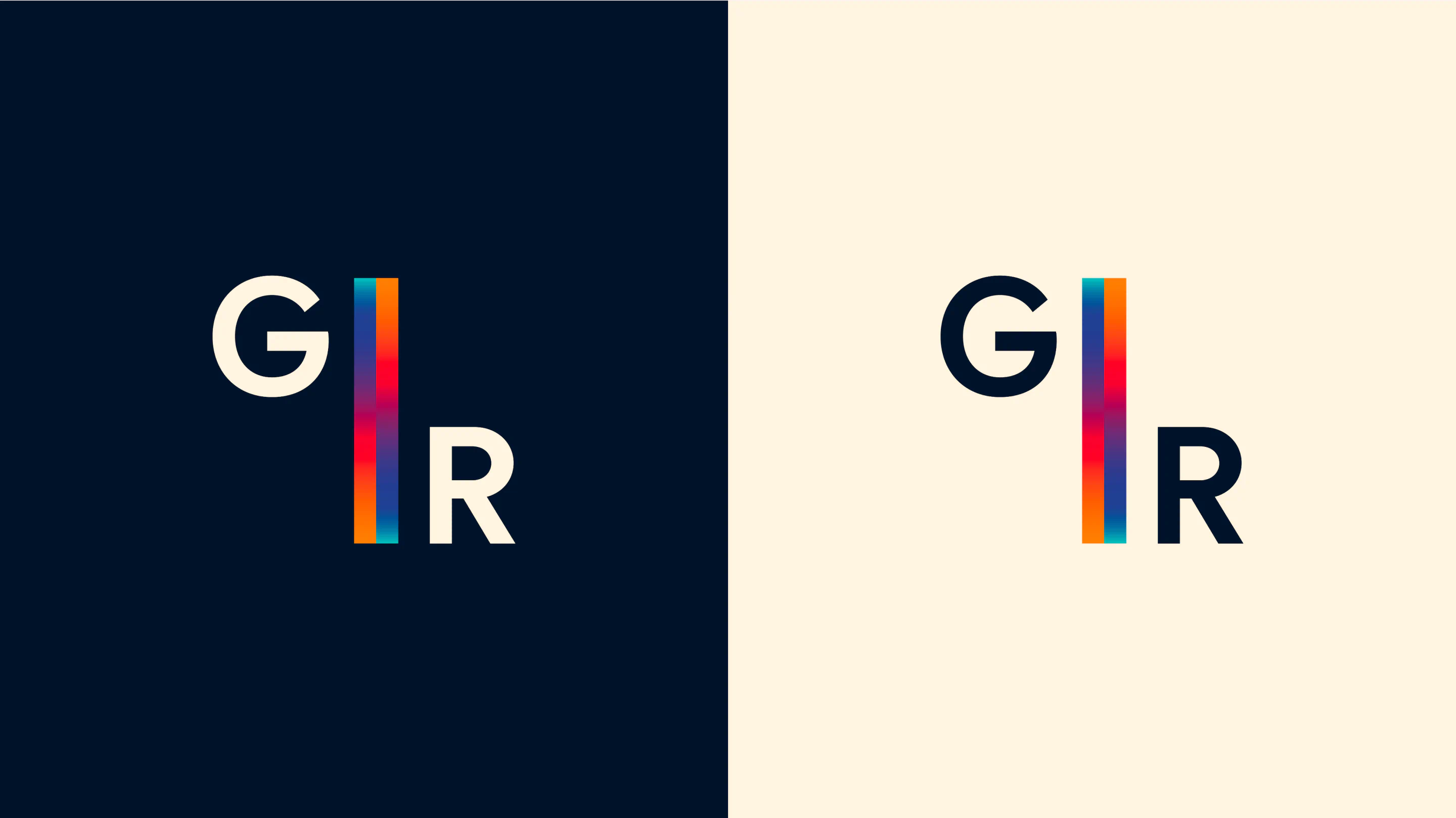
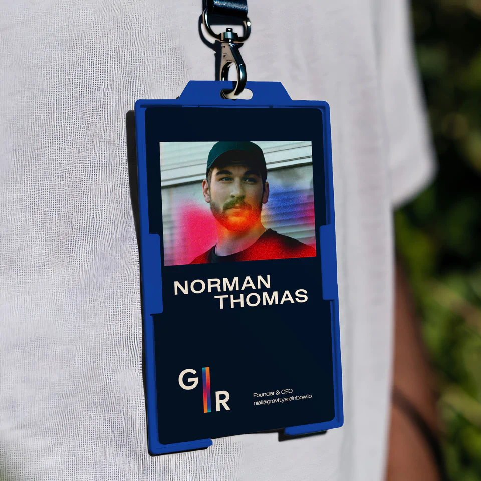
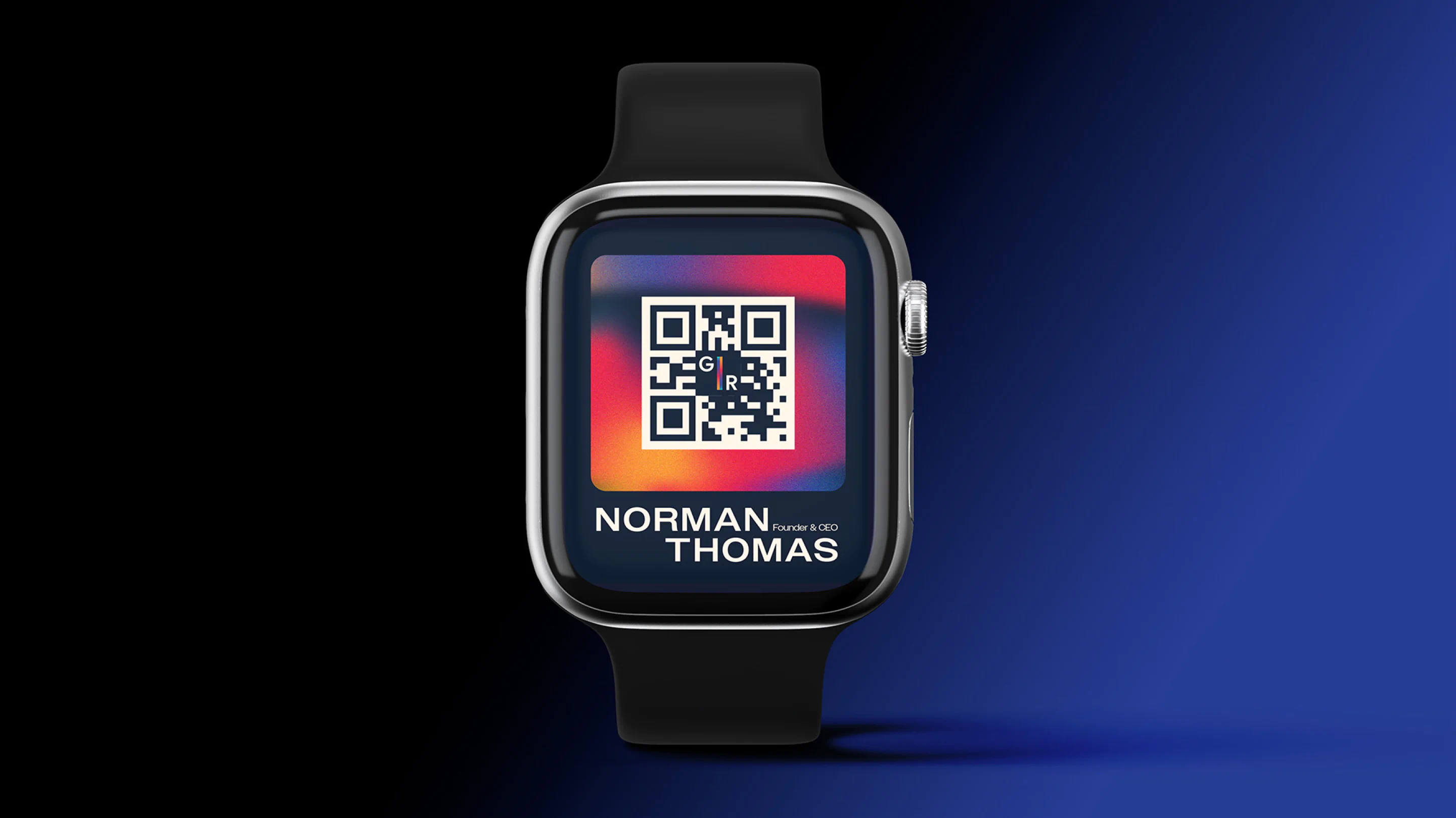
We developed a conceptual brand identity for Gravity’s Rainbow, a personal investment company focused on technology and AI-driven ventures. By stacking the wordmark and joining the two “I’s”, we introduced subtle movement, supported by prismatic gradients and a gravity-well inspired visual system.
Бриф
Create a brand identity for a personal investment company focused primarily on technology, AI-driven ventures, funds and property. The goal was to craft a forward-thinking, intelligent and conceptually layered brand that feels contemporary and future-facing, while rooted in meaning.
The name, inspired by the novel Gravity’s Rainbow, opens the door to multiple interpretations. It is expansive, thought-provoking and open-ended. Our task was to embrace this ambiguity and position the company as a curated portfolio of bold, tech-led investments, particularly within AI and emerging technologies.
Реалізація
Gravity’s Rainbow is a name that already carries weight. It invites curiosity and resists simplicity. That tension became the foundation of the identity.
Rather than overcomplicate the system, we leaned into clarity and control. The wordmark became our primary canvas. By stacking the words Gravity and Rainbow above each other, we created a distinctive structural alignment. The two “I’s”, one from each word, sit vertically in line and are joined in a downward and upward motion. This subtle gesture introduces movement within a restrained typographic structure, visually echoing the push and pull associated with gravity itself.
Typography was intentionally minimal, but not neutral. We introduced sharper, engineered edges within the letterforms to create a more progressive and technically fluent feel. The harder cuts contrast against the natural rhythm of the type, resulting in a mark that feels deliberate, precise and digitally native. It reflects a company operating at the intersection of logic, intuition and long-term vision.
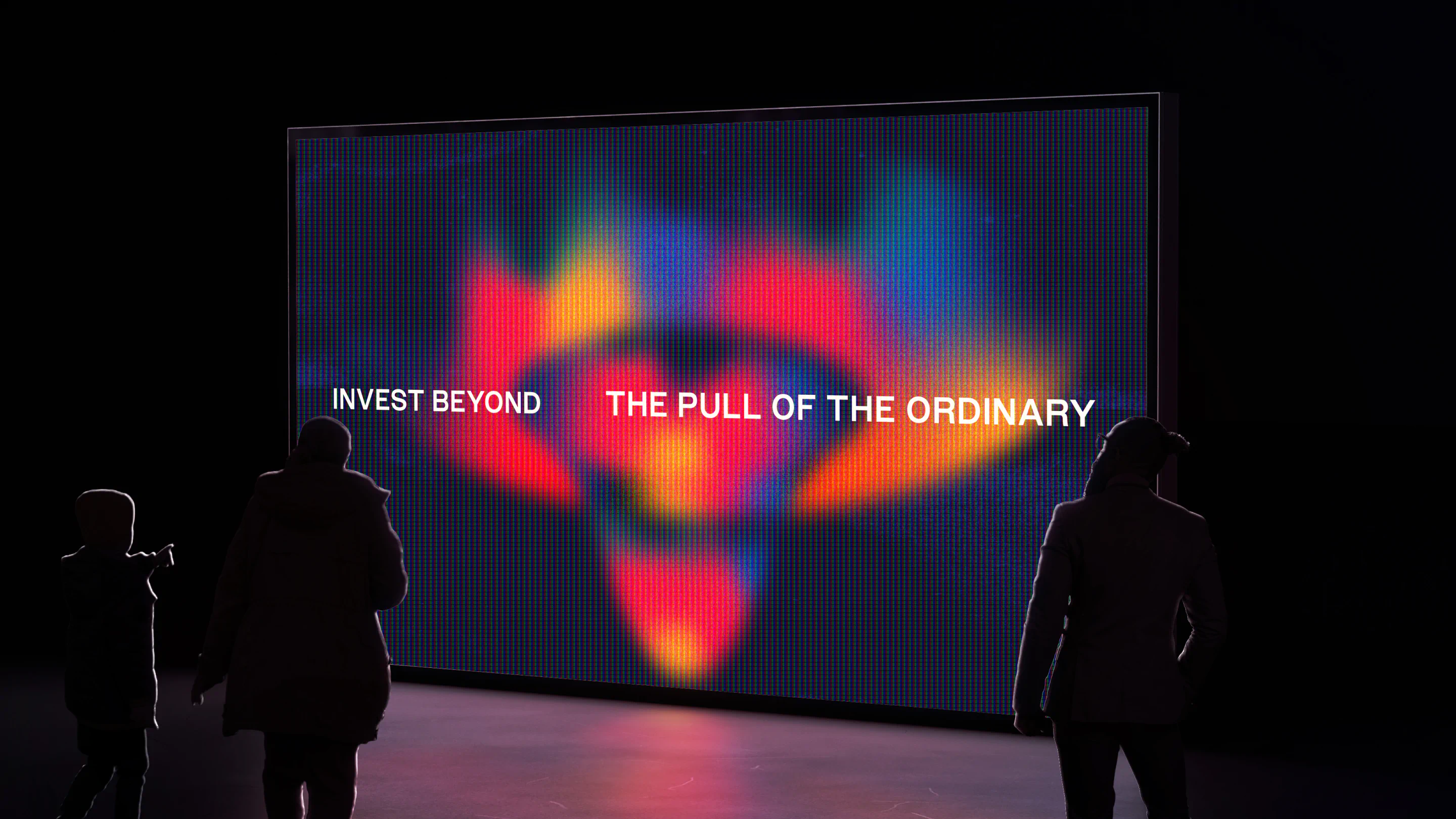
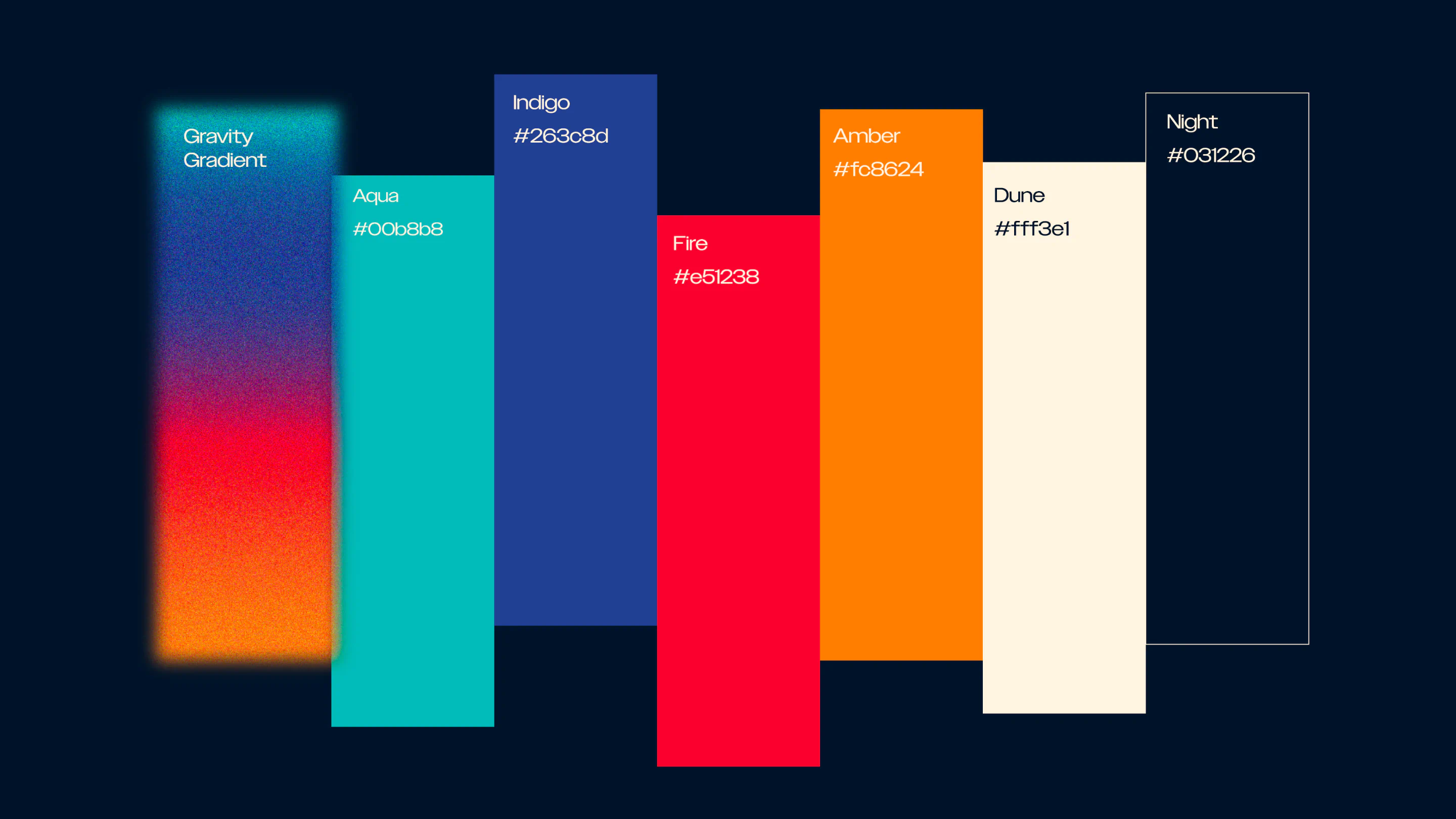
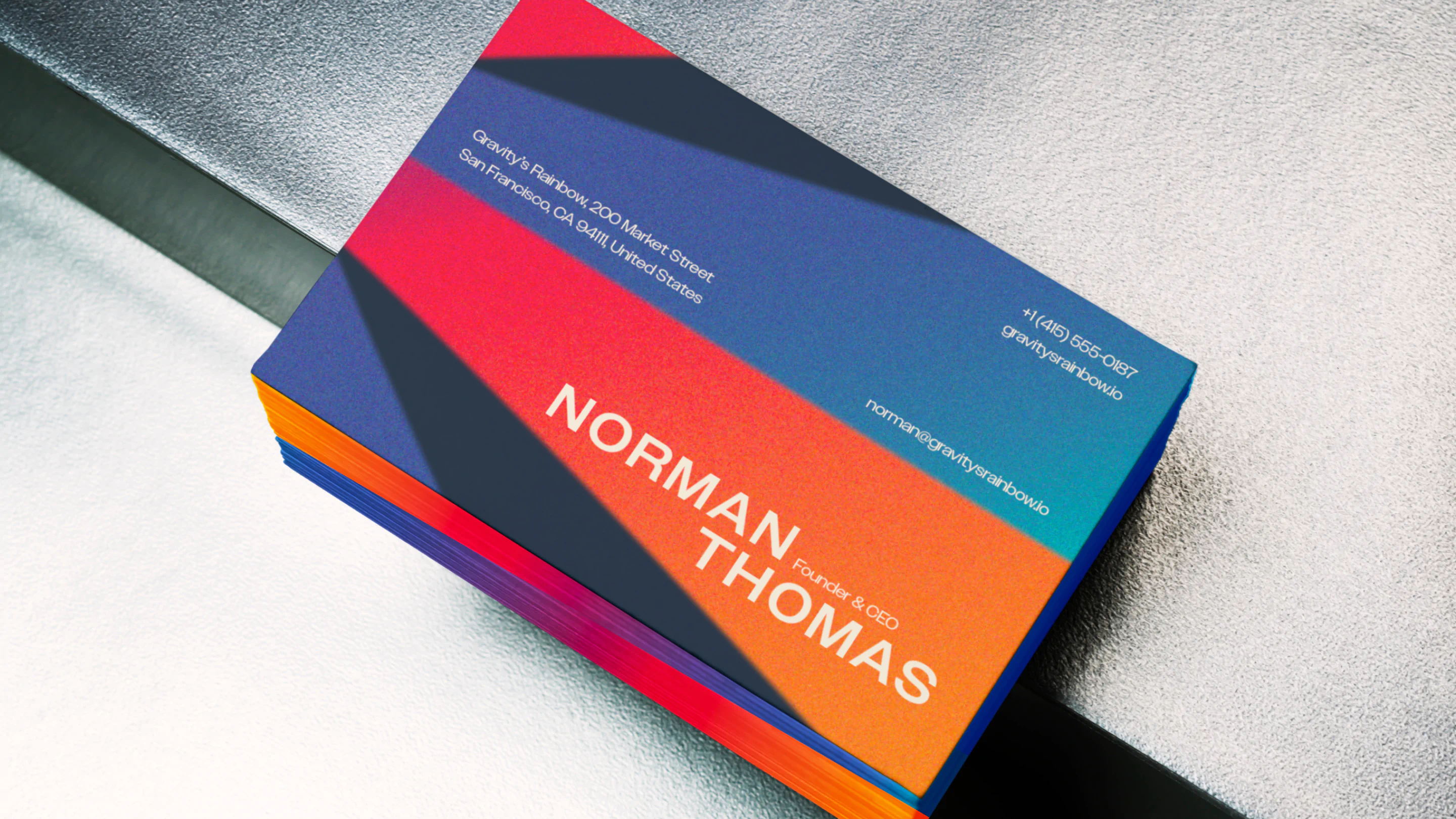
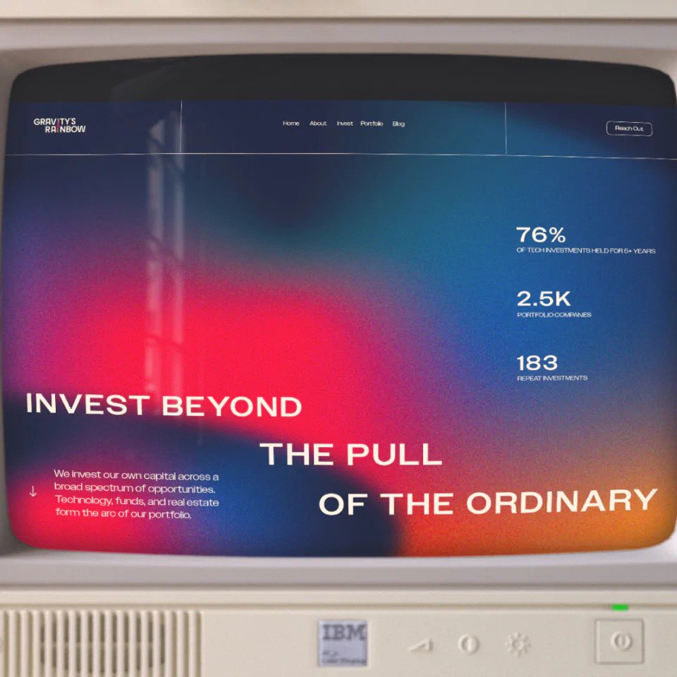
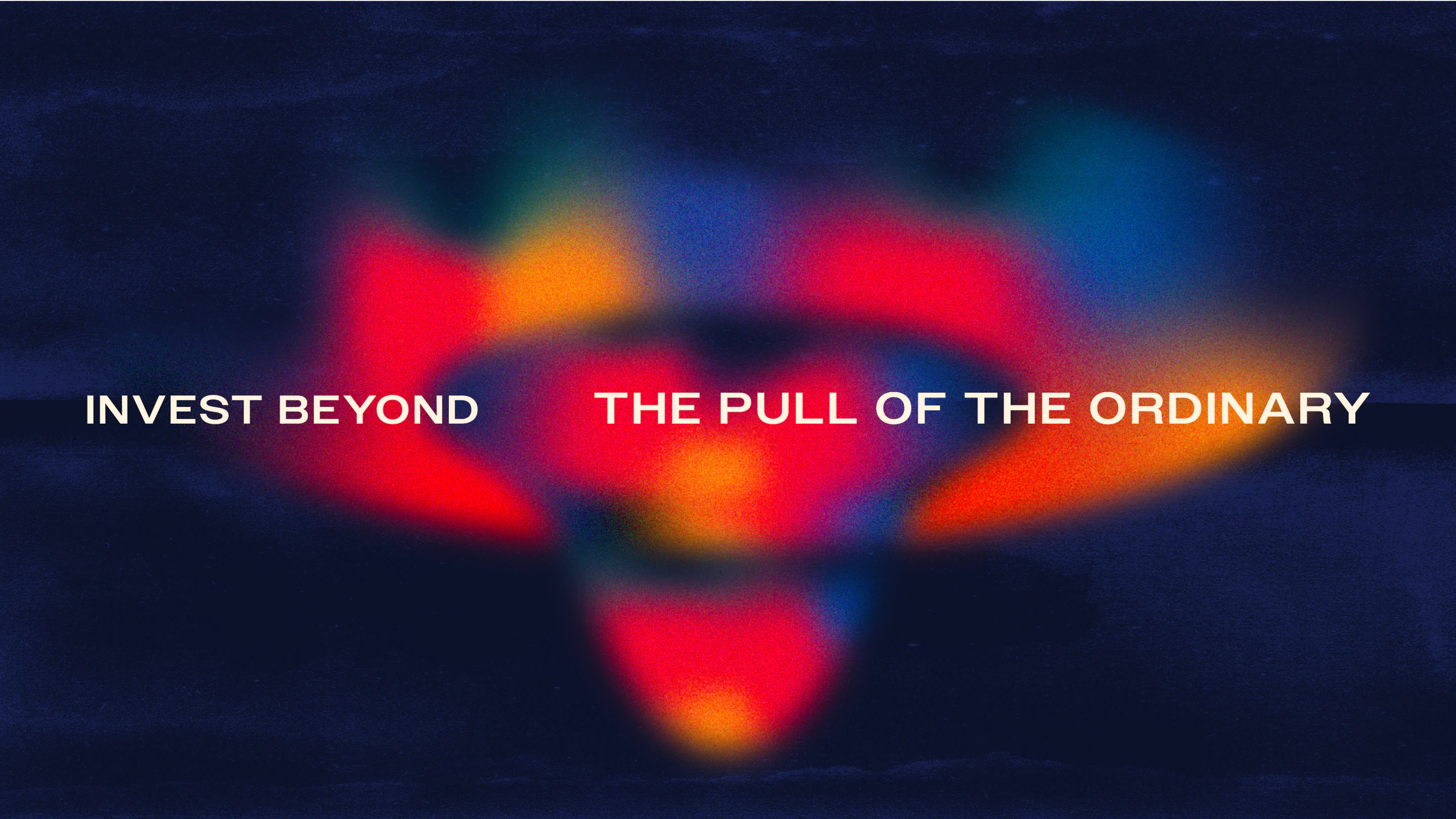
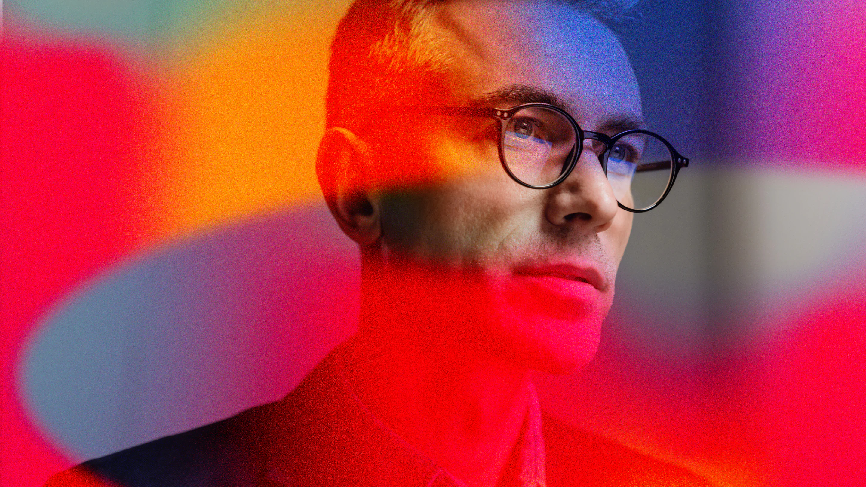
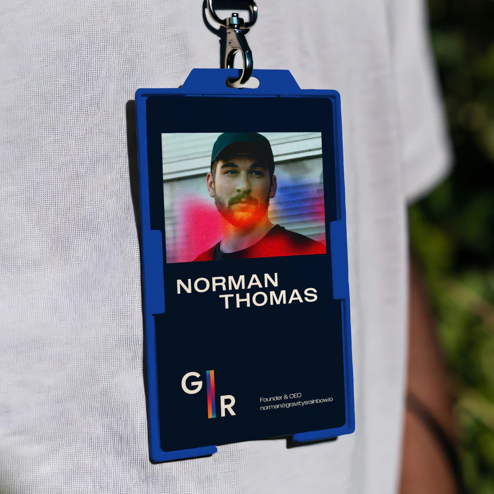
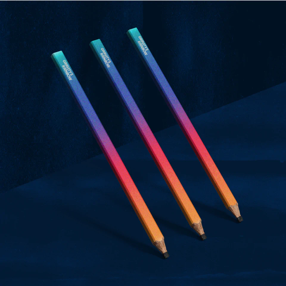
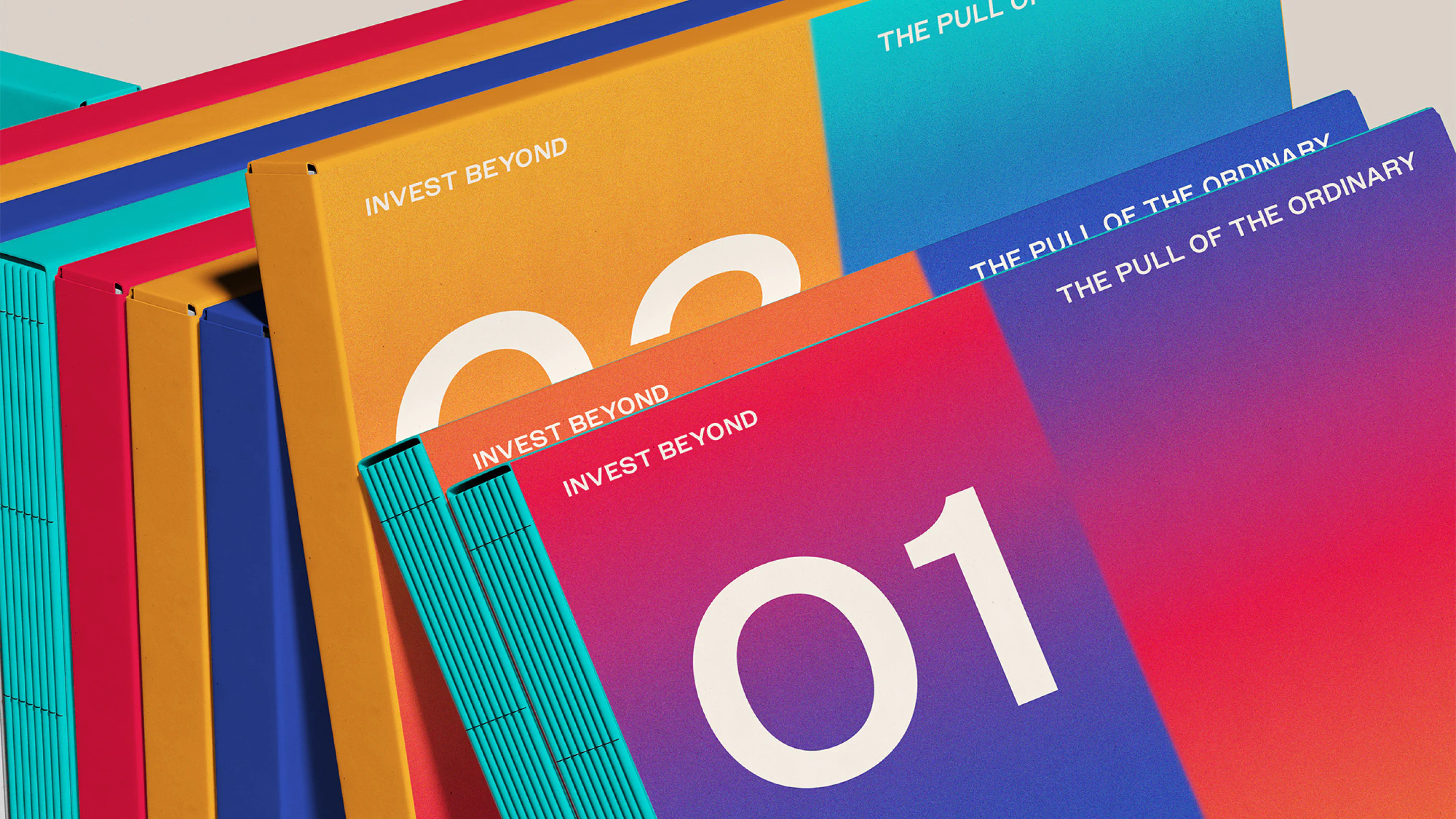
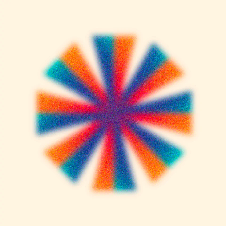
Visually, we built a world that balances intellectual depth with contemporary energy. A grain-infused texture system adds tactility and atmosphere, while prismatic gradient hues introduce dimension and intrigue. These rainbow gradients are conceptual rather than decorative. We developed a gradient asset inspired by the abstraction of a gravity well, expanding and distorting colour into an immersive focal point. This device can be scaled, cropped and amplified across applications, functioning as both a background system and a recognisable brand signature.
There is also a quiet nod to the original book cover treatment, not through imitation, but through tone. A sense of depth, mystery and layered meaning underpins the entire visual system.
The final identity positions Gravity’s Rainbow as more than an investment vehicle. It becomes a considered showcase of forward-thinking ventures, particularly in AI and technology, presented through a brand that feels intelligent, intentional and future-facing.
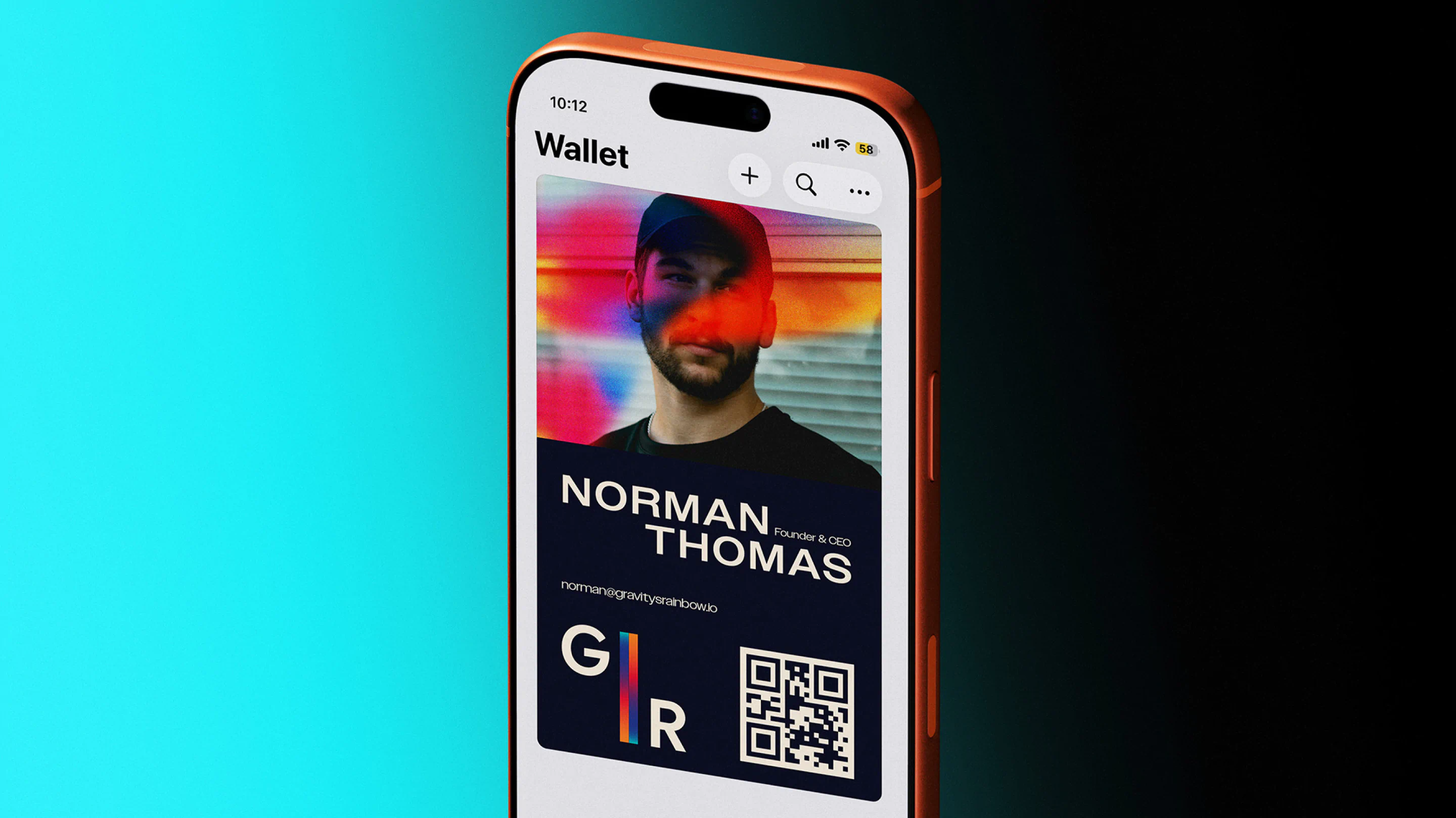






Результати